How the Best Websites Nail Responsive Design

Creating a website that looks incredible on every device isn’t a bonus anymore—it’s the baseline. People access the internet from phones, tablets, desktops, smart TVs, and everything in between. A website that doesn’t adjust fluidly across screen sizes creates friction, and friction kills conversions. That’s why the best websites invest in responsive design from the ground up.
If you’re building on WordPress, mastering responsive design isn’t optional—it’s essential. Thankfully, WordPress themes and page builders have matured significantly, offering robust features for mobile-friendliness. But understanding how and why responsive design works can still make the difference between a site that performs and one that simply displays.
Let’s explore the core principles and practices behind the websites that absolutely nail it.
What Is Responsive Design?
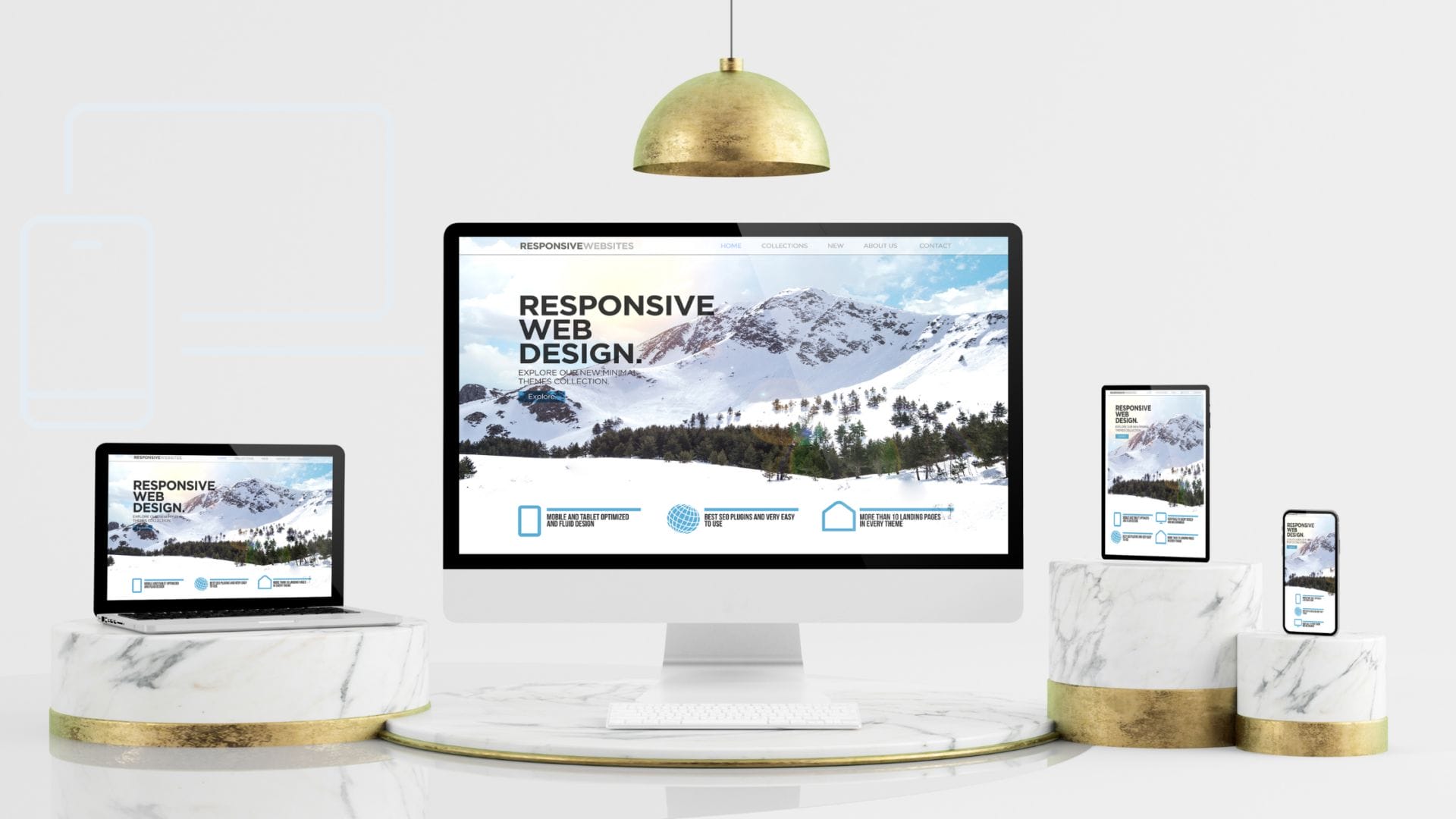
Responsive design refers to a web development strategy that ensures your site adapts fluidly to various screen sizes and resolutions. It’s not about shrinking everything down—it’s about creating flexible grids, scalable images, and dynamic content that adjusts for readability and functionality. Whether someone visits your site on a phone or a widescreen monitor, they should experience clarity and ease of use.
Instead of building separate sites for each device (a common practice years ago), responsive design uses a single codebase with style rules that adapt at defined breakpoints. This approach is cost-effective, easier to maintain, and more aligned with how real users engage across devices.
“Design must reflect the practical and aesthetic in business but above all… good design must primarily serve people.” — Thomas J. Watson
Key Breakpoints and Layout Adjustments
One of the most crucial aspects of responsive design is understanding breakpoints. Breakpoints are the pixel widths at which your layout needs to change to look and function well. These shifts help avoid content overlapping, squished buttons, or awkward scrolling.
Common breakpoints include:
- 320px (small phones)
- 768px (tablets)
- 1024px (laptops)
- 1280px+ (desktops and large monitors)
When building in WordPress, most modern themes include built-in media queries that automatically adjust layout elements at these breakpoints. Still, knowing how to tweak these manually using custom CSS (or within Elementor or Divi) gives you a creative edge.
Also Read: How a Backend Engineer Designs a Website
Top CSS Frameworks (Bootstrap, Tailwind, Flexbox/Grid)
While WordPress gives you a foundation, frameworks give you precision. CSS frameworks make responsive design less about trial and error and more about structured control.
- Bootstrap offers a grid-based system that makes it easy to align content, stack elements, and apply responsive classes to any section.
- Tailwind CSS is utility-first, which means you apply responsiveness directly through class names. It pairs beautifully with WordPress custom themes.
- Flexbox and CSS Grid aren’t frameworks but layout models native to CSS. They offer granular control over how elements flow, wrap, and stack.
Using these tools ensures faster development and consistency across screen sizes. The best websites usually have a framework behind them, offering flexibility without sacrificing structure.
“Creativity is nothing but a mind set free.” — Torrie T. Asai
Adaptive vs Responsive
It’s easy to confuse adaptive and responsive design, but they aren’t quite the same. Responsive design is fluid. It scales and adjusts continuously based on screen size. Adaptive design, on the other hand, detects the user’s device and loads a layout tailored specifically for that device.
For WordPress users, responsive is usually the go-to strategy. Most themes, especially premium ones like Astra, OceanWP, or Hello Elementor, use responsive techniques under the hood. However, adaptive can work well for performance-heavy applications where loading lighter assets for smaller devices makes sense.
Visual Case Studies of Responsive Design Done Right
Let’s spotlight a few examples of responsive design that hit the mark:
- Apple.com offers seamless transitions from desktop to mobile. Navigation simplifies without sacrificing brand feel, and the product visuals scale beautifully.
- BBC News provides an incredible reading experience across devices. Text remains legible, images adjust appropriately, and the grid system supports various types of content.
- TechCrunch shows how a WordPress-powered site can handle responsiveness through clean layouts and mobile-friendly ad placements.
These examples succeed because they prioritize user experience at every screen size. Consistency, clarity, and performance drive their design decisions.
“People ignore design that ignores people.” — Frank Chimero
Tools for Testing Responsiveness
Creating a responsive website is only half the battle. You also need to test it. Luckily, you don’t need to buy ten different devices. Here are the tools the best websites use to test:
- Google Chrome DevTools – Offers screen emulators and manual resizing.
- BrowserStack – Lets you test on real devices and browsers without owning them.
- Responsinator – A simple tool that shows how your site looks on popular devices.
- Pingdom & GTmetrix – Not just for speed—they reveal layout shifts and content loading issues on mobile.
In WordPress, many builders like Elementor Pro come with built-in responsive mode testing. It’s smart to test each major breakpoint before launch.
Also Read: Choosing Craft CMS vs WordPress for Your Website Development
Accessibility in Responsive Design
Responsiveness should never come at the cost of accessibility. Your site should be usable by people with visual, motor, or cognitive challenges. The best websites don’t just look good—they work for everyone.
Here’s how to keep your responsive design inclusive:
- Maintain keyboard navigation
- Ensure color contrast is readable
- Use responsive typography for legibility
- Avoid elements that shift or disappear on smaller screens
WordPress plugins like WP Accessibility and themes like GeneratePress already account for many of these factors. Still, it’s worth reviewing your designs manually to ensure compliance with WCAG guidelines.
Image Scaling and Optimization
Images are often the heaviest assets on any site. On a large desktop screen, you want crisp, high-res images. On mobile, those same files can destroy performance and eat up data. Responsive image handling is a must.
WordPress makes this relatively easy:
- It automatically creates multiple sizes for uploaded images
- Plugins like Smush or ShortPixel compress images without losing quality
- Lazy loading (built into WordPress core now) helps speed up mobile load times
Use the <picture> tag or the srcset attributes for advanced control. Or lean on themes that already handle image responsiveness in the background.
“The details are not the details. They make the design.” — Charles Eames
Building from Mobile Up (Mobile-First)
Mobile-first design flips the old paradigm on its head. Instead of building for desktops and scaling down, you start by designing for the smallest screen and layer complexity upward.
This method ensures that your site is lightweight, fast, and focused at its core. WordPress themes like Kadence and Neve embrace this principle. Many of their elements are built to function beautifully on mobile before being enhanced for larger screens.
Benefits of mobile-first:
- Faster page load speeds
- Cleaner design hierarchy
- Greater focus on what users need
The best websites start from mobile and work their way up, ensuring performance and clarity every step of the way.
Conclusion: Why Responsive Design Is Non-Negotiable
Responsive design isn’t a trend—it’s a user expectation. People don’t think twice about the devices they use to access your site. They expect it to work, look good, and function seamlessly. If it doesn’t, they bounce.
By focusing on responsiveness from the beginning, you set your WordPress site up for success. You reduce bounce rates, improve engagement, and boost SEO. Responsive design also future-proofs your website. New screen sizes and resolutions will continue to emerge, but if your site is built on responsive principles, it will adapt without needing a complete overhaul.
So, whether you’re using a WordPress theme, builder, or custom code, start with responsiveness in mind. Make it part of your design DNA. That’s how the best websites stand out.
“Good design is obvious. Great design is transparent.” — Joe Sparano
Interesting Reads:

Shashank is a seasoned digital marketing and WordPress expert who specializes in SEO, software tools reviews, and cutting-edge strategies for boosting online presence. With a passion for simplifying complex topics, Goutham crafts engaging blog posts that help readers optimize their websites, improve search engine rankings, and stay ahead in the ever-evolving digital landscape.