Orange Black Website Design in 2026

The digital world, color is far more than a simple aesthetic choice—it serves as a powerful communication tool that shapes user perception, evokes emotion, and defines brand identity. Among the most striking and memorable combinations, orange and black stand out for their bold, modern appeal. This vibrant pairing perfectly balances contrasting qualities: the energy, creativity, and warmth of orange harmonizes with the sophistication, strength, and elegance of black, creating a visually dynamic and engaging experience that immediately captures attention.
An Orange Black Website goes beyond mere aesthetics; it can strategically influence how users perceive your brand. Orange, known for its energetic and inviting qualities, draws visitors in, encourages interaction, and stimulates a sense of urgency—making it ideal for call-to-action buttons, promotional banners, and interactive elements. Black, on the other hand, exudes authority, professionalism, and timeless elegance, providing a grounding contrast that adds depth and clarity to your design. Together, they create a powerful visual hierarchy that guides users naturally through content while leaving a strong, lasting impression.
From tech startups and creative agencies to sports brands, e-commerce platforms, and personal portfolios, an orange and black website can convey confidence, innovation, and professionalism. It signals to visitors that your brand is bold, forward-thinking, and unafraid to make a statement.
Why Orange and Black Websites Stand Out
In the fast-paced world of web design, color is more than just decoration—it’s a statement. Among the myriad of color combinations, orange and black has emerged as a bold, striking duo that commands attention. From tech startups and creative agencies to sports brands, this palette conveys energy, sophistication, and a modern edge, making it perfect for businesses looking to stand out online.
Orange is synonymous with creativity, enthusiasm, and warmth. It draws the eye naturally, sparks curiosity, and encourages interaction—perfect for calls-to-action and highlighted elements. Black, on the other hand, brings power, elegance, and contrast, grounding the vibrancy of orange with sophistication and depth. Together, these colors create a dynamic balance that is both visually appealing and emotionally engaging.
Brands across industries have embraced this combination. Think of high-octane sports brands, edgy tech startups, or daring creative studios—they all use orange and black to convey confidence and innovation. Whether it’s the iconic Fanta campaigns, Harley-Davidson motorcycles, or sleek personal portfolios, the orange-black color scheme consistently delivers high impact.
But designing such a website doesn’t have to be complicated. With WordPress, creating a professional, visually compelling orange-black website is accessible even for beginners. By using flexible themes like BuddyX, you can easily apply bold color palettes, customize layouts, and integrate dynamic features without touching a single line of code. In this guide, we’ll explore how to plan your color strategy, pick the right shades, design visually balanced pages, and bring your orange-black website to life with practical WordPress tools.
Also Read: Best CRO Tools & Platforms for E-commerce and SaaS
Color Psychology Behind Orange and Black
Colors are far more than mere visual elements on a screen—they carry deep psychological significance, influence perception, and can even drive user behavior. Each color evokes distinct emotions and associations, making it a powerful tool for shaping how visitors experience your brand. Orange and black, in particular, form a compelling duo that blends energy, warmth, and approachability with sophistication, authority, and elegance.
Orange is often associated with creativity, enthusiasm, and optimism. It grabs attention without feeling aggressive, encouraging engagement and interaction. This makes it an ideal choice for call-to-action buttons, promotional highlights, or elements where you want users to feel excited and motivated. Black, by contrast, represents power, sophistication, and professionalism.
What Orange Represents
Orange is a vibrant and energetic color that evokes creativity, warmth, and friendliness. Unlike red, which can feel aggressive, or yellow, which sometimes comes across as fleeting or overly bright, orange strikes a perfect balance—it’s bold and attention-grabbing without overwhelming the senses. In web design, this versatility makes orange an ideal choice for guiding user behavior, highlighting key elements, and communicating a brand’s personality.
In practical terms, orange is often used for:
- Call-to-action buttons: Orange naturally encourages clicks and engagement without feeling pushy, making it perfect for buttons, sign-ups, and subscription prompts.
- Highlights and icons: Its visibility draws the eye to important features, notifications, or key sections of a website, ensuring critical content doesn’t go unnoticed.
- Youthful and creative branding: Orange communicates energy, friendliness, and innovation, making it a popular choice for brands targeting dynamic, forward-thinking audiences.
Industries that leverage orange effectively include tech startups, creative agencies, sports brands, and entertainment companies. Iconic examples include Fanta’s playful orange campaigns, which convey fun and excitement, and Harley-Davidson’s bold orange accents, which exude energy, strength, and adventurous spirit. By incorporating orange thoughtfully, websites can create a sense of enthusiasm and approachability, inspiring users to interact, explore, and engage with the brand in meaningful ways.
What Black Represents
Black is the ultimate symbol of power, sophistication, and authority in design. It conveys a sense of elegance, professionalism, and timelessness, making it a go-to choice for brands that want to appear strong, confident, and reliable. Beyond its symbolic meaning, black also serves a functional role in web design by providing a strong visual contrast that allows vibrant colors—like orange—to truly stand out and capture attention.
Using black strategically in web design offers several benefits:
- Establish professionalism and elegance: Black communicates authority and luxury, which is why it is commonly used by high-end brands, corporate websites, and professional portfolios.
- Provide visual hierarchy and depth: By contrasting with brighter colors or lighter backgrounds, black helps organize content, guiding users’ attention to key elements and improving overall navigation.
- Improve readability: When paired with bright, neon, or warm colors, black enhances text legibility and ensures that important messages are easily understood.
Designers can also experiment with charcoal or soft black tones, which provide the sophistication of black while reducing visual fatigue. These softer variations help make large blocks of color less overwhelming, creating a comfortable viewing experience that keeps users engaged longer. Brands like Apple, Nike, and Chanel exemplify the power of black in digital and print design, using it to convey authority, timelessness, and trust. By combining black with vibrant accents such as orange, websites can achieve a dynamic, balanced, and visually striking aesthetic that appeals to modern audiences.
How Orange and Black Work Together
The combination of orange and black creates a visually striking and emotionally balanced design that resonates with users. Orange, with its vibrant and energetic qualities, naturally grabs attention, stimulates curiosity, and encourages interaction. Black, in contrast, provides grounding, sophistication, and a sense of trust, helping to balance the brightness of orange while maintaining a professional and polished look. When used together, these colors form a dynamic duo that can enhance both aesthetics and usability on a website.
This powerful pairing offers several key advantages:
- Creates contrast that guides user focus: The stark difference between bright orange and deep black draws the eye to important elements, ensuring users notice key messages, headings, or interactive features.
- Highlights CTAs, icons, or product features effectively: Orange elements stand out against black backgrounds, making buttons, banners, and icons more noticeable and clickable, which can improve engagement and conversions.
- Communicates energy and professionalism simultaneously: While orange conveys creativity, excitement, and approachability, black adds authority, reliability, and elegance. Together, they send a clear message that your brand is both bold and trustworthy.
Industries from tech startups and creative agencies to sports brands and e-commerce platforms frequently leverage this palette to establish a modern, bold, and memorable web presence. For example, brands like Harley-Davidson use orange accents against black to convey excitement and rugged sophistication, while sports teams or event platforms often rely on the high-energy contrast to grab attention and inspire action.
Industries Using Orange & Black Successfully
The Orange Black Website color combination isn’t just visually striking—it’s strategically effective across a variety of industries. By balancing energy, creativity, and warmth (orange) with sophistication, authority, and professionalism (black), brands can create designs that capture attention while conveying trustworthiness. Here’s how different sectors leverage this dynamic palette:
-
Sports Brands: High-energy and bold, the orange-black palette instantly grabs attention and excites fans. Orange conveys enthusiasm, movement, and adrenaline, while black adds strength and authority, making it ideal for athletic apparel, team websites, and event promotions. Brands like Harley-Davidson and certain sports teams effectively use this pairing to communicate competitiveness, passion, and reliability.
-
Creative Agencies: For agencies focusing on design, marketing, or digital innovation, orange represents creativity, experimentation, and approachability. Black provides a sleek, professional backdrop that ensures the brand appears polished and credible. Together, these colors help agencies showcase their inventive spirit while maintaining client trust, making the website visually compelling and memorable.
-
Construction and Tech Startups: In industries where progress, action, and reliability matter, orange signals movement, innovation, and forward-thinking solutions, while black reinforces strength, stability, and professionalism. Construction companies, software startups, and tech innovators often use this palette to communicate energy and dependability simultaneously, positioning themselves as both dynamic and trustworthy in competitive markets.
By understanding the psychology and visual impact of orange and black, businesses across these industries can craft modern, bold, and user-friendly websites that leave a lasting impression. Whether for marketing campaigns, product highlights, or interactive features, this color combination helps brands stand out while subtly guiding user engagement and decision-making.
Color Psychology and Conversions
Colors do more than make a website look appealing—they directly impact user behavior and purchasing decisions. Studies indicate that color can influence up to 85% of consumers’ buying choices, highlighting the critical role of strategic color use in web design. The combination of orange and black is particularly effective in driving conversions because it balances emotional stimulation with trust and credibility.
Orange, with its vibrant and energetic qualities, naturally draws attention to action-oriented elements such as call-to-action buttons, promotional banners, subscription forms, and limited-time offers. By creating a sense of urgency and excitement, orange encourages users to engage immediately without feeling pressured or overwhelmed.
Examples of Emotional Impact
- Orange buttons on black hero sections naturally attract clicks
- Black typography with orange highlights guides the reader’s attention without overwhelming them
- Dark background with orange accents communicates luxury and exclusivity
When you apply these principles to your WordPress site, the result is a design that’s not only visually appealing but also psychologically persuasive.
Planning Your Orange and Black Website
Before diving into WordPress or any web development platform, it’s crucial to plan your orange and black website carefully. Thoughtful planning lays the foundation for a site that is not only visually striking but also user-friendly, strategically organized, and aligned with your brand’s identity and goals. Rushing into design without a clear strategy can lead to inconsistent visuals, poor user experience, and missed opportunities for engagement and conversions.
Start by defining your brand personality and objectives. Determine how the energetic and bold qualities of orange, combined with the sophistication and authority of black, can best communicate your message. Decide which elements—such as call-to-action buttons, headers, icons, banners, and interactive features—will benefit from orange accents, and where black can provide contrast, structure, and readability.
Define Your Purpose
Every website serves a different goal. Ask yourself:
- Are you creating a brand site, portfolio, agency website, online store, or community platform?
- What action do you want visitors to take? Subscribe, buy, join a community, or contact you?
Defining your purpose helps determine where orange and black should be used for maximum impact. For example, an eCommerce site may use orange for buy buttons, while a portfolio site might use orange sparingly to highlight creative projects.
Also Read: Best WYSIWYG HTML Editors
Know Your Audience
Choosing the right color palette is about more than aesthetics—it’s about connecting emotionally with your target audience. Your orange and black design should resonate with the people you want to engage, inspiring trust, excitement, or creativity depending on your brand goals. Understanding your audience ensures that your bold color choices communicate the intended message and encourage interaction.
For example:
-
Creative professionals: Designers, marketers, and artists often respond positively to bold, vibrant palettes. The energetic combination of orange and black can convey innovation, creativity, and forward-thinking ideas, making your site visually inspiring and motivating for this group.
-
Sports fans and adventure enthusiasts: This audience appreciates high-contrast, energetic designs that reflect excitement, movement, and competitiveness. Using orange for action-oriented elements against black backgrounds can capture their attention and evoke enthusiasm.
-
Tech users and business professionals: These users tend to value sleek, modern aesthetics with professional touches. Black provides sophistication and trustworthiness, while strategically placed orange adds energy and highlights key features or actions.
Mapping your audience helps you tailor your orange-black design to the emotions and responses you want to elicit. By aligning color choices with your visitors’ preferences, you ensure that your website not only looks striking but also engages users effectively, enhances usability, and drives conversions.
Sketch Layout Ideas Based on Color Hierarchy
Before jumping into full-scale design, creating a layout sketch or wireframe helps you visualize how your orange and black color scheme will function across the website. By planning color dominance and hierarchy early, you ensure a balanced, visually appealing design that guides users effectively and highlights key elements.
- Primary areas (headers, hero sections, backgrounds): Sections like headers, hero banners, and main backgrounds are ideal for black, which provides elegance, depth, and a strong visual foundation. Black establishes structure and allows vibrant orange elements to stand out without overwhelming visitors.
- Secondary elements (buttons, icons, call-to-action highlights): such as buttons, icons, call-to-action highlights, and banners, use orange to draw attention and encourage interaction. Strategically placing orange in these areas ensures users’ eyes are guided toward critical features, increasing engagement and conversions.
- Typography: also benefits from careful color planning. Use black or dark gray for body text to maximize readability against lighter backgrounds, and reserve orange accents for headings, subheadings, or key highlights. This creates a clear visual hierarchy, helping users scan content easily while reinforcing your brand’s bold aesthetic.
Wireframing your layout allows you to experiment with contrast, spacing, and balance before committing to the final design. By sketching out how black and orange interact across different sections, you can identify potential readability issues, overuse of vibrancy, or unbalanced spacing early in the design process. This proactive approach saves time during development and ensures that your orange-black website is both striking and user-friendly.
Creating a Moodboard
Before diving into WordPress design, creating a moodboard is an essential step for defining your website’s visual style and ensuring consistency across all pages. A moodboard acts as a visual blueprint, allowing you to experiment with your orange and black palette, typography, icons, and other design elements before committing to the final layout.
Use tools like Canva, Adobe Color, or Coolors to explore different shades of orange and black, test complementary accent colors, and visualize how they work together. Moodboards make it easy to maintain cohesion across your website and other marketing materials.
When building your moodboard, include:
- Primary and secondary colors: Decide which shades of orange will highlight CTAs, icons, and important sections, and which blacks or dark grays will provide structure and depth.
- Fonts and typography styles: Select heading and body fonts that complement your bold palette while ensuring readability and professionalism.
- Icon and button styles: Experiment with shapes, sizes, and hover effects to maintain a consistent, engaging interactive experience.
- Sample sections: Visualize key areas like hero banners, product highlights, testimonials, and footers, showing how orange and black interact in real layouts.
A well-crafted moodboard ensures that your orange-black website stays cohesive, stylish, and visually compelling as you move into WordPress. It also serves as a reference point for your design team, making collaboration easier and helping maintain your brand identity throughout the development process.
Choosing Where Orange or Black Will Dominate
Deciding which color dominates your website is a crucial step in designing a visually striking yet balanced orange and black site. The right dominance ensures that your design captures attention without overwhelming visitors, guiding them naturally through content and calls-to-action.
- Black-dominant: Using black as the primary color creates an elegant, sophisticated, and professional look. Dark backgrounds or sections provide depth and structure, while orange accents highlight CTAs, icons, buttons, and key messages. This approach is ideal for brands that want to convey authority, trust, and a polished digital presence while still injecting energy through vibrant orange elements.
- Orange-dominant: For playful, high-energy, or youth-focused brands, using orange as the dominant color can create a lively and engaging experience. In this scenario, black is reserved for text, accents, and structural elements to maintain readability and contrast. This approach works well for creative agencies, sports brands, or entertainment platforms aiming to evoke enthusiasm, action, and excitement.
- Balanced approach: Alternating sections of black and orange—or using black for text and orange for visual highlights—creates a harmonious and dynamic look. This approach ensures that neither color overwhelms the other and allows you to guide user focus strategically, emphasize important content, and maintain visual rhythm across the site.
By planning color dominance thoughtfully, you create a website that is not only visually appealing but also functional, user-friendly, and conversion-focused. Strategic use of orange and black ensures clarity, readability, and an emotional impact that resonates with your target audience.
Why Use WordPress for Orange and Black Websites
When designing a striking orange and black website, the platform you choose can significantly impact both the look and functionality of your site. WordPress stands out as the ideal solution for modern, visually-driven websites due to its unparalleled flexibility, extensive theme options, and robust customization capabilities. Whether you are a tech startup, creative agency, or personal brand, WordPress makes it easy to bring bold color schemes to life while maintaining a professional and user-friendly experience.
One of WordPress’s greatest strengths is its vast library of themes and templates, many of which are fully customizable to accommodate unique branding requirements. For an orange and black website, you can choose a theme with prebuilt layouts that emphasize high contrast, bold typography, and dynamic visual elements. This ensures that your vibrant orange accents pop against black backgrounds, creating a visually engaging and memorable user experience.
Also Read: Best AI Writing & SEO Co-Pilot Tools
Flexibility of WordPress Themes and Color Customization
One of the biggest advantages of WordPress is its flexibility in layout, typography, and color customization, making it the ideal platform for building a bold orange and black website. Whether your goal is a sleek portfolio, a high-converting eCommerce store, or a dynamic community hub, WordPress gives you the tools to implement your color strategy consistently and efficiently.
- Global color settings: WordPress and many of its themes allow you to define global color schemes, ensuring that your chosen shades of orange and black are applied consistently across the entire site. This not only saves time but also maintains brand cohesion, whether it’s headers, links, buttons, or backgrounds.
- Customizable headers, footers, and blocks: WordPress themes provide the flexibility to customize specific sections such as headers, footers, sidebars, and content blocks. This allows you to strategically place vibrant orange accents exactly where they’ll grab attention, while black provides structure, depth, and readability.
- Reusable components: With WordPress, you can create reusable components—like call-to-action sections, banners, or feature blocks—that adhere to your color strategy. This ensures visual consistency without manually duplicating styles, improving workflow efficiency and design uniformity.
Overall, WordPress’s combination of theme flexibility, color customization, and reusable design elements allows you to craft an orange and black website that is both bold and cohesive, maximizing visual impact while maintaining functionality and user engagement.
Why BuddyX Is Ideal for Stylish, Community-Oriented Designs
For websites that include member features, social networking, or community interactions, the BuddyX theme is an exceptional choice. Its modern design capabilities, built-in customization options, and compatibility with popular plugins make it ideal for creating a professional and visually cohesive orange and black website.
Pre-Built Community Templates:
BuddyX comes with a variety of pre-designed community templates that are optimized for modern aesthetics, including bold color palettes. These templates allow you to implement an orange and black theme seamlessly, without starting from scratch, making it easier to launch visually appealing pages quickly.
Built-In Customization:
With BuddyX, you can easily customize colors, typography, and layout elements, giving you complete control over your site’s orange and black aesthetic. Adjust headers, footers, buttons, and background sections to ensure your branding is consistent throughout every page.
Compatibility with Essential Plugins:
BuddyX works seamlessly with BuddyPress, WooCommerce, and Elementor, allowing your orange and black design elements to shine across dynamic pages, member dashboards, eCommerce stores, and interactive sections. This flexibility makes it ideal for community hubs, social networks, and membership-based sites.
Mobile-Friendly and Responsive:
BuddyX is fully responsive, ensuring your bold orange and black colors look striking on all devices—from desktops and tablets to smartphones. Mobile responsiveness is crucial for maintaining engagement, readability, and accessibility across your entire audience.
Beginner-Friendly Yet Powerful:
Whether you’re a beginner or an advanced user, BuddyX allows you to implement a professional, stylish, and cohesive design without writing a single line of code. Its intuitive interface and extensive documentation make it easy to manage, customize, and scale your community-oriented website while maintaining a visually bold and modern aesthetic.
Other Recommended Themes for Orange-Black Aesthetics
While BuddyX is ideal for community-focused websites, several other WordPress themes work exceptionally well for creating bold, modern orange and black designs. These themes offer flexibility, customization, and aesthetic control, allowing you to maintain brand consistency and highlight key elements effectively.
- Astra: Astra is a lightweight and highly customizable theme that integrates seamlessly with Elementor and other page builders. Its fast performance and global color settings make it easy to implement orange and black accents across your website, from headers and buttons to banners and product highlights.
- Kadence: Kadence is perfect for modern, minimalistic designs. It provides strong color control, advanced typography options, and pre-built layouts, enabling you to create an elegant orange-black aesthetic that balances vibrancy and sophistication.
- Blocksy: Blocksy comes with pre-built templates and global palette settings, allowing you to consistently apply your orange and black color scheme throughout every page. It is lightweight, responsive, and highly adaptable for portfolios, blogs, eCommerce stores, or corporate websites.
- Hello Elementor: Hello Elementor is a blank canvas theme designed for full creative freedom. Paired with Elementor, it allows you to implement custom orange and black layouts, interactive features, and dynamic design elements while maintaining complete control over every visual detail.
Each of these themes provides the tools to highlight calls-to-action in orange, create contrast against black backgrounds, and maintain a cohesive visual hierarchy. Whether you prefer pre-built templates or full creative control, these options ensure your orange-black website is striking, functional, and conversion-focused.
Essential Plugins for Design Freedom
To create a bold and fully functional Orange Black Website, WordPress plugins are essential. They extend the platform’s capabilities, giving you the flexibility to implement custom layouts, interactive elements, and cohesive branding across every page. Using the right combination of plugins ensures that your site is not only visually striking but also highly functional, scalable, and user-friendly.
- Elementor / Spectra: These visual page builders allow you to design custom layouts, place orange and black accents precisely, and experiment with interactive elements without coding. Elementor and Spectra give you full control over typography, spacing, buttons, and section styling, ensuring your color hierarchy and design vision remain consistent across the site.
- WooCommerce: For eCommerce websites, WooCommerce provides robust store functionality while allowing you to maintain your orange-black aesthetic. From product pages and category layouts to checkout buttons and promotional banners, you can highlight key actions in orange against black backgrounds, boosting conversions and creating a visually cohesive shopping experience.
- BuddyPress / BuddyBoss: If your site includes community-building features, these plugins integrate seamlessly with themes like BuddyX, allowing you to build member profiles, activity feeds, groups, and forums. Orange and black design elements can be applied to user dashboards, buttons, and notifications, maintaining brand consistency throughout interactive sections.
- WPForms / Gravity Forms: Stylish, functional forms are essential for lead generation, contact pages, and user engagement. Both WPForms and Gravity Forms allow you to customize form fields, buttons, and layout colors, making it easy to apply your orange-black CTA buttons and maintain a professional, branded appearance.
By combining the right themes and plugins, WordPress enables you to build an orange-black website that is not only visually bold but also fully functional, interactive, and scalable. This synergy between design and functionality ensures your site captivates users, enhances engagement, and drives business growth.
Setting Up WordPress for Your Orange and Black Website
Now that you’ve carefully planned your color strategy and selected WordPress as your platform, the next step is to set up your website properly. A well-structured setup provides a solid foundation for implementing your orange and black design, ensuring both functionality and visual appeal from the start.
Start by choosing a reliable hosting provider that supports WordPress and offers fast loading speeds, strong security, and scalability. A responsive hosting environment is critical, as it ensures your vibrant orange and black design performs well across devices and screen sizes.
Choosing Hosting and Installing WordPress
Before designing your orange-black website, it’s crucial to select the right hosting provider and properly install WordPress. A reliable hosting environment ensures fast loading times, strong security, and smooth scalability—key factors for maintaining a visually striking and high-performing site.
- Select a reliable hosting provider: For speed and uptime, consider providers like SiteGround, Bluehost, or Cloudways.
- Install WordPress: Most hosts offer one-click WordPress installation. After installation, you’ll have access to the WordPress dashboard—the central hub for building your site.
Installing and Activating the BuddyX Theme
Once WordPress is installed, the next step is to install and activate the BuddyX theme, especially if you’re building a community-oriented orange-black website. BuddyX offers a modern, visually appealing foundation with built-in customization options, making it perfect for implementing bold color schemes and interactive features.
Upload and activate the theme:
- Navigate to Appearance → Themes → Add New → Upload Theme
- Select the BuddyX zip file and click Install
- After installation, click Activate
BuddyX comes with demo content for community-oriented websites, which is useful if you want a starting point for your orange-black layout.
Installing a Child Theme (Optional but Recommended)
If you plan to customize CSS without affecting theme updates:
- Go to Appearance → Theme Editor and create a child theme
- Copy the parent theme’s files to the child theme
- Customize colors, typography, or layout safely
Using a child theme ensures that your orange-black customizations remain intact even after theme updates.
Setting Up Demo Content or Starting From Scratch
- Demo content: Ideal for beginners, BuddyX demos give you ready-made pages, layouts, and color schemes to modify.
- Starting from scratch: Advanced users can build pages using Elementor or the WordPress block editor, applying your orange-black palette strategically.
Configuring Basic Settings
- Permalinks: Go to Settings → Permalinks → Post Name for SEO-friendly URLs.
- Site identity: Upload your logo, set your site title and tagline. For orange-black branding, ensure your logo fits the palette.
- Menus: Create a simple navigation menu with headings for your main sections—Home, About, Portfolio, Blog, Contact, or Shop.
Installing Essential Plugins
Before starting design, consider installing these:
- Elementor / Spectra: For page building and color customization
- BuddyPress / BuddyBoss: If you’re adding community features
- WooCommerce: If you plan to sell products
- WPForms: For stylish orange-black forms
Designing the Orange and Black Aesthetic
Designing a visually striking orange and black website is all about balance, contrast, and strategic color placement. When executed thoughtfully, this bold color combination not only creates a modern, memorable aesthetic but also enhances usability, guides visitor attention, and drives engagement and conversions.
Start by establishing a consistent color hierarchy. Use black as the dominant background or base color to provide structure, elegance, and readability, while reserving orange for high-impact elements like call-to-action buttons, highlights, banners, and key icons. This ensures that orange stands out and naturally draws the user’s focus without overwhelming the design.
Also Read: Best KPI Software for Tracking Performance
Choosing the Perfect Shade of Orange
Not all oranges are created equal, and selecting the right shade is essential for creating a visually cohesive and emotionally resonant orange-black website. The shade you choose influences how users perceive your brand, evokes specific emotions, and affects readability and contrast when paired with black.
| Bright, vibrant orange (#FF6600) | Energetic and attention-grabbing, perfect for buttons and CTAs. |
| Softer orange (#F97316) | Warm and friendly, ideal for highlights and icons without overwhelming the eye. |
| Muted orange (#FFA85A) | Great for backgrounds and secondary elements for a subtle, modern look. |
Selecting the Right Black
Black is the backbone of an orange-black website, providing depth, contrast, and a sophisticated visual foundation. Choosing the right shade of black ensures your content is readable, your accents pop, and your overall design feels polished rather than harsh. Here are some options to consider:
| Pure black (#000000) | Strong, bold, and professional |
| Charcoal (#1C1C1C) | Softer on the eyes, good for long backgrounds |
| Gray-black (#222222) | Modern and slightly muted, excellent for contrast with bright orange |
Using different black shades across sections adds texture and hierarchy to your design.
Creating Visual Balance
Achieving visual balance is essential when designing an orange-black website. While orange is energetic and attention-grabbing, black provides sophistication and structure. Thoughtful placement of these colors ensures your website is engaging, readable, and visually appealing rather than overwhelming.
- Black backgrounds with orange highlights: Using black for hero banners, headers, footers, and large sections provides a strong foundation and creates depth. Vibrant orange highlights on buttons, icons, and key content elements guide user attention and make calls-to-action stand out without overpowering the design.
- Orange-dominant sections: Orange-dominant areas can be used sparingly to emphasize specific content, such as testimonials, promotions, or featured products. Pair these sections with black text or accents to maintain readability and contrast, ensuring that bold orange does not become visually overwhelming.
- White or gray accents: Incorporating neutral tones like white or gray reduces visual fatigue and helps break up high-contrast sections. For example, using light gray backgrounds for content areas or white text on orange buttons improves clarity and enhances user experience.
Typography That Matches the Palette
Typography plays a crucial role in enhancing the visual impact, readability, and hierarchy of an orange-black website. Choosing fonts that complement your color palette ensures your content is accessible, engaging, and aligned with your brand’s bold aesthetic.
- Sans-serif fonts: Modern, clean sans-serif fonts work best for both headings and body text on orange-black websites. They provide clarity, maintain a contemporary look, and pair well with vibrant color accents. Fonts like Montserrat, Poppins, Roboto, and Open Sans are excellent choices that balance style with readability.
- Bold headings: Headings are prime real estate for orange accents. Using orange headings on a black background immediately draws attention to key sections, highlights important messages, and helps guide users through your content. Bold font weights enhance impact and ensure that headings are visible even at a glance.
- Readable body text: For body content, white or light gray text on dark backgrounds ensures accessibility and reduces eye strain. Maintaining high contrast between text and background not only improves readability but also keeps your design visually balanced and professional.
By carefully selecting fonts and applying them consistently with your orange-black color strategy, you create a website that is both visually striking and highly readable, enhancing user engagement and reinforcing your brand identity.
Using Contrast to Highlight CTAs
Calls-to-action (CTAs) are critical for driving user engagement, conversions, and interactions on your orange-black website. Strategic use of contrast ensures that these elements stand out and guide visitors naturally through your site.
- Orange buttons on dark sections: Placing bright orange buttons against black or dark backgrounds creates high visual contrast, instantly drawing attention to key actions such as “Sign Up,” “Buy Now,” or “Learn More.” This combination leverages the energetic appeal of orange while benefiting from the sophistication and depth of black, making CTAs impossible to miss.
- Black or gray buttons on light sections: When CTAs appear on lighter backgrounds, use black or dark gray buttons. This maintains visual hierarchy and ensures the call-to-action remains clear without clashing with the surrounding design. Pairing subtle orange accents, such as icons or hover effects, can further enhance engagement.
- Add hover effects: Interactive elements like hover effects encourage clicks and engagement. Slight color changes, shading, or animations—such as orange buttons darkening on hover or black buttons with orange outlines—create a sense of responsiveness and invite users to take action.
Examples of Sections
Hero Banner:
Black background, large bold text, orange CTA buttons. Optional background image with orange overlay.
Product Highlights:
White or black section with orange icons or labels. Use subtle gradients for a modern feel.
Footer:
Dark black or charcoal background. Orange links or icons for social media. Maintain minimal design to avoid clutter.
Accessibility Tips
Accessibility is essential to ensure everyone can experience your website comfortably and effectively:
- Ensure contrast ratios meet WCAG guidelines for readability.
- Avoid using bright orange for large text blocks on dark backgrounds.
- Consider colorblind-friendly shades for orange such as #FF6600.
- Add ARIA labels for buttons and interactive elements to improve screen reader support.
Enhancing Visual Interest
A visually striking orange-black website captures attention not just through color, but also through dynamic design elements. Adding subtle effects and interactive features enhances engagement, guides user focus, and creates a modern, professional feel.
- Gradients and overlays: Use subtle black-to-gray gradients or orange overlays on images to add depth and sophistication. Gradients help blend elements seamlessly, create smooth transitions, and prevent flat, overwhelming blocks of color. Orange overlays can highlight products, banners, or hero sections while reinforcing your bold palette.
Animations: Lightweight animations make your website feel interactive and modern. Consider:
- Hover transitions for buttons, icons, and images.
- Fade-ins or slide-ins for sections as users scroll.
- Tools like Framer Motion or Elementor’s built-in motion effects can add subtle animations without slowing down the site.
Parallax effects: Parallax scrolling creates a sense of depth and immersion, allowing background images or sections to move at a different speed than foreground content. Use parallax effects sparingly to enhance visual interest without overwhelming the orange-black palette.
Maintaining Consistency
Consistency is key to creating a professional, visually appealing, and emotionally engaging orange-black website. A cohesive design ensures that your brand is instantly recognizable, improves usability, and reinforces trust among visitors.
- Stick to 2–3 shades of orange and black throughout your design for a cohesive look.
- Keep button styles, icon colors, and headings consistent across pages.
- Ensure all interactive elements follow the established orange-black theme for better brand recognition.
By following these principles, your orange-black website will appear professional, modern, and emotionally engaging—while remaining user-friendly and conversion-oriented.
Adding Subtle Hover Effects and Transitions
Hover effects and transitions are powerful tools for enhancing interactivity and guiding user behavior on an orange-black website. When applied thoughtfully, they make your site feel modern, responsive, and engaging without overwhelming your bold color palette.
- Hover effects on buttons: Adding a slight orange glow, color shift, or subtle shadow when users hover over buttons draws attention to key calls-to-action (CTAs). This visual cue encourages clicks and interaction, making your CTAs more effective while maintaining brand consistency.
- Card animations: For sections like community posts, product cards, or feature highlights, smooth slide-in, fade, or scale animations add depth and dynamism. These micro-interactions make content feel interactive and alive, increasing user engagement without distracting from the orange-black aesthetic.
- Menu transitions: Highlighting selected menu items in orange provides immediate visual feedback to users, improving navigation clarity. Subtle transitions for dropdowns, hover states, or submenu appearances enhance usability while reinforcing your brand colors.
BuddyX supports CSS and built-in color settings to achieve these effects consistently across your site.
Using BuddyX’s Built-in Color and Typography Settings
- Define global colors for orange and black to maintain consistency.
- Customize typography for headings, body text, and buttons.
- Ensure color contrast meets accessibility standards.
- Apply settings to forms, lists, and CTA elements site-wide.
Designing Dynamic Sections With the Orange-Black Palette
1. Community Dashboard
- Black sidebar with orange icons
- Activity feed with alternating dark sections and orange highlights
2. Membership Signup
- Orange CTA buttons against black or dark gray background
- Input fields with subtle orange borders
3. Interactive Forums
- Highlight active threads or pinned posts in orange
- Use black card backgrounds for readable, professional layout
Enhancing Engagement with Interactive Elements
- Badges and achievements: Make them orange to stand out on black cards
- Notification banners: Use orange for alerts or updates
- Hover animations: Add movement to avatars, buttons, or cards to make the site feel alive
By combining BuddyX’s dynamic capabilities with your orange-black theme, you create a site that is not only visually bold but also highly interactive and user-focused. This approach keeps members engaged, encourages participation, and strengthens your online community’s identity.
Showcase: Best Orange and Black Website Examples
Seeing how orange and black works in action helps you understand how to apply the palette effectively. Below are some of the best examples across industries, along with insights you can use for your WordPress website.
1. Creative Agencies
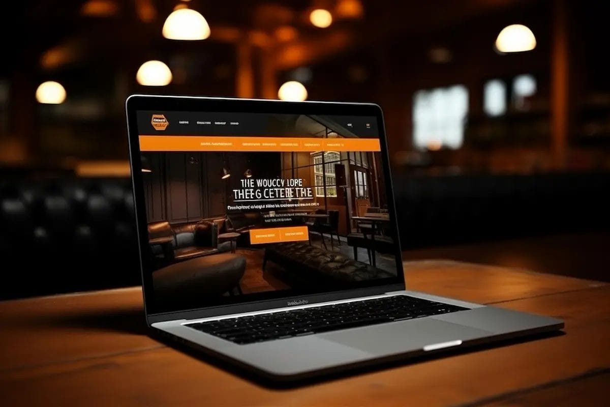
Example: A design studio with a bold black homepage, orange CTAs, and vibrant project thumbnails.
- Black backgrounds create a sleek, professional frame for work samples.
- Orange highlights direct attention to portfolio projects and contact buttons.
- Consistent typography reinforces brand identity without overwhelming the design.
2. Fitness / Sports Brands
Example: A gym or sports brand featuring orange-black hero banners, event highlights, and merchandise.
- Orange evokes energy, motivation, and urgency—perfect for fitness CTAs.
- Black adds contrast and a sense of professionalism.
- Action-oriented elements (sign-up buttons, schedule links) pop visually against the dark background.
3. Motorcycle or Adventure Sites
Example: Brands like Harley-Davidson use a strong black base with orange accents for navigation, badges, and banners.
- The palette conveys power, confidence, and adventure.
- Minimal use of secondary colors maintains a bold, focused look.
- Orange elements emphasize deals, promotions, or featured products effectively.
4. Tech Startups
Example: A modern software company using black landing pages with orange buttons and icons to guide user actions.
- Orange CTAs guide users toward sign-ups or demos.
- Black backgrounds make animations, screenshots, and graphics pop.
- Simple, bold layout keeps content readable while highlighting important actions.
5. Personal Portfolios
Example: A photographer or designer showcasing work with a predominantly black site and orange accents.
- Orange draws attention to portfolio categories, featured work, or contact buttons.
- Black provides a neutral canvas for images or video content.
- Subtle hover effects in orange enhance interactivity without clutter.
6. eCommerce Stores
Example: An online store selling gadgets or lifestyle products with black product grids and orange highlights for discounts or CTA buttons.
- Orange highlights create urgency and increase conversions.
- Black backgrounds elevate product images and maintain a premium feel.
- Strategic placement of orange buttons drives purchases effectively.
7. Educational / Online Communities
Example: Membership platforms or online learning sites using black dashboards with orange accents for badges, notifications, and progress indicators.
- Orange accent colors highlight interactive features and achievements.
- Black backgrounds keep dashboards clean and readable.
- Consistent orange-black branding builds trust and visual identity.
What Makes These Examples Effective
- High Contrast: Orange highlights on black backgrounds guide attention efficiently.
- Balanced Usage: Orange is used sparingly for emphasis, preventing overwhelming visuals.
- Consistency: Typography, icons, and hover effects match the orange-black palette.
- Interactive Elements: Animations, CTAs, and badges reinforce engagement.
Design Inspiration for Your Site
- Hero Sections: Dark background with bright orange CTA buttons
- Product / Portfolio Highlights: Use orange for icons, labels, and hover effects
- Footer & Navigation: Dark base with orange links for readability and impact
- Interactive Elements: Orange hover effects, badges, and notifications make your site feel alive
By studying these examples, you can see how orange and black isn’t just bold—it’s versatile, professional, and conversion-driven.
Advanced Customization with CSS and Elementor
Once your orange and black website is fully set up, you can take your design to the next level using Elementor and custom CSS. These tools allow you to implement unique layouts, advanced animations, and a cohesive visual identity, ensuring your site stands out from competitors while maintaining usability and professionalism.
Setting Up Global Color Palettes in Elementor
Global colors in Elementor ensure consistency across your website:
- Open Elementor → Site Settings → Global Colors.
- Define your primary colors:
- Orange (#FF6600) – for buttons, highlights, and icons
- Black (#0D0D0D / #1C1C1C) – for backgrounds and text
- Optional secondary colors (gray or white) for readability
- Apply these global colors to headings, text, buttons, and sections to maintain a cohesive look.
Customizing Buttons, Hover Effects, and Gradients
- Buttons: Orange CTA buttons with rounded edges and hover transitions.
- Hover Effects: Subtle animations like color shifts, shadows, or scale.
- Gradients: Black-to-orange or charcoal-to-orange gradients for hero sections, banners, or cards.
Example CSS for Buttons:
.btn-orange {
  background-color: #FF6600;
  color: #fff;
  border-radius: 6px;
  transition: all 0.3s ease;
}

.btn-orange:hover {
  background-color: #FF8000;
  transform: scale(1.05);
}
Adding Parallax or Dark Overlay Effects
- Parallax: Adds depth to hero images or background sections.
- Dark Overlay: Enhances readability when using background images with bright orange elements.
- Blending Modes: Experiment with overlay opacity and blend settings to keep contrast balanced.
Typography Enhancements
- Apply heading and body text fonts consistently across all pages.
- Use bold orange headings for emphasis on black sections.
- Use light or gray text for body copy to improve readability.
Using Animation to Make Designs Feel Alive
Animations grab attention and make interactions engaging:
- Scroll effects: Fade, slide, or zoom elements as users scroll.
- Hover animations: Buttons, icons, or images respond to user interaction.
- Framer Motion / Elementor Motion Effects: Create subtle movement for hero banners or feature sections.
Maintaining Orange-Black Consistency
- Stick to 2–3 shades of orange and black for all interactive elements.
- Ensure buttons, hover effects, and icons match your global palette.
- Regularly review contrast ratios to meet accessibility standards.
Practical Example
- Hero Banner: Black background, orange heading, orange CTA button with hover scale effect.
- Product Section: Black cards with orange labels and icons, subtle shadow on hover.
- Footer: Charcoal background with orange social media icons and links.
By combining Elementor’s visual editor with custom CSS, you can create a fully personalized orange-black website that feels modern, professional, and engaging.
SEO Optimization for Orange Black Websites
A visually striking orange and black website is only effective if it can be discovered by your target audience. While bold design captures attention, search engine optimization (SEO) ensures your site ranks well on Google, attracts organic traffic, and supports your business goals. By combining aesthetics with SEO best practices, you can create a website that is both visually compelling and highly discoverable.
Start with on-page SEO. Optimize page titles, meta descriptions, headings, and alt tags to include relevant keywords while maintaining a natural, readable flow. For orange-black websites, ensure that text contrasts well against background colors, which not only improves readability but also supports search engines in indexing your content effectively.
Optimizing Images and Graphics
- Alt Text: Describe images accurately with keywords, e.g., “orange black website hero banner”.
- File Names: Use descriptive file names with keywords before uploading.
- Image Compression: Use tools like Smush or ShortPixel to reduce file size without losing quality.
- Responsive Images: Ensure images scale correctly for mobile and desktop.
Meta Titles and Descriptions
- Include primary keyword “orange black website” naturally.
- Write compelling meta descriptions to improve click-through rate (CTR).
Example:
- Title: Orange and Black Website Design – Bold WordPress Guide
- Meta Description: Learn how to create a modern orange black website with WordPress. Tips, examples, and BuddyX customization included.
URL Structure
- Keep URLs clean, readable, and keyword-rich.
- Example: yourwebsite.com/orange-black-website
Attracting Backlinks
- Reach out to design blogs, WordPress theme directories, and community websites.
- Share orange-black design examples or case studies.
- Create visual content (infographics, color palettes) for Pinterest and design forums.
Using Color Keywords for Visual Search
- Google Lens and other visual search tools prioritize clear, high-contrast imagery.
- Include orange-black images in galleries, demos, and blog posts.
- Add proper alt text and captions to help visual search indexing.
On-Page SEO Best Practices
- Use headings (H1, H2, H3) strategically with primary and secondary keywords.
- Include internal links to relevant articles:
- Agriculture Web Design
- Best WordPress Themes for Design
- How to Customize Colors in WordPress
- Ensure keyword density is natural and not forced.
Mobile Optimization and Core Web Vitals
- Ensure your orange-black design loads quickly on all devices.
- Use lazy loading for images, caching plugins, and minified CSS/JS.
- Check mobile responsiveness to keep buttons, menus, and CTA elements accessible.
Schema Markup
- Implement FAQ schema for question-answer sections.
- Use image schema for hero banners and portfolio examples.
- Schema increases chances of rich snippets in search results, improving CTR.
By following these SEO practices, your orange-black website will not only look bold and modern but also attract targeted traffic, engagement, and higher search rankings.
Speed, Performance, and Accessibility
A bold orange and black website can make a strong first impression, but its impact diminishes if pages load slowly or users struggle to navigate. Optimizing speed, performance, and accessibility ensures that visitors enjoy a seamless experience while fully appreciating your striking visual design.
Avoiding Large Dark Backgrounds That Slow Load Times
- Large high-resolution black or dark images can increase page load times.
- Use optimized image formats like WebP.
- Implement CSS gradients or solid dark backgrounds instead of heavy images where possible.
- Minimize unnecessary scripts or heavy visual effects.
Lazy Loading and Caching
- Lazy loading ensures images and media only load when users scroll to them, improving perceived speed.
- Use caching plugins like WP Rocket, W3 Total Cache, or LiteSpeed Cache to store static files and speed up load times.
- Combine and minify CSS/JS files to reduce server requests.
Accessibility Checks
- Contrast Ratios: Ensure sufficient contrast between orange elements and black backgrounds (minimum WCAG ratio 4.5:1 for text).
- Readable Typography: Avoid small font sizes or overly decorative fonts.
- Alt Text: All images should have descriptive alt text.
- Keyboard Navigation: Ensure buttons and links are accessible via keyboard.
- Colorblind-Friendly Design: Use slightly varied shades of orange for clarity.
Mobile Responsiveness
- Test your orange-black site on different devices and screen sizes.
- Ensure buttons and CTAs are large enough to tap easily.
- Adjust font sizes and spacing for readability on small screens.
- Use Elementor or BuddyX responsive settings to customize layouts for mobile.
Optimizing Animations
- Avoid heavy animations that slow mobile performance.
- Use subtle CSS or Elementor Motion Effects.
- Test scrolling and hover effects for smooth interaction.
Monitoring Performance
- Use tools like Google PageSpeed Insights, GTmetrix, or Lighthouse to monitor load times.
- Focus on improving First Contentful Paint (FCP) and Largest Contentful Paint (LCP) for better user experience.
- Ensure server response times are optimized through reliable hosting.
By focusing on speed, performance, and accessibility, your orange-black website will not only look modern and bold but also deliver a smooth, enjoyable experience for all users, increasing engagement, retention, and conversions.
Brand Consistency & Marketing
Creating a visually bold orange and black website is just the beginning of establishing a strong digital presence. To strengthen your brand identity and build recognition, it’s essential to extend your orange-black aesthetic across all marketing channels. Consistent use of your brand colors, typography, and visual elements helps reinforce your message, increases brand recall, and creates a cohesive experience for your audience.
Start by applying your orange and black color scheme to social media profiles, email newsletters, and digital ads. Use consistent tones for headers, icons, buttons, and graphics, ensuring that your audience instantly associates these visuals with your brand. This uniformity makes your marketing campaigns more recognizable and professional.
Extending Orange-Black Branding to Social Media
- Use your orange and black color palette for social media graphics, posts, and ads.
- Maintain consistency in fonts and design elements across platforms like Instagram, Twitter, LinkedIn, and Facebook.
- Create highlight covers, story templates, and post layouts in orange-black to reinforce brand identity.
Designing Matching Logo and Icon Sets
- Your logo should harmonize with your website’s primary colors.
- Use orange for emphasis in logos or icons to draw attention.
- Design favicon, social icons, and navigation icons using orange-black for visual cohesion.
Maintaining Consistent Color Usage
- Stick to 2–3 shades of orange and black for all digital materials.
- Apply the same color hierarchy in emails, newsletters, banners, and ads.
- Use templates for recurring graphics to ensure uniformity.
Emotional Branding for User Loyalty
- Orange evokes energy and friendliness, while black conveys sophistication and trust.
- Consistent color application across platforms reinforces your brand’s personality.
- Emotional branding increases user trust, engagement, and loyalty.
Marketing Collateral Tips
- Email campaigns: Orange CTAs on black or neutral backgrounds improve CTR.
- Banners and landing pages: Maintain the color contrast for key messaging.
- Printable materials: Ensure your orange appears vibrant but not overpowering when printed.
Integrating Website with Marketing Strategy
- Use your orange-black theme to highlight offers, promotions, and CTAs.
- Leverage color consistency for retargeting campaigns to improve recognition.
- Ensure all landing pages maintain the same design language as your main website.
By maintaining brand consistency, your orange-black aesthetic becomes more than just a website design—it becomes a cohesive identity that resonates with your audience across all channels.
Common Design Mistakes to Avoid
While orange and black can create a bold, modern, and memorable website, improper use of this color combination can have the opposite effect—making your site feel overwhelming, hard to read, or unprofessional. By being aware of common pitfalls, you can ensure your design remains striking, user-friendly, and conversion-focused.
1. Using Too Much Orange
- Overloading pages with bright orange can overwhelm visitors.
- Limit orange to CTAs, highlights, icons, and key sections.
- Balance with black, charcoal, or neutral backgrounds to create visual breathing space.
2. Poor Contrast Causing Readability Issues
- Orange text on black backgrounds may strain the eyes if the shades aren’t balanced.
- Always check WCAG contrast ratios for body text, headings, and buttons.
- Consider lighter orange or white text for readability on dark backgrounds.
3. Mismatched Secondary Colors
- Adding random or clashing secondary colors disrupts the cohesive orange-black theme.
- Stick to neutral shades or complementary tones like gray, white, or subtle muted colors.
- Avoid bright reds, greens, or neon tones that compete with orange.
4. Forgetting About White Space and Balance
- Crowded layouts make even bold color schemes feel chaotic.
- Use spacing, margins, and padding to let content breathe.
- Proper white space enhances readability and emphasizes orange-black highlights.
5. Ignoring Accessibility
- Accessibility ensures all users can navigate and understand your website.
- Avoid relying solely on color to convey meaning.
- Use text labels, alt text, and sufficient contrast to make content accessible.
6. Overcomplicating Animations or Effects
- Excessive hover effects, scroll animations, or parallax can distract users.
- Keep animations subtle and purposeful.
- Focus on highlighting key CTAs and interactive sections rather than overwhelming the design.
By avoiding these mistakes, your orange-black website will remain visually appealing, professional, and user-friendly while maintaining the bold and modern aesthetic that attracts attention.
Final Thoughts: Making Your Orange Black Website Stand Out
Designing a bold orange-black website is far more than simply picking two striking colors—it’s about crafting a cohesive, visually compelling, and highly engaging user experience that resonates with your audience. Every choice, from selecting the perfect shades of orange and black to balancing typography, spacing, and layout hierarchy, contributes to a professional and memorable website. Thoughtful use of CTAs, icons, hero sections, and interactive elements ensures that your site not only looks stunning but also guides users intuitively toward your goals, whether that’s generating leads, showcasing a portfolio, or building an online community.
With WordPress and the BuddyX theme, even beginners can create complex, feature-rich layouts without touching a single line of code. BuddyX offers built-in customization for colors, typography, and interactive community features, while Elementor and custom CSS allow you to fine-tune every design element—from hover animations and parallax effects to dynamic buttons and gradients. This combination empowers you to turn bold color choices into an intuitive, professional, and functional website that stands out in your industry.
As you move forward:
- Plan carefully: Start with mood boards, sketches, and color hierarchies to visualize the orange-black balance across different sections of your website. Think about how colors will draw attention to key content and CTAs.
- Test and iterate: Regularly check for accessibility, responsiveness, and load performance on desktops, tablets, and smartphones. Make adjustments to ensure the user experience remains smooth and visually striking across devices.
- Leverage your palette: Extend your orange-black theme beyond the website—social media posts, email campaigns, marketing banners, and even offline materials can reinforce your brand identity consistently.
- Stay inspired: Continuously explore top orange-black website examples, creative agencies, and portfolio sites to gather fresh ideas, new layouts, and innovative interaction techniques.
The combination of orange and black is energetic, bold, and sophisticated, offering a unique opportunity to make a lasting impression. When applied thoughtfully and strategically, it helps you capture attention, convey your brand personality clearly, and drive meaningful engagement and conversions, turning a visually stunning site into a powerful business asset.
FAQs
1. Is orange and black a good color combination for websites?
Yes, orange and black create a bold, modern, and visually striking combination. Orange conveys energy, creativity, and friendliness, while black adds sophistication, strength, and professionalism. Together, they work well for tech startups, creative agencies, sports brands, adventure websites, and personal portfolios, helping your site grab attention and build a strong brand identity.
2. Can I create an orange-black website without coding?
Absolutely! Using WordPress along with themes like BuddyX, Astra, or Kadence, you can design an orange-black website without writing code. With page builders like Elementor, you can customize colors, typography, buttons, layouts, and interactive features, while BuddyX adds dynamic community or membership functionalities, all perfectly matching your orange-black aesthetic.
3. What industries benefit most from an orange-black website design?
The orange-black color scheme is versatile and suits multiple industries. Sports and fitness brands use it for energy and motivation, creative agencies for bold portfolios, tech startups for sleek and modern branding, motorcycle or adventure sites for power and thrill, and personal portfolios to make images and content pop. Its bold contrast makes CTAs, icons, and hero sections highly effective across sectors.
4. How do I maintain accessibility with an orange-black website?
Accessibility is key when using bold colors. Ensure there is sufficient contrast between orange elements and black backgrounds (WCAG recommended ratio ≥ 4.5:1), use readable fonts, and avoid relying on color alone to convey information. Incorporating alt text, keyboard navigation, and mobile-friendly layouts ensures all users, including colorblind individuals, can navigate and interact with your site easily.
5. Can I mix other colors with orange and black?
Yes, but carefully. Secondary colors should be neutral shades like gray or white to complement the primary palette. Avoid bright, clashing colors that compete with orange. Using additional colors sparingly—for example, in secondary buttons or infographics—keeps the design cohesive while maintaining the bold and modern impact of your orange-black website.
Interesting Reads:
Best Discord Chat Software Alternatives

Shashank is a seasoned digital marketing and WordPress expert who specializes in SEO, software tools reviews, and cutting-edge strategies for boosting online presence. With a passion for simplifying complex topics, Goutham crafts engaging blog posts that help readers optimize their websites, improve search engine rankings, and stay ahead in the ever-evolving digital landscape.