How to Learn from the Best Web Designs Online

“Design is intelligence made visible.”
— Alina Wheeler
Introduction: Why the Best Web Designs Aren’t Just Pretty
Not all websites are created equal. Some simply feel better. They guide you smoothly, speak clearly, and leave a lasting impression. These are the best-designed websites—not because they follow trends, but because they blend function with emotion, usability with beauty.
If you’re a web designer, WordPress user, entrepreneur, or content creator, studying these standout websites isn’t just inspiring—it’s strategic. The digital world has become too fast-paced for design to be optional. From site structure and typography to UX flow and conversions, there’s a lot to learn from the top 1% of websites—and more importantly, a lot you can replicate affordably using tools like WordPress, Gutenberg, Elementor, and Spectra.
This guide walks you through how to identify, analyze, and apply the key elements that make top-tier websites effective, transforming your website into something that looks, feels, and functions like a pro-built brand, without hiring an expensive agency.
What Truly Defines a “Best Designed” Website?
The best-designed websites aren’t the most flashy or expensive—they’re the most intentional. Every heading, image, animation, and interaction exists to support clarity, ease, and trust. From Apple’s minimalist layout to a freelance portfolio on Webflow, they all share a core design DNA.
Core Traits of Elite Web Design:
- A clear visual hierarchy that tells users what to look at next
- Fast loading speeds that reduce bounce and increase trust
- Mobile-first interfaces that adapt smoothly
- Persuasive CTAs and frictionless navigation
- Cohesive branding, consistent from logo to footer
- Engaging, scannable content blocks
- Trust elements like social proof, testimonials, and badges
These aren’t just nice-to-haves—they’re business-critical. And the best part? Every one of these can be recreated using WordPress, even with minimal technical knowledge.
Also Read: Online Store Web Design with WordPress: Principles That Turn Visitors into Buyers
Why You Should Study the Best (Instead of Starting from Scratch)
Inspiration fuels efficiency. Trying to design from scratch—without learning from what already works—is like trying to invent a car without ever studying one.
According to Adobe, 38% of users will stop interacting with a website if its layout is unattractive. Meanwhile, studies consistently show that a strong design improves perceived trust, purchase intent, and user retention.
By analyzing top-performing websites, you gain:
- Clarity on structure and flow
- Language frameworks for high-converting copy
- Design confidence through proven systems
- Visual inspiration that aligns with current UX standards
And with WordPress, you already have access to themes, builders, and plugins that mirror the exact features elite sites use.
Where to Find the Best Web Design Inspiration
A good eye starts with seeing what’s possible. Some of the world’s most innovative designs are publicly accessible if you know where to look:
- Awwwards: Industry-recognized websites judged for UX, UI, and creativity
- CSS Design Awards: Celebrates front-end excellence
- One Page Love: A fantastic resource for minimalist and conversion-focused layouts
- Behance & Dribbble: Direct access to top designers’ portfolios
- WordPress Showcase: Real examples of sites powered by WordPress
- Theme Demos: Astra, Kadence, and Blocksy have stunning starter templates built in
Pro Tip: Create a swipe file of designs that speak to your brand’s audience. Then compare what you see with what your current site does.
Use WordPress as Your Creative Playground
WordPress is the best canvas for bringing your design learnings to life. It’s cost-effective, open-source, and doesn’t restrict your creativity.
You can mimic almost any top-tier website using:
- Themes like Astra, Kadence, and GeneratePress for performance-first foundations
- Page builders like Elementor, Bricks, and Spectra for layout control
- FSE (Full Site Editing) in Gutenberg for visual structure without code
- Plugins for animation, forms, trust signals, and more
With Elementor’s motion effects or Spectra’s animation blocks, you can reproduce most high-end sections—including scroll-based interactions and sticky headers—without a single line of custom code.
How to Break Down a Great Website’s Design
Start with structure. High-performing websites guide the user effortlessly through a visual journey. It’s not just about color or font—it’s about flow.
A Common Successful Page Structure:
- Hero Section: Big headline, subhead, CTA button
- Feature Section: Three to four key benefits with icons or visuals
- Trust Block: Client logos, testimonials, or star ratings
- Conversion Block: Signup form, product CTA, or inquiry section
- FAQs or Content Footer: Extra clarity or brand reinforcement
Using block-based editors or theme template kits, you can replicate this exact flow in WordPress with just a few clicks. Kadence Starter Templates and Spectra patterns are especially good for this.
Also Read: The Ultimate Web Design Guidelines
Learning Visual Hierarchy and Spacing from the Pros
A website isn’t just a series of blocks—it’s a rhythm. Great sites guide the eye using contrast, whitespace, and balance.
What to Observe:
- Headline scale (usually 2–3x body font size)
- Section spacing (comfortable breathing room)
- Consistent line height and paragraph width (readability)
- Visual flow from image to text to button
In WordPress, set global typography and spacing using the Customizer. Avoid hardcoded styles in builders unless you’re controlling them globally.
“Whitespace is like air: it is necessary for design to breathe.”
— Wojciech Zieliński
Find Conversion Psychology in Design Patterns
Design is behavior. The best websites know exactly what you want and help you take the next step without hesitation.
Key Psychological Tactics:
- Contrasting CTA buttons placed where attention naturally lands
- Social proof, like client testimonials, star ratings, or trust badges
- Urgency cues via copy or micro-interactions
- Simplified journeys—one goal per page
Try replicating these elements using WordPress plugins like:
- WPForms or Fluent Forms for lead capture
- Spectra’s CTA blocks
- TrustPulse or WP Review for real-time social proof
Even free tools can emulate the tactics used by million-dollar brands.
Ensure Brand Consistency Across Pages
Cohesion isn’t about making every page identical—it’s about creating a unified experience. The best websites maintain a consistent visual identity regardless of page or purpose.
What That Looks Like:
- The same primary colors across all CTAs, links, and buttons
- A consistent typography system with no more than 2 fonts
- Imagery that shares tone (photos, illustrations, or icons)
- Reusable headers, footers, and layouts via WordPress templates
Plugins like Editor Plus or Spectra Global Styles help you lock down these styles once and apply them everywhere.
Study Micro-Interactions and Motion
Sometimes the magic is in the subtle touches: a button hover, a section fade-in, or a scrolling reveal. Done well, motion adds elegance and fluidity.
Micro-Interactions to Emulate:
- Hover effects on CTAs
- Parallax scroll sections
- Progress bars or animation counters
- Delayed fade-ins for testimonials or icons
WordPress builders like Bricks, Elementor Pro, and Spectra support all of these natively—no need for custom JS libraries.
Just use animation intentionally. If it doesn’t support the content or improve focus, cut it.
Learn from Typography and Messaging
Text is half the design. How content is written and styled influences bounce rates, engagement, and brand perception.
What to Watch in Copy:
- Short, bold headlines that clarify benefit, not features
- Paragraphs that build rhythm and use plain language
- Strong CTA verbs (“Start Now”, “Get Free Access”)
- Balance between scannability and depth
Analyze how top sites structure their text—and then apply that structure using block editors, heading hierarchies, and WordPress’s Customizer settings.
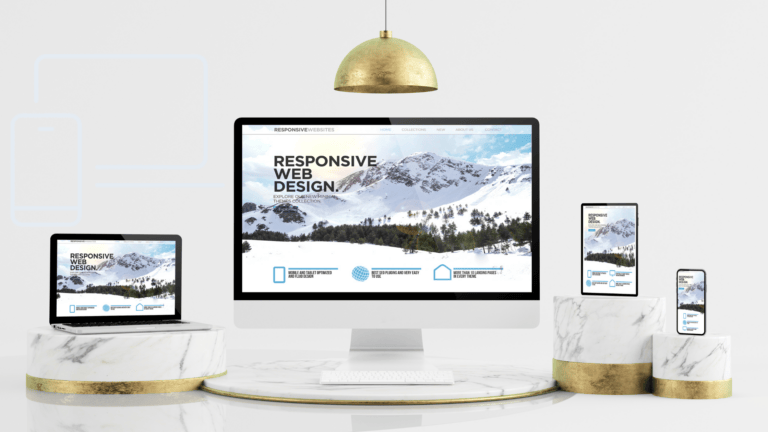
Also Read: How the Best Websites Nail Responsive Design
Adapt What You Learn—Don’t Copy Blindly
Inspiration becomes imitation when you don’t adapt. Use what you observe as guidance, not gospel.
Here’s How to Remix:
- Take layout ideas and apply them to your product or brand language
- Swap images and icons with brand-specific versions
- Keep the structure, but adjust colors, tone, and spacing
- Blend learnings from multiple sources—not just one
WordPress empowers you to modularize your approach—saving layout blocks, creating reusable templates, and testing variations.
Measure What You Apply: Feedback > Assumptions
After implementation, test. A gorgeous website that doesn’t convert is still failing. Use analytics tools to turn inspiration into measurable performance.
Feedback Tools for WordPress Users:
- Google Analytics for user behavior
- Hotjar or Clarity for visual heatmaps
- A/B testing with plugins like Nelio or Thrive Optimize
- Speed insights via GTMetrix or PageSpeed
Update based on real user data, not just your gut. Iterate every month, not every year.
“A designer knows they have achieved perfection not when there is nothing more to add, but when there is nothing left to take away.”
— Antoine de Saint-Exupéry
Keep Learning: Tools for Ongoing Inspiration
To keep your creative well full, bookmark these resources:
- Awwwards.com
- One Page Love
- Dribbble
- ThemeForest (for structure, not just style)
- Kadence and Astra starter templates
Use tools like Loom, Notion, or Raindrop.io to save, annotate, and track design ideas over time.
Final Thoughts: Learn, Build, Repeat
Design inspiration isn’t about copying pixel-perfect trends—it’s about learning the patterns that create clarity, emotion, and trust. The best-designed websites are blueprints in plain sight.
With WordPress, you have all the tools to turn that inspiration into real results—no coding required. Start with structure, build with clarity, measure with feedback, and optimize continuously.
And remember: great design isn’t a destination. It’s a process.
“If you think good design is expensive, you should look at the cost of bad design.”
— Ralf Speth
Interesting Reads:
How to Choose the Best Free Template
Build a Professional Community Website with BuddyX Theme and BuddyBoss

Shashank is a seasoned digital marketing and WordPress expert who specializes in SEO, software tools reviews, and cutting-edge strategies for boosting online presence. With a passion for simplifying complex topics, Goutham crafts engaging blog posts that help readers optimize their websites, improve search engine rankings, and stay ahead in the ever-evolving digital landscape.