
In 2024, the best digital experiences don’t just work — they feel intuitive, inclusive, and delightful. Whether it’s AI that actually helps instead of annoys, dark mode that doesn’t strain your eyes, or navigation so simple your grandma could use it, the UX trends that matter are the ones that put human needs first.
So let’s talk about what’s actually shaping the future of UI/UX design services. Spoiler: these UI/UX design trends 2025 are less about metaverse fantasies and more about making apps that don’t make you want to throw away your phone.

Quick Links
1. Accessibility
The first feature of great UI/UX design is accessibility. If your app or website isn’t accessible, you’re shutting people out. And no, slapping on a screen-reader toggle at the last minute doesn’t count.
Think about it: A banking app that uses clear labels instead of cryptic icons isn’t just helping visually impaired users — it’s making life easier for everyone. Ever tapped the wrong button because it was just an unlabeled symbol? Exactly.
Good accessibility means:
- High-contrast modes that don’t turn text into an eye-straining mess.
- Keyboard navigation that actually works (try tabbing through some sites — you’ll be shocked how many break).
- Descriptive alt text so people aren’t left guessing what an image is supposed to convey.
It’s not just about putting in the effort — it’s also about avoiding legal trouble. A well-thought-out UX ensures users can navigate your product without confusion. If people get lost due to poor design, it’s not just frustrating; it can lead to complaints, lost business, or even lawsuits, especially when accessibility is ignored. Clear, intuitive interfaces protect you from unnecessary risks.
Also Read: Best Order Management Software
2. AI usage
Nowadays, many companies use Ai to improve their search recommendations.
A well-designed news app learns what you like but doesn’t trap you in a filter bubble. It suggests articles on your interests (say, space exploration) but still lets you explore other topics.
If users can’t tweak what AI recommends — or worse, don’t even know why something’s being suggested — they’ll start distrusting the whole experience.
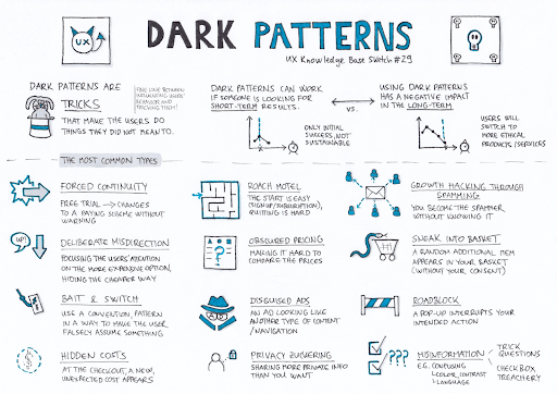
3. No more dark patterns
You know those sneaky design tricks that make it way too easy to sign up for something and way too hard to cancel? Yeah, those need to die.
Ethical UX means:
- Clear privacy settings (not buried under six menus).
- One-click unsubscribe (not “Please call customer service during business hours”).
- No manipulative nudges (looking at you, “Only 3 left!” pop-ups that reappear every time you hesitate).
People are tired of feeling tricked. Build trust, and they’ll stick around.
4. Microinteractions that actually feel good
Ever tapped a button and wondered if it registered? A tiny vibration or sound fixes that instantly. So, correct and well thought-out microinteractions is a key UX principle to follow in 2025.
Good microinteractions:
- Give feedback (like a subtle animation when a message sends).
- Make actions feel satisfying (that little “ding” when you complete a task? Chef’s kiss).
- Reduce uncertainty (if a swipe does something, show it happening).
5. Thought-out dark mode
Dark mode isn’t just a cool feature — it’s a necessity for a lot of people. But if your “dark mode” is just inverted colors with zero thought, it’s worse than useless.
Good dark mode:
- Uses deep grays or navy instead of pure black (which can cause eye strain).
- Adjusts contrast so text stays readable.
- Doesn’t make buttons look like they’ve disappeared into the void.
If your app’s dark mode turns red text into a glowing neon sign, fix it.
6. Seamless switching between devices
People bounce between phones, tablets, and laptops all day. If your app works perfectly on mobile but turns into a disaster on desktop, users will notice — and not in a good way.
A well-designed note-taking app syncs instantly, no “Syncing…” spinner for five minutes. A shopping cart doesn’t empty itself when you switch devices.
If your UX isn’t consistent across platforms, people will find one that is.
7. Voice & gesture control that works
Voice assistants are everywhere, but if yours makes people repeat themselves three times, they’ll give up.
Good voice UX:
- Understands natural language (no robotic “PLEASE SAY ‘TURN OFF LIGHTS’ AGAIN”).
- Doesn’t require endless confirmations (“Are you sure? Really sure?”).
- Works offline when possible (because yelling at your phone in a dead zone is frustrating).
If you are on a budget and can’t develop a good-working voice control, postpone its implementation and build a minimal viable product without it.
Also Read: Best Warehouse Management Software
8. Design that makes people feel something
Great UX isn’t just functional — it’s emotional. A meditation app with calming colors and smooth animations feels different from a hyper-energetic fitness tracker.
Small details matter:
- Typography that matches the tone (playful vs. serious).
- Animations that feel fluid, not jarring.
- Sounds that reinforce actions (not random beeps).
If your app feels sterile, people won’t remember it.
9. Simple navigation
If users have to dig through five menus to find what they need, they’ll leave.
Good navigation is:
- Predictable (if “Settings” is always in the top-right, don’t suddenly move it).
- Minimal (Netflix’s four-tab layout works because it’s dead simple).
- Consistent (don’t rename things randomly).
The fewer decisions users have to make, the happier they’ll be. Don’t turn your design into a maze.
10. Adaptive UI
A first-time user needs guidance. A power user wants shortcuts. A good UI adjusts for both.
For example, a language-learning app might start with big, friendly buttons for beginners but offer keyboard shortcuts for advanced users.
If your design treats everyone the same, you’re frustrating half your audience.
11. Real-time collaboration without the lag
Remote work isn’t going away. If your app still makes people refresh to see changes, it’s outdated.
Good collaboration tools:
- Show live updates (Google Docs-style).
- Highlight who’s doing what (so two people don’t edit the same line).
- Don’t freeze when someone else joins.
Nothing kills productivity like yelling, “Did you see my edit?!”
12. Sustainable design
Eco-friendly features aren’t just for tree-huggers. A ride-sharing app that highlights electric car options or tracks CO2 savings can sway decisions.
Small touches matter:
- Let users opt for digital receipts instead of paper.
- Show the environmental impact of choices.
- Avoid unnecessary data loads (which drain battery and data).
It’s not about virtue signaling — it’s about aligning with what users already care about.
13. AR & 3D that’s actually useful
Augmented reality isn’t just for Pokémon Go. A furniture app that lets you see how a couch looks in your living room? That’s solving a real problem.
But AR only works if:
- It’s fast (no 10-second lag to load).
- It’s accurate (if the virtual table clips through your real wall, it’s useless).
- It’s optional (not forced into every interaction).
If it doesn’t add value, don’t force it.
14. Empty states that don’t feel empty
A blank screen is intimidating. A well-designed empty state guides users instead of abandoning them.
A project management app might greet new users with templates or example tasks. A music app could suggest playlists instead of showing a void.
First impressions matter — don’t leave people staring at nothing.
15. Data-driven design
If your UX decisions are based on hunches, you’re doing it wrong.
A fitness app that recommends workouts based on your progress (not generic plans) keeps people engaged. Analytics should drive:
- Feature improvements (what do users actually use?).
- Personalization (what works for one group might annoy another).
- Bug fixes (if a button gets zero clicks, maybe it’s in the wrong place).
Also Read: Best Application Lifecycle Management Tools
UI/UX mistakes to avoid
Let’s be real — bad UX isn’t just annoying; it’s offensive. It’s the digital equivalent of a door labeled “PUSH” that only opens when you pull. If you don’t want your product to be ignored, avoid these mistakes:
1. Ignoring real user data
Designing based on hunches instead of actual behavior? Congrats, you’ve built something nobody wants.
2. Dark patterns that trick users
Sneaky checkboxes, hidden unsubscribe links, or fake countdown timers (“Only 2 left!”) don’t make you clever — they make you untrustworthy. If your UX relies on manipulation, users will notice. And leave.
3. Cluttered, confusing navigation
If users need a map to find basic features, your design is broken. Endless menus, inconsistent layouts, and disappearing buttons don’t make your app “powerful” — they make it exhausting.
4. Ignoring load times
Nobody cares about your fancy animations if the app takes 10 seconds to load. Optimize performance, or watch users bounce faster than a dropped call.
5. No feedback on actions
Did that button press work? Is the app frozen? If users have to guess, your UX is broken. Microinteractions exist for a reason — use them.
6. Forcing sign-ups too early
Blocking content behind a login wall before users even know if they want your app? That’s not growth hacking — it’s desperation.

The bottom line
The best digital experiences don’t just function — they feel right. Don’t underestimate the importance of UI/UX design. Because at the end of the day, people don’t remember pixels — they remember how an experience made them feel. And that’s what great design is all about.
Interesting Reads:
Unlocking Lead Growth Strategies: Jumpfactor Reveals IT Firms’ Success
How Geo-Fencing Works & Why It’s a Game-Changer for Businesses

