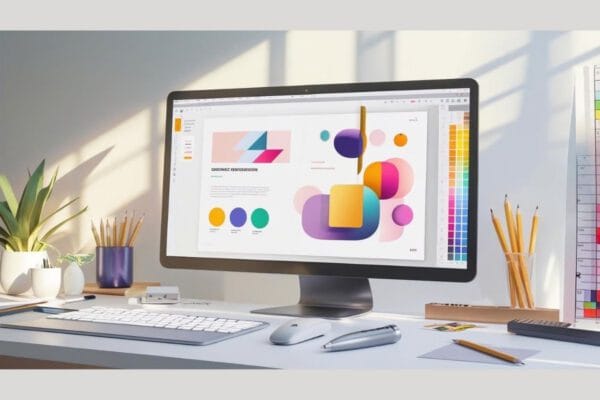
Website Designing
 Shashank Dubey
·
·
6 min read
Shashank Dubey
·
·
6 min read
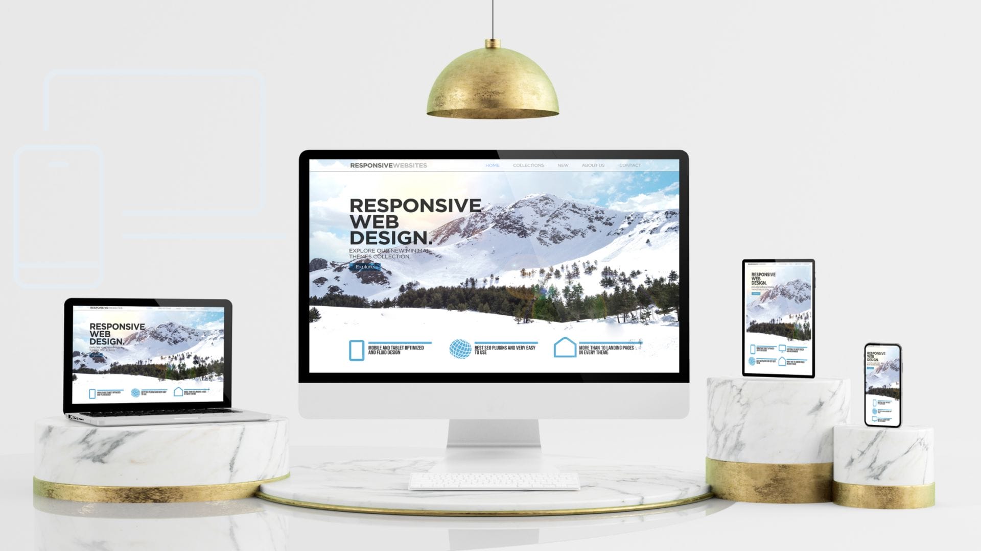
How the Best Websites Nail Responsive Design
Creating a beautiful website is no longer enough, it has to look and function flawlessly on every screen. From smartphones to smart TVs, today’s users expect seamless, responsive experiences. This blog breaks down how the best websites achieve that through flexible layouts, smart CSS frameworks, mobile-first strategies, image optimization, and real-world testing tools. Whether you're using WordPress or building from scratch, responsive design isn’t just a design choice—it’s a necessity. Learn how to do it right and future-proof your site for all devices.
Shashank Dubey
·
·
6 min read