More than 60% of web traffic now comes from mobile devices. Yet a large number of BuddyPress-powered communities still load broken navigation menus, overflowing activity feeds, and member cards that stack in ways no one can read on a phone. If your BuddyPress site falls apart at 390px, you are handing your members a bad first impression every single day.
This guide covers the real problems that kill BuddyPress mobile experiences, the design patterns that fix them, and how BuddyX handles responsive community design from the ground up. By the end, you will know exactly how to test your site at 390px, what CSS breakpoints matter, and why BuddyX Pro is built to get this right for you.
Why Most BuddyPress Themes Fail on Mobile
BuddyPress adds social networking features to WordPress: activity feeds, member directories, private messaging, groups, and profile pages. These features come with a lot of interactive UI. Most generic WordPress themes were not designed with those components in mind. When BuddyPress is layered on top, the gaps show up immediately on small screens.
Navigation Menus That Overflow
The most common failure is a top navigation bar that runs off the right edge of the screen at 390px. Community sites tend to have long nav menus: Home, Members, Groups, Activity, Forums, My Profile, and more. Without a hamburger toggle or a collapsible drawer, users on phones cannot reach half the links.
Worse, some themes apply a fixed pixel width to nav items. At 390px that means the nav bleeds past the right viewport edge. Users scroll horizontally to find links they should tap immediately. This pattern breaks within the first five seconds of a visit.
Activity Feeds That Break at Narrow Widths
BuddyPress activity feeds display an avatar on the left and a content block on the right. On desktop this works because there is plenty of horizontal space. On a 390px screen, if the avatar column is fixed at 60px and the content column uses a percentage, the layout can collapse or overlap. Images inside activity items often have no max-width set, so they spill outside the container.
Long URLs in activity posts are another issue. Without word-break or overflow-wrap rules, a single long URL stretches the entire feed container wider than the viewport. The user must scroll right to read anything, and the layout looks broken even though the code is technically valid.
Member Cards That Stack Badly
Member directories in BuddyPress typically use a grid of cards. On desktop you might show 4 cards per row. At 390px, many themes try to keep 2 cards per row. If the card has an avatar, name, tagline, and a follow button, cramming that into roughly 175px per card makes every element too small to read or tap.
Tap targets are a related problem. Google’s guidelines call for touch targets of at least 48x48px. A follow or connect button that is 28px tall at 390px will generate tapping errors constantly. Users tap the wrong element, get frustrated, and leave.
Profile Pages With Fixed Sidebars
Many BuddyPress themes use a two-column layout for profile pages: sidebar with avatar and stats on the left, activity and settings on the right. At 390px, themes that do not have a responsive sidebar rule will stack these columns in the wrong order, or worse, display them side by side at 50% width making both unreadable.
BuddyX Responsive Design Patterns
BuddyX was built specifically for BuddyPress communities. Every template is designed with mobile-first principles. That means the base CSS targets small screens first, then adds layout complexity as the viewport grows. Here is what that looks like in practice. If you are still deciding which theme to use, our BuddyPress themes comparison for 2026 covers the full competitive landscape.
Mobile-First CSS Architecture
In a mobile-first stylesheet, you write the base styles for the smallest viewport and use min-width media queries to override them at larger sizes. This is the opposite of the desktop-first approach, where you write for wide screens and use max-width queries to shrink things down.
Mobile-first is better for performance because mobile devices download fewer CSS rules by default. It also forces designers to make hard decisions about what content matters most at small sizes, rather than trying to squeeze desktop layouts into a phone screen.
BuddyX applies this pattern across all its templates. The activity feed, member grid, group listing, and profile layout all start with a single-column mobile stack and expand to multi-column views at wider breakpoints.
CSS Breakpoints Used in BuddyX
BuddyX uses a set of breakpoints that map to real device sizes. Understanding these helps you write custom CSS that stays in sync with the theme’s own layout shifts.
| Breakpoint | Min Width | Target Devices |
|---|---|---|
| Mobile | 0 to 639px | iPhone SE, iPhone 14, Galaxy S22 |
| Small Tablet | 640px | iPad Mini portrait |
| Tablet | 768px | iPad portrait |
| Large Tablet | 1024px | iPad landscape |
| Desktop | 1280px | Laptops and monitors |
| Wide Desktop | 1536px | Large monitors |
The 390px viewport falls inside the 0-639px mobile band. Any custom CSS you write for mobile should target that range without a min-width, or use max-width: 639px to apply styles only to that band.
/* Custom mobile styles for BuddyX targeting 390px and similar phones */
@media (max-width: 639px) {
  .bp-members-list .list-wrap {
    grid-template-columns: 1fr; /* single column on narrow screens */
  }

  .bp-activity .activity-avatar {
    width: 40px;
    height: 40px;
    flex-shrink: 0;
  }

  .site-header .main-navigation {
    display: none; /* hidden until toggle is clicked */
  }

  .site-header .menu-toggle {
    display: flex;
    align-items: center;
    min-height: 48px;
    min-width: 48px;
  }
}
Touch-Friendly Navigation in BuddyX
BuddyX uses a hamburger menu toggle on mobile viewports. When tapped, it opens a full-width slide-down navigation panel. This pattern works well because it keeps the header lean (logo + toggle only), which is critical at 390px where header height should be kept under 60px so users can see content quickly.
The mobile menu items in BuddyX are full-width blocks with generous padding. Each item is at least 48px tall, making them easy to tap without zooming. Sub-menu items are indented and expand on tap, rather than requiring a hover state that does not exist on touch screens.
BuddyX Pro extends the navigation with a sticky bottom bar option for mobile. This mirrors the pattern used by native apps like Instagram and Twitter: primary actions are anchored at the bottom of the screen where thumbs naturally rest. For a BuddyPress community, these actions might be Home, Activity, Groups, Members, and Notifications.
Tap Targets and Spacing
Every interactive element in BuddyX is sized to meet the 48x48px minimum tap target standard. This includes buttons in the activity feed (Like, Comment, Share), follow and connect buttons on member cards, group join buttons, and notification action buttons.
Spacing between tap targets matters as much as the target size itself. Google’s guidance recommends at least 8px between adjacent targets. BuddyX enforces this through consistent margin and padding values in its component styles, reducing the chance of accidental taps on the wrong button.
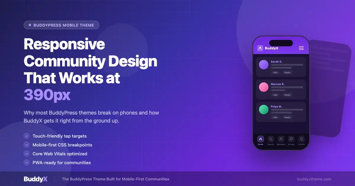
Activity Feed at 390px
The BuddyX activity feed at 390px collapses to a single column with the avatar pinned to the top-left of each item. The content area takes full width. Images inside activity posts are set to max-width: 100% so they never overflow the container. Long URLs break with word-break: break-all rules applied to the activity content class.
The action bar (Like, Comment, Share) sits below the activity content and uses flexbox with space-between. At 390px, if there are three action items, each item has enough room because BuddyX limits the action bar to three items on mobile and hides additional actions behind a “More” overflow button.
Member Directory at 390px
By default, BuddyX shows one member card per row at 390px. Each card is the full width of the viewport, making it easy to read the member’s name, avatar, and tagline. The follow or connect button is full-width at the bottom of each card, providing a large, easy tap surface.
In BuddyX Pro you can switch to a 2-up grid on mobile if your member data is minimal (avatar and name only). The theme handles this via a layout option in the customizer, not a CSS hack, so the touch target sizes are still enforced.
How to Test Your BuddyPress Site at 390px
Testing at a specific viewport width is straightforward in any modern browser. Here is the process using Chrome DevTools, which is the most common workflow for WordPress developers.
Using Chrome DevTools Device Emulation
- Open Chrome and navigate to your BuddyPress community URL.
- Press
F12or right-click anywhere and choose Inspect. - Click the device toolbar icon (the small phone/tablet icon in the top-left of the DevTools panel), or press
Ctrl+Shift+Mon Windows/Linux orCmd+Shift+Mon Mac. - In the dimensions dropdown at the top, choose Edit and add a custom device: name it “iPhone 14” with a width of 390 and height of 844. Set the device pixel ratio to 3.
- Select your custom device from the dropdown. The browser viewport now emulates a 390px physical screen.
- Reload the page. This triggers a fresh load so that any JavaScript-based responsive logic re-runs.
- Walk through every BuddyPress page: Activity feed, Members directory, Groups listing, individual Group page, Member profile, and the Registration and Login pages.
What to Check on Each Page
Work through this checklist for every BuddyPress page you test at 390px:
- No horizontal scrollbar. The page body should be exactly 390px wide with no overflow.
- Navigation is accessible. The hamburger toggle is visible and opening it shows all nav items at a readable size.
- Avatar images load at the correct size and do not overflow their containers.
- Text is readable without zooming. Body text should be at least 16px.
- Buttons and links are at least 48px tall. Check this with the DevTools Accessibility panel or by inspecting computed styles.
- Images inside activity posts scale down correctly. No image should extend past the viewport edge.
- Forms (login, registration, post activity, send message) are full-width and their submit buttons are large enough to tap.
- Pagination controls or infinite scroll triggers are reachable and tapable.
Using Firefox Responsive Design Mode
Firefox has a similar tool called Responsive Design Mode, accessed via Ctrl+Shift+M or Cmd+Shift+M on Mac. One advantage of Firefox’s tool is that it shows a ruler overlay and lets you drag the viewport edges to any size. Type 390 directly into the width field and press Enter to snap to that exact width.
Firefox also has a touch simulation mode. When enabled, mouse clicks are sent as touch events. This helps catch issues where hover-only states (like dropdown menus) would never trigger on a real phone.
Real Device Testing
Browser emulation is a good starting point but is not a substitute for testing on a real device. Browser engines on iOS and Android have small differences in how they handle things like viewport units, momentum scrolling, and fixed position elements. Get your site URL onto a physical phone and walk through the same checklist above.
For remote testing, BrowserStack and LambdaTest both offer real device clouds. You can test on an actual iPhone 14 (390px) or Galaxy S22 (360px) without owning the hardware. BrowserStack has a free tier with limited sessions that is often enough for a spot-check.
Swipe Gestures and Touch Interactions
Mobile users expect swipe gestures for certain actions. Swiping left to dismiss a notification, swiping to navigate between profile tabs, and pull-to-refresh on an activity feed are patterns users have learned from native apps. Adding these to a BuddyPress theme requires JavaScript, but the foundation is CSS and HTML structure.
Swipeable Tabs on Profile Pages
BuddyPress member profiles have multiple tabs: Activity, Profile, Friends, Groups, Forums (if bbPress is active). On desktop these are horizontal links. On mobile at 390px, a row of five tabs will overflow or require very small font sizes.
BuddyX handles this by converting the profile tab row to a horizontally scrollable strip on mobile. The strip is overflow-x: auto with scrollbar-width: none so the scrollbar is hidden. Users can swipe left and right on the tab strip to reveal more tabs, and the active tab is always in view when the page loads.
/* Horizontal scrolling tab bar, BuddyX pattern */
@media (max-width: 639px) {
  .bp-profile-tabs {
    display: flex;
    flex-wrap: nowrap;
    overflow-x: auto;
    scrollbar-width: none; /* Firefox */
    -ms-overflow-style: none; /* IE/Edge */
    gap: 8px;
    padding-bottom: 4px;
  }

  .bp-profile-tabs::-webkit-scrollbar {
    display: none; /* Chrome/Safari */
  }

  .bp-profile-tabs .tab-item {
    flex-shrink: 0;
    white-space: nowrap;
    padding: 10px 16px;
    min-height: 44px;
  }
}
Pull-to-Refresh on Activity Feeds
Native pull-to-refresh is triggered by the browser on mobile Safari and Chrome when the user pulls down past the top of the page. WordPress sites that use AJAX to load new activity items can intercept this and fetch new posts instead of reloading the full page. BuddyX Pro includes an AJAX activity refresh that fires when a user pulls down on the feed, showing a spinner and prepending new items at the top.
Core Web Vitals on Mobile
Google’s Core Web Vitals measure page experience and factor into search rankings. On mobile, the targets are harder to hit because devices have less processing power and slower network connections than desktops. Here is what each metric means for a BuddyPress community site and how BuddyX helps.
Largest Contentful Paint (LCP)
LCP measures how long it takes for the largest visible element to render. For a BuddyPress activity feed, this is often the first activity item’s image or the page hero section. The target is under 2.5 seconds on a 4G connection.
BuddyX improves LCP by loading fonts efficiently, using system fonts as fallbacks, and setting loading="eager" only on above-the-fold images. Activity items below the fold use loading="lazy" so they do not compete with the initial render.
Cumulative Layout Shift (CLS)
CLS measures unexpected layout movement during page load. A score under 0.1 is the target. On BuddyPress pages, layout shifts often happen when avatar images load after the page layout has already been painted, pushing text down. Or when an ad slot or notification bar loads and shifts content.
BuddyX avoids CLS issues by reserving space for avatar images with explicit width and height attributes. The theme also avoids inserting dynamic content above existing content after the page has loaded, which is a common cause of high CLS scores.
Interaction to Next Paint (INP)
INP replaced First Input Delay (FID) as a Core Web Vital in 2024. It measures the delay between a user interaction (tap, click, key press) and the next visual update. For BuddyPress communities with a lot of JavaScript, this can be a challenge. The target is under 200ms.
BuddyX keeps its JavaScript lean. Interactive features like the mobile menu toggle, AJAX activity loading, and notification counts are handled with small, focused scripts rather than large jQuery plugins. BuddyX Pro uses event delegation and deferred loading for non-critical scripts, keeping the main thread available for user interactions.
Measuring Core Web Vitals for Your Site
Run your BuddyPress site through Google PageSpeed Insights using the mobile tab. This gives you field data (from real Chrome users) and lab data (simulated). Focus on the field data first because it reflects actual user experience. The report highlights which specific elements are causing LCP delays or CLS shifts.
For ongoing monitoring, Google Search Console has a Core Web Vitals report under Experience. It groups URLs by status (Good, Needs Improvement, Poor) and shows which specific pages are dragging down your scores.
PWA Basics for BuddyPress Community Sites
Progressive Web Apps (PWAs) let users install your community site to their phone’s home screen and access it like a native app. For a BuddyPress community, this means members can tap your icon from their home screen and go straight to the activity feed, with push notifications and offline support possible.
The Web App Manifest
A web app manifest is a JSON file that tells the browser how to display your site when installed. It defines the app name, icon, theme color, and start URL. For a BuddyPress community, the start URL should be the activity feed page so members land on fresh content immediately after tapping the icon.
{
  "name": "My BuddyPress Community",
  "short_name": "Community",
  "start_url": "/activity/",
  "display": "standalone",
  "background_color": "#ffffff",
  "theme_color": "#7c3aed",
  "icons": [
    {
      "src": "/wp-content/themes/buddyx/images/icon-192.png",
      "sizes": "192x192",
      "type": "image/png"
    },
    {
      "src": "/wp-content/themes/buddyx/images/icon-512.png",
      "sizes": "512x512",
      "type": "image/png"
    }
  ]
}
Link the manifest in your theme’s head section: <link rel="manifest" href="/manifest.json">. BuddyX Pro includes built-in PWA manifest support via the theme’s customizer, so you do not need to edit code manually.
Service Workers for Offline Support
A service worker is a JavaScript file that runs in the background and can intercept network requests. For a BuddyPress community, a basic service worker can cache static assets (CSS, JavaScript, fonts, theme images) so that even on a slow connection, the page shell loads instantly from cache.
Dynamic content (activity posts, member profiles) is harder to cache because it changes frequently. A common pattern is a stale-while-revalidate strategy: serve the cached version immediately, then fetch fresh data from the server in the background and update the cache. This makes the feed feel instant even on poor connections.
Plugins like Super PWA and PWA for WP work well with BuddyX. They generate the manifest and service worker files automatically and provide a WordPress admin UI for configuration.
Push Notifications for Community Engagement
Once your site is a PWA, you can send push notifications to members who have opted in. For a BuddyPress community, useful notifications include: new activity from friends, new group posts, direct messages, and @mentions. These pull members back to the site without requiring them to check email.
Push notification support requires a server-side component to send the notifications. The OneSignal WordPress plugin integrates with BuddyPress to trigger notifications based on community events. BuddyX Pro is tested for compatibility with OneSignal and does not conflict with the notification UI it adds to the front end.
BuddyX Pro: Built for Mobile-First Communities
BuddyX is the only WordPress theme built specifically for BuddyPress communities with mobile-first design at its core. Every decision in the theme, from breakpoints to tap target sizes to activity feed layout, is made with the 390px viewport in mind. You can read the full getting started guide at BuddyPress WordPress Theme: Complete Getting Started Guide for 2026 to set up BuddyX from scratch.
Here is what BuddyX Pro adds beyond the free version for mobile community builders:
- Sticky mobile bottom navigation bar: Primary community actions anchored at the bottom of the screen, matching native app UX patterns.
- AJAX activity feed refresh: Pull-to-refresh and auto-polling for new posts without a full page reload.
- Advanced member card layouts: Customizer control over mobile member grid columns, card padding, and button styles.
- Custom mobile header options: Ability to show different logo, search bar, and action icons on mobile vs desktop.
- PWA manifest builder: One-click manifest configuration from the WordPress customizer.
- Dark mode support: Full dark theme toggle that works at every breakpoint, including 390px.
- WooCommerce mobile cart: If your community has a marketplace component, the BuddyX Pro WooCommerce styles keep the cart and checkout usable on small screens.
BuddyX free version is a strong starting point. BuddyX Pro unlocks the features that make a community feel like a native mobile app rather than a website squeezed into a phone screen.
Common Questions About BuddyX Mobile
Can I Change the BuddyX Mobile Breakpoints?
Yes. BuddyX uses CSS custom properties (variables) for some of its layout values, and you can override breakpoints in a child theme. The recommended approach is to create a child theme, add a style.css that overrides only what you need, and use @media queries with your custom breakpoint values. Do not edit the parent theme files directly because updates will overwrite your changes.
How Do I Add a Custom Mobile Menu Item?
In the WordPress customizer, go to Menus and create or edit the menu assigned to your primary navigation. Add pages, custom links, or BuddyPress component pages. BuddyX’s mobile hamburger menu automatically includes any items in the primary menu. For the Pro sticky bottom bar, you assign a separate “Mobile Bottom Bar” menu with up to five items.
Is BuddyX Compatible with bbPress on Mobile?
Yes. BuddyX includes responsive styles for bbPress forum pages. Forum topic lists stack cleanly at 390px, the reply form is full-width, and the forum breadcrumb navigation wraps instead of overflowing. If you run into a specific bbPress component that looks broken on mobile, check the BuddyX support forum first as most layout issues have already been addressed.
How Do I Improve Mobile Load Speed Further?
Beyond what BuddyX already does, these steps make the biggest difference:
- Enable a caching plugin (WP Rocket, LiteSpeed Cache, or W3 Total Cache) with mobile-specific cache enabled. Some hosts serve different cached pages to mobile visitors.
- Serve images in WebP format. WordPress 5.8 and later convert uploaded images to WebP. Check that your hosting server supports WebP delivery.
- Use a CDN. Cloudflare’s free plan caches static assets and serves them from edge nodes close to your visitors, cutting load times for international community members.
- Limit external scripts. Each third-party script (analytics, chat widgets, social share buttons) adds network requests. Audit your plugins and remove anything that loads scripts you do not need on every page.
Putting It All Together
Building a BuddyPress community that works well at 390px is not a matter of luck or complicated code. It comes down to using a theme that was designed for this from the start, testing at the right viewport sizes, and paying attention to tap target sizes, overflow rules, and breakpoint decisions.
Most BuddyPress themes fail on mobile because they were built for desktop first and mobile was treated as an afterthought. The result is broken navigation, overflowing feeds, and member cards that are impossible to read. Your community members experience these failures every time they open their phones.
BuddyX takes the opposite approach. Mobile is the starting point, and every template is tested at 390px before it ships. The breakpoints are calibrated to real device sizes. The tap targets meet Google’s accessibility guidelines. The activity feed, member directory, and profile pages all collapse to single-column layouts that work on the smallest current smartphones.
Add BuddyX Pro for the sticky mobile navigation bar, AJAX feed refresh, PWA manifest builder, and dark mode support, and you have a community platform that feels like a native app, built on WordPress and BuddyPress.
Start with the free BuddyX theme to see the mobile-first foundation for yourself. When your community is ready to grow, BuddyX Pro gives you the tools to make every member feel at home on their phone. See how BuddyX compares to other options in our best BuddyPress themes for 2026 roundup.