Building a custom community website with BuddyPress gives you full control over how members interact, connect, and engage. But getting that control requires understanding how BuddyPress renders its output and how your theme shapes every screen your community members see. This guide walks through BuddyPress theme development from the ground up: the template hierarchy, child theme setup, component overrides, CSS custom properties, and block patterns. Whether you are starting fresh or extending BuddyX as your base, you will leave with a working mental model and real code to use immediately.
How BuddyPress Outputs Its Templates
BuddyPress does not store its templates inside your active theme by default. It ships its own template files inside the plugin itself, under /buddypress/bp-templates/bp-legacy/ and the newer bp-nouveau template pack. When BuddyPress renders a page, it searches for templates in a specific order:
- Your active theme’s root folder, inside a
/buddypress/directory - Your active theme’s
/community/directory (supported by bp-nouveau) - The parent theme, following the same structure
- The BuddyPress plugin’s own template directory as a final fallback
This lookup chain is the foundation of BuddyPress theme development. You override a template by placing a file at the correct path inside your theme. BuddyPress will find your version first and render it instead of the bundled fallback.
The Template Hierarchy in Detail
BuddyPress components each have their own subfolder inside the templates directory. The main ones you will work with are:
| Component | Template path (inside /buddypress/) |
|---|---|
| Activity stream | activity/ |
| Members directory | members/ |
| User profile | members/single/ |
| Groups directory | groups/ |
| Group single page | groups/single/ |
| Messages | members/single/messages/ |
| Notifications | members/single/notifications/ |
| Registration | registration/ |
Each folder contains individual PHP partial files. For example, activity/activity-loop.php renders the list of activity items and activity/entry.php renders a single activity item. You only need to copy and override the specific file you want to change, not the entire folder.
Creating a BuddyX Child Theme Step by Step
BuddyX is the leading BuddyPress-compatible theme and provides a clean, well-structured base for community sites. Building a child theme of BuddyX lets you override templates and styles while keeping the parent theme’s updates intact. Here is how to set it up properly.
Step 1: Create the Child Theme Folder
Inside your wp-content/themes/ directory, create a new folder named after your theme, for example buddyx-child. Inside that folder you need at minimum two files: style.css and functions.php.
Step 2: Write style.css with the Theme Header
The style.css file must declare the parent theme via the Template header. Without this, WordPress will not load the parent theme’s templates.
/*
Theme Name: BuddyX Child
Theme URI: https://yoursite.com/buddyx-child
Description: A child theme of BuddyX for custom community branding
Author: Your Name
Author URI: https://yoursite.com
Template: buddyx
Version: 1.0.0
License: GNU General Public License v2 or later
Text Domain: buddyx-child
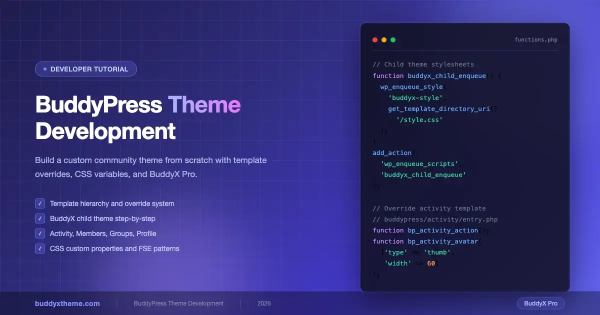
*/Step 3: Enqueue Parent and Child Stylesheets in functions.php
Add this to your child theme’s functions.php to load both stylesheets in the correct order:
<?php
/**
 * Enqueue parent and child theme stylesheets.
 */
function buddyx_child_enqueue_styles() {
    $parent_style = 'buddyx-style';

    wp_enqueue_style(
        $parent_style,
        get_template_directory_uri() . '/style.css',
        array(),
        wp_get_theme( 'buddyx' )->get( 'Version' )
    );

    wp_enqueue_style(
        'buddyx-child-style',
        get_stylesheet_directory_uri() . '/style.css',
        array( $parent_style ),
        wp_get_theme()->get( 'Version' )
    );
}
add_action( 'wp_enqueue_scripts', 'buddyx_child_enqueue_styles' );
This ensures the parent stylesheet loads first, then your child stylesheet overrides specific rules.
Step 4: Activate the Child Theme
Go to Appearance > Themes in your WordPress admin and activate BuddyX Child. Your site will look identical to before, but now you have a clean override layer to work within.
Overriding BuddyPress Component Templates
Now that your child theme is active, you can start overriding BuddyPress templates. The process is always the same: copy the original template from the BuddyPress plugin directory into your theme’s /buddypress/ folder at the matching path, then edit your copy. BuddyPress will pick up your version first.
Activity Stream Templates
The activity stream is the heartbeat of most BuddyPress communities. To customize how individual activity items appear, copy this file from the plugin:
buddypress/bp-templates/bp-nouveau/buddypress/activity/entry.php
Paste it into your theme at:
buddyx-child/buddypress/activity/entry.php
Here is a trimmed example that adds a custom class to each activity item and injects a reaction count placeholder:
<?php
/**
 * Custom activity entry template.
 * Overrides: buddypress/bp-templates/bp-nouveau/buddypress/activity/entry.php
 */
?>
<li class="custom-activity-item <?php bp_activity_css_class(); ?>" id="activity-<?php bp_activity_id(); ?>">
    <div class="activity-avatar">
        <a href="<?php bp_activity_user_link(); ?>">
            <?php bp_activity_avatar( array( 'type' => 'thumb', 'width' => 60, 'height' => 60 ) ); ?>
        </a>
    </div>
    <div class="activity-content">
        <div class="activity-header">
            <?php bp_activity_action(); ?>
        </div>
        <div class="activity-inner">
            <?php bp_activity_content_body(); ?>
        </div>
        <div class="activity-meta custom-activity-meta">
            <span class="activity-timestamp"><?php bp_activity_time_since(); ?></span>
            <?php bp_activity_comment_button(); ?>
        </div>
    </div>
</li>
Members Directory Template
To change how member cards display in the directory, override the member loop item. Copy from:
buddypress/bp-templates/bp-nouveau/buddypress/members/loop/list-item.php
Place your override at:
buddyx-child/buddypress/members/loop/list-item.php
A common customization is adding a member’s last activity date or a custom profile field below their name. Use bp_member_last_active() to output the last active timestamp and xprofile_get_field_data() to pull any custom xProfile field value.
<?php
// Pull a custom xProfile field named "Professional Role"
$role = xprofile_get_field_data( 'Professional Role', bp_get_member_user_id() );
if ( $role ) {
    echo '<span class="member-role">' . esc_html( $role ) . '</span>';
}
?>
Groups Directory and Single Group Templates
Groups have two layers of templates: the directory (the list of all groups) and the single group view (the group’s own pages). To restyle group cards in the directory, override:
buddyx-child/buddypress/groups/loop/list-item.php
For the single group header, the file to override is:
buddyx-child/buddypress/groups/single/cover-image-header.php
Adding group metadata like member count and group type to the card is straightforward:
<?php
// Display member count and group type
$count = bp_get_group_member_count();
$type  = bp_groups_get_group_type( bp_get_group_id() );
?>
<div class="group-meta">
    <span class="group-member-count"><?php echo esc_html( $count ); ?></span>
    <?php if ( $type ) : ?>
        <span class="group-type-label"><?php echo esc_html( $type ); ?></span>
    <?php endif; ?>
</div>
Member Profile (xProfile) Templates
The user profile view pulls from the members/single/ directory. The main layout file is members/single/home.php, which controls the profile header and tab navigation. To rearrange the profile sidebar or add custom data panels, this is the file to override.
For the xProfile fields tab specifically, override:
buddyx-child/buddypress/members/single/profile/profile-wp.php
You can also register a completely custom profile tab by hooking into BuddyPress’s nav system from your child theme’s functions.php:
<?php
/**
 * Add a custom "Portfolio" tab to member profiles.
 */
function buddyx_child_add_portfolio_nav() {
    if ( ! bp_is_user() ) {
        return;
    }

    bp_core_new_nav_item(
        array(
            'name'                => __( 'Portfolio', 'buddyx-child' ),
            'slug'                => 'portfolio',
            'position'            => 80,
            'screen_function'     => 'buddyx_child_portfolio_screen',
            'default_subnav_slug' => 'portfolio',
        )
    );
}
add_action( 'bp_setup_nav', 'buddyx_child_add_portfolio_nav', 100 );

function buddyx_child_portfolio_screen() {
    add_action( 'bp_template_content', 'buddyx_child_portfolio_content' );
    bp_core_load_template( 'members/single/plugins' );
}

function buddyx_child_portfolio_content() {
    echo '<div class="portfolio-tab">';
    // Render portfolio items here.
    echo '</div>';
}
Custom Component Styling with CSS Custom Properties
BuddyX uses CSS custom properties (CSS variables) extensively to control colors, spacing, and typography across the theme. This makes child theme styling much cleaner than hunting for specific selectors. Instead of overriding deep CSS rules, you redefine variables at the :root level in your child theme’s style.css.
Core BuddyX CSS Variables
Open BuddyX’s main style.css and search for :root to find the variable declarations. Common ones you will want to override include:
/* buddyx-child/style.css */

:root {
    /* Brand colors */
    --buddyx-color-primary:       #6366f1;  /* Indigo 500 */
    --buddyx-color-primary-dark:  #4f46e5;  /* Indigo 600 */
    --buddyx-color-secondary:     #8b5cf6;  /* Violet 500 */
    --buddyx-color-accent:        #a78bfa;  /* Violet 400 */

    /* Typography */
    --buddyx-font-family-base:    'Inter', -apple-system, BlinkMacSystemFont, sans-serif;
    --buddyx-font-size-base:      1rem;
    --buddyx-line-height-base:    1.6;

    /* Spacing */
    --buddyx-spacing-sm:          0.5rem;
    --buddyx-spacing-md:          1rem;
    --buddyx-spacing-lg:          1.5rem;
    --buddyx-spacing-xl:          2rem;

    /* Border radius */
    --buddyx-border-radius:       0.5rem;
    --buddyx-border-radius-lg:    1rem;

    /* Shadows */
    --buddyx-shadow-sm:           0 1px 3px rgba(0, 0, 0, 0.1);
    --buddyx-shadow-md:           0 4px 12px rgba(0, 0, 0, 0.12);
}
This single block of variable overrides rebrands the entire community interface without touching a single template file. Every component that references --buddyx-color-primary picks up your new brand color automatically.
BuddyPress-Specific Component Styles
For BuddyPress-specific components, target BuddyPress’s own CSS classes. BuddyPress (bp-nouveau template pack) applies predictable class patterns:
/* Activity stream */
.bp-nouveau #activity-stream li.activity-item {
    background: var(--buddyx-color-surface, #ffffff);
    border-radius: var(--buddyx-border-radius);
    box-shadow: var(--buddyx-shadow-sm);
    margin-bottom: var(--buddyx-spacing-md);
    padding: var(--buddyx-spacing-lg);
    border-left: 4px solid var(--buddyx-color-primary);
    transition: box-shadow 0.2s ease;
}

.bp-nouveau #activity-stream li.activity-item:hover {
    box-shadow: var(--buddyx-shadow-md);
}

/* Member cards */
.bp-nouveau #members-list .member-block {
    border-radius: var(--buddyx-border-radius-lg);
    overflow: hidden;
    transition: transform 0.2s ease, box-shadow 0.2s ease;
}

.bp-nouveau #members-list .member-block:hover {
    transform: translateY(-2px);
    box-shadow: var(--buddyx-shadow-md);
}

/* Group cards */
.bp-nouveau #groups-list .group-header .group-name a {
    color: var(--buddyx-color-primary);
    font-weight: 600;
}

/* Navigation tabs */
.bp-nouveau .bp-navs ul li.current a.bp-nouveau .bp-navs ul li.selected a {
    border-bottom-color: var(--buddyx-color-primary);
    color: var(--buddyx-color-primary);
}
FSE Block Patterns for BuddyPress Components
WordPress Full Site Editing (FSE) and block patterns open new ways to integrate BuddyPress content into your theme layouts. While BuddyPress’s core output is still PHP-template-driven, you can build block patterns that wrap BuddyPress shortcodes or sit alongside BuddyPress pages to create polished layouts.
Registering a Block Pattern for a Community CTA
Register block patterns from your child theme’s functions.php. Here is a pattern that creates a community welcome banner pointing visitors to the Members directory:
<?php
/**
 * Register community block patterns.
 */
function buddyx_child_register_patterns() {
    if ( ! function_exists( 'register_block_pattern' ) ) {
        return;
    }

    register_block_pattern(
        'buddyx-child/community-welcome-banner',
        array(
            'title'       => __( 'Community Welcome Banner', 'buddyx-child' ),
            'description' => __( 'A hero-style banner with a link to the members directory.', 'buddyx-child' ),
            'categories'  => array( 'community' ),
            'content'     => '
<!-- wp:group {"style":{"color":{"background":"#6366f1"}},"textColor":"white","className":"community-welcome-banner"} -->
<div class="wp-block-group community-welcome-banner has-white-color" style="background-color:#6366f1">
    <!-- wp:heading {"textAlign":"center","level":1} -->
    <h1 class="wp-block-heading has-text-align-center">Welcome to Our Community</h1>
    <!-- /wp:heading -->
    <!-- wp:paragraph {"align":"center"} -->
    <p class="has-text-align-center">Connect with members, join groups, and start conversations that matter.</p>
    <!-- /wp:paragraph -->
    <!-- wp:buttons {"layout":{"type":"flex","justifyContent":"center"}} -->
    <div class="wp-block-buttons">
        <!-- wp:button {"backgroundColor":"white","textColor":"primary"} -->
        <div class="wp-block-button">
            <a class="wp-block-button__link has-white-background-color has-primary-color" href="/members">Browse Members</a>
        </div>
        <!-- /wp:button -->
    </div>
    <!-- /wp:buttons -->
</div>
<!-- /wp:group -->
            ',
        )
    );
}
add_action( 'init', 'buddyx_child_register_patterns' );
Using Template Parts in FSE Themes
If you are building on BuddyX Pro’s FSE-compatible version, you can define template parts that wrap BuddyPress page content. Store these in buddyx-child/parts/ and reference them from your block templates in buddyx-child/templates/. This lets you control the sidebar, header, and footer independently for BuddyPress pages while keeping the core BuddyPress output intact.
Handling BuddyPress Hooks in Your Child Theme
BuddyPress exposes dozens of action and filter hooks that let you modify output without overriding entire template files. This is the preferred approach when you only need to inject small changes.
Common Action Hooks
Some of the most useful action hooks for theme developers:
bp_before_member_header- fires before the member profile header rendersbp_after_member_header- fires after the member profile headerbp_before_activity_entry- fires before each activity itembp_after_activity_entry- fires after each activity itembp_before_group_header- fires before the group headerbp_group_header_meta- fires inside the group header meta area
Here is a practical example that adds a verified badge to members who have a specific BuddyPress role or xProfile value:
<?php
/**
 * Add a verified badge after the member name in the profile header.
 */
function buddyx_child_verified_badge() {
    $user_id  = bp_displayed_user_id();
    $verified = get_user_meta( $user_id, 'community_verified', true );

    if ( '1' === $verified ) {
        echo '<span class="verified-badge" aria-label="' . esc_attr__( 'Verified member', 'buddyx-child' ) . '">';
        echo '<svg viewBox="0 0 24 24" width="20" height="20" fill="none" stroke="#6366f1" stroke-width="2"><polyline points="20 6 9 17 4 12"></polyline></svg>';
        echo '</span>';
    }
}
add_action( 'bp_after_member_header', 'buddyx_child_verified_badge' );
Common Filter Hooks
Filters let you modify BuddyPress data before it renders:
<?php
/**
 * Change the default avatar size for activity entries.
 *
 * @param array $params Avatar parameters.
 * @return array
 */
function buddyx_child_activity_avatar_size( $params ) {
    if ( isset( $params['type'] ) && 'thumb' === $params['type'] ) {
        $params['width']  = 48;
        $params['height'] = 48;
    }
    return $params;
}
add_filter( 'bp_core_avatar_default_thumb', 'buddyx_child_activity_avatar_size' );

/**
 * Modify the members query to show only active members in the last 30 days.
 *
 * @param array $args Members query arguments.
 * @return array
 */
function buddyx_child_active_members_only( $args ) {
    if ( is_page( 'members' ) ) {
        $args['type'] = 'active';
    }
    return $args;
}
add_filter( 'bp_before_has_members_parse_args', 'buddyx_child_active_members_only' );
Organizing Your Child Theme File Structure
As your overrides grow, keeping files organized becomes important. Here is a recommended structure for a BuddyX child theme that overrides BuddyPress templates:
buddyx-child/
├── buddypress/
│   ├── activity/
│   │   ├── entry.php
│   │   └── activity-loop.php
│   ├── members/
│   │   ├── index.php
│   │   ├── loop/
│   │   │   └── list-item.php
│   │   └── single/
│   │       ├── home.php
│   │       └── profile/
│   │           └── profile-wp.php
│   └── groups/
│       ├── index.php
│       ├── loop/
│       │   └── list-item.php
│       └── single/
│           └── cover-image-header.php
├── parts/
│   └── community-sidebar.html
├── templates/
│   └── community-page.html
├── assets/
│   ├── css/
│   │   └── community.css
│   └── js/
│       └── community.js
├── functions.php
└── style.css
Split your CSS into logical files and enqueue them conditionally. Only load BuddyPress-specific styles on BuddyPress pages using bp_is_active() and bp_is_user() checks.
When to Build a Custom Theme vs. Start with BuddyX Pro
Every BuddyPress project eventually faces this decision: build something entirely custom, or extend an established base. Here is an honest breakdown of both paths.
Building from Scratch
Building a completely custom BuddyPress theme makes sense when:
- Your design requirements cannot be achieved through CSS overrides alone
- You need a very lightweight theme with zero unused styles
- You are building a white-label product where no parent theme branding can leak through
- Your team has deep WordPress theme development experience and dedicated time
The downside: you take on full responsibility for BuddyPress compatibility. Every time BuddyPress updates its template structure or adds a new component, you need to audit your custom templates and update them manually. This is a significant maintenance commitment.
Starting with BuddyX Pro
BuddyX Pro is purpose-built for BuddyPress communities and is the smarter starting point for most projects. Here is what you get out of the box:
- Full BuddyPress component templates, tested and maintained against BuddyPress updates
- WooCommerce integration for paid membership communities
- CSS custom property architecture that makes rebranding fast
- Multiple layout options for the members directory, groups, and profile pages
- Elementor and other page builder compatibility
- Dedicated BuddyPress widgets and header/footer builder
- Performance-optimized CSS loading with component-scoped stylesheets
With BuddyX Pro as your base, the child theme work in this guide takes hours instead of days. You start with working BuddyPress templates and a clean CSS variable system, then layer your customizations on top. Updates to BuddyX Pro do not overwrite your child theme changes.
For most client projects and most SaaS community products, starting with BuddyX Pro reduces development time by 60 to 80 percent compared to building from scratch.
Testing Your BuddyPress Theme Overrides
Testing BuddyPress theme changes requires a realistic data set. An empty community will not expose layout issues that appear with real member counts and activity volumes. Use the BuddyPress dummy data importer or the BP REST API to seed test members, groups, and activity items before QA.
Key areas to test after any template override:
- Activity stream with mixed activity types: posts, friendships, group joins, profile updates
- Members directory in both grid and list view (BuddyX toggles these)
- Group directory with groups that have cover images and groups that do not
- User profile with all xProfile fields filled and with empty fields
- Registration form flow, including the profile completion step
- Mobile layout at 390px, 768px, and 1024px breakpoints
BuddyX Pro includes a demo importer that creates 20+ test members with varied profile data. Use it in your local development environment to get a realistic preview before deploying changes.
Performance Considerations for BuddyPress Themes
BuddyPress adds database queries to every community page. Your theme choices can either compound that load or help manage it. A few guidelines:
- Do not call
xprofile_get_field_data()inside loops without caching the result. Use a transient or object cache when pulling profile fields in list views. - Avoid running additional
WP_Querycalls inside BuddyPress template loops. BuddyPress already runs its own queries; nested queries multiply the database load. - Load component CSS conditionally. BuddyX Pro handles this automatically, but in a custom build you should enqueue activity styles only on activity pages, group styles only on group pages, and so on.
- Use BuddyPress’s built-in pagination. Never load all members or all groups in a single query; always pass the
per_pageargument tobp_has_members()andbp_has_groups().
Start Your Community Theme with BuddyX Pro
The techniques in this guide work with any BuddyPress-compatible theme, but they work best when your base is built for BuddyPress from day one. BuddyX Pro gives you a maintained, performant, and extensible foundation so you can focus on your community’s unique experience rather than rebuilding solved problems.
Whether you are building a fitness community, an education platform, a professional network, or a corporate intranet, BuddyX Pro provides the component library, layout system, and CSS architecture that makes BuddyPress theme development faster and more reliable. If you are still deciding between theme options, see our detailed comparison of the best BuddyPress themes in 2026 to understand how BuddyX stacks up against other options before you commit.
For a step-by-step setup walkthrough once your child theme is in place, the BuddyPress WordPress theme getting started guide covers initial configuration, BuddyPress component activation, and the key settings that affect how your community looks out of the box.
The Bottom Line for Developers
BuddyPress theme development rewards a systematic approach. Start by understanding the template lookup order. Build on a solid base like BuddyX Pro. Override only the specific templates you need to change. Use CSS custom properties to handle 80 percent of visual customization without touching PHP. Add hooks and filters for targeted output changes. Test with real data at real breakpoints before you deploy.
The community your clients and users experience lives in the details: the hover state on a member card, the way an activity item renders on a 390px screen, the speed at which the members directory loads on a shared host. Getting those details right is what separates a good BuddyPress implementation from a great one. BuddyX Pro gives you the platform to focus on those details instead of rebuilding the fundamentals.