BuddyX 5.1.0 ships a feature called Site Skin. The name is deceptively simple. What it describes is a design-token system that replaces every scattered color setting across the theme with a single vocabulary of CSS custom properties. Pick your brand color once, and it flows through the activity stream, member profiles, groups, the header, the footer, and every plugin integration without you touching each area by hand.
This is the second post in the BuddyX 5.1.0 tutorial series. The first post covered the Customizer Framework that replaced Kirki and how your saved settings survive untouched. This post focuses on what that framework now powers: the token system, the eight built-in style variations, and how to write a custom skin that matches your brand in under an hour.
What Site Skin actually is
Before BuddyX 5.1.0, changing a color in the theme meant finding it in one of a dozen separate sections: header colors here, button colors there, link colors somewhere else, footer background in yet another panel. That worked, but it meant the same brand color lived in fifteen different customizer fields. Change it once and you had to remember to chase it through every other field.
Site Skin works differently. It organizes all forty-five color fields into nine navigable clusters inside a single Customizer section. Behind the scenes, every one of those fields writes to a CSS custom property in the --bx-color-* namespace. The theme’s stylesheets, the BuddyPress integration styles, the WooCommerce and LearnDash compatibility layers - they all read from those properties instead of having hardcoded hex values. There is one source of truth for color, and it lives in the :root block that inc/Tokens/Component.php emits on every page.
The practical result: you set your primary color once, and it reaches the activity stream cards, the group cover photos, the member profile headers, the login page button, and the WooCommerce cart all at once. Nothing stays out of sync.
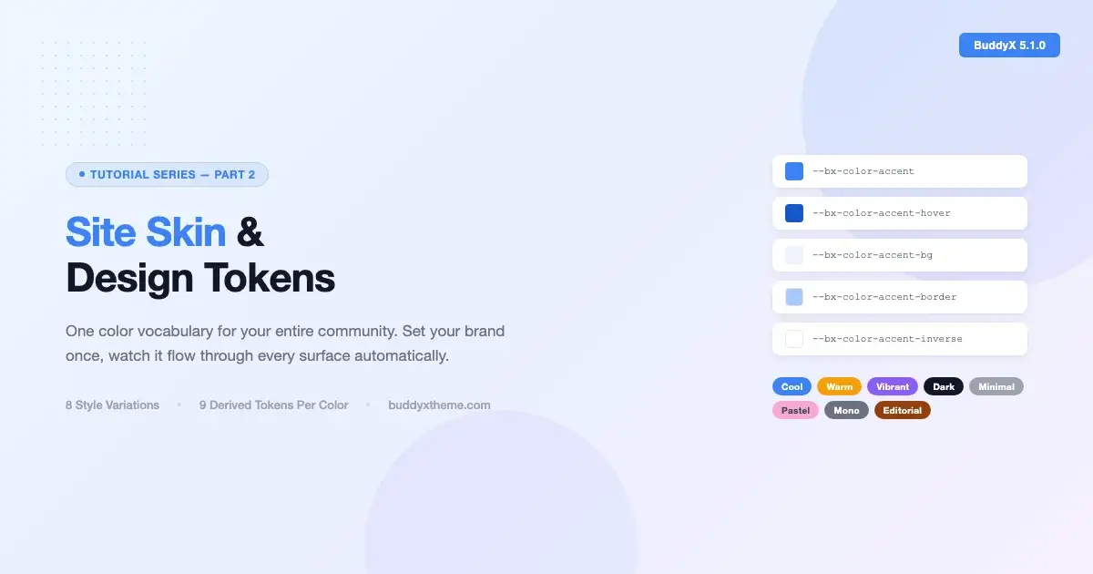
The -bx-color-* token model
Every color in the theme derives from a token in the --bx-color-* namespace. When you set your primary accent color in the customizer, the system does not just save a single hex value. It automatically generates nine derived variants from that one base value and writes all of them into :root.
The nine derived variants
For any given base color token, the system produces these variants automatically:
- -rgb - the same color expressed as an RGB triplet, ready for
rgba()compositing - -hover - a slightly darker or more saturated value for hover states
- -active - a pressed/active state variant
- -focus - the focus-ring color, WCAG-safe
- -bg - a very light tint of the base, suitable for section backgrounds
- -bg-strong - a slightly deeper tint for alternating rows or card backgrounds
- -border - a muted version suitable for borders and dividers
- -disabled - a low-saturation variant for disabled states
- -inverse - the color that reads well on top of the base (used for button label text)
This means that when you set --bx-color-accent, the theme automatically has --bx-color-accent-hover, --bx-color-accent-bg, and seven more variants - all computed and emitted without you specifying them individually. Buttons get the right hover state, focus rings pass contrast checks, and light background sections use the right tint. You did not write any of that manually.
How the token cascade works
The system emits one :root { ... } block on every page. Framework tokens (border widths, shadow values, spacing neutrals) emit first. Style variation tokens overlay those next. Customizer-driven values written by the Site Skin fields emit last, so a value you explicitly set in the customizer always wins over anything the active variation or the framework defaults provide.
There is no !important anywhere in this chain. The cascade does the right thing by declaration order. Theme stylesheets, BuddyPress styles, and plugin compat layers all read from var(--bx-color-*) rather than hardcoded hex, so when the :root block changes, every consumer updates in the same browser repaint.
One
:rootblock, one source of truth. Set your brand color once and everything downstream updates automatically.
The eight built-in style variations
Site Skin ships with eight ready-made palettes called style variations. Each one is stored as a JSON file under styles/ in the theme and follows WordPress’s native variation format. You switch between them from a single toggle in the Customizer’s Site Skin section, and the entire theme repaints immediately in the live preview.
Here is what each variation looks like in practice:
| Variation | Character | Best for |
|---|---|---|
| Editorial | Warm cream background, Newsreader headings, restrained neutrals | Knowledge communities, newsletters, professional networks |
| Minimal | Near-white background, generous whitespace, thin borders | SaaS communities, productivity tools, developer hubs |
| Vibrant | High-saturation accent, punchy button colors, bold surface tints | Youth communities, entertainment, gaming |
| Pastel | Soft, desaturated tones throughout, gentle gradients | Wellness communities, creative spaces, parenting groups |
| Cool | Blue-shifted neutrals, cooler surface colors, crisp borders | Corporate communities, legal or financial networks |
| Warm | Amber-shifted neutrals, warm background tints | Food communities, local groups, home and lifestyle |
| Monochrome | Strictly greyscale palette with no hue | Photography communities, architectural portfolios |
| Dark | Deep surface colors, light text, inversion of the default hierarchy | Gaming, developer, or media communities that prefer a dark default |
When you activate a variation, the system does more than swap a few accent colors. The variation’s palette propagates to every surface token the theme defines: the subheader band, the footer background, the copyright bar, input borders, and the site loader all flip together. The entire visual system is coherent from the moment you pick a variation, before you have customized a single field.
Creating a custom skin: step by step
A custom skin means overriding the tokens that matter for your brand without touching the tokens you are happy with. There are two places to do this: the Customizer’s Site Skin section for visual-drag-and-pick work, and a child theme’s style.css or custom.css for code-level overrides that survive theme updates.
Step 1: Pick a base variation
Start by choosing the built-in variation that is closest to your brand. Open Appearance - Customize - Site Skin and use the style variation radio control. If your brand is warm and editorial, start with Editorial or Warm. If it is crisp and corporate, start with Minimal or Cool. You want to begin close so that the tokens you do not touch already look right.
Step 2: Set the primary accent color
In the Site Skin section, the first cluster is Brand Colors. Set the accent color to your brand’s primary color. Watch the live preview: the navigation active state, the button fill, the link hover color, and the activity stream action buttons all update immediately. The nine derived variants for that color are generated and written to :root automatically.
Step 3: Set surface and text colors
Work through the remaining clusters: Surface Colors (background, card background), Text Colors (body text, heading text, muted text), Border Colors, and so on. You do not need to touch every field. Any field left at its default inherits from the active variation, so you only override what genuinely differs from the variation you started with.
Step 4: Lock overrides in a child theme
If you want token overrides that persist across Site Skin changes and cannot be accidentally cleared through the Customizer, put them in your child theme’s stylesheet. Target the :root selector directly:
/* child-theme/style.css */

:root {
  /* Brand primary */
  --bx-color-accent:          #1a6cf5;
  --bx-color-accent-hover:    #1558cc;
  --bx-color-accent-active:   #1044a3;
  --bx-color-accent-focus:    #1a6cf5;
  --bx-color-accent-bg:       #eef4fe;
  --bx-color-accent-bg-strong: #d6e7fd;
  --bx-color-accent-border:   #a8c8fb;
  --bx-color-accent-disabled: #8db4e8;
  --bx-color-accent-inverse:  #ffffff;

  /* Surface */
  --bx-color-surface:         #f9fafb;
  --bx-color-surface-strong:  #f1f3f5;

  /* Text */
  --bx-color-text:            #111827;
  --bx-color-text-muted:      #6b7280;
}
These declarations sit inside a normal stylesheet rule, so they respect the cascade. The child theme’s stylesheet loads after the parent theme’s :root emission, which means these values win without needing !important. The specificity of :root is identical between parent and child, so declaration order is the tie-breaker - and the child theme’s stylesheet is always last.
Which tokens should you override?
The highest-leverage overrides are the accent color cluster (your brand’s primary and its nine derived variants), the surface colors (background and card background), and the text colors. Those three clusters account for roughly eighty percent of what a visitor sees. The remaining clusters - borders, inputs, footer, copyright - tend to inherit well from whatever you set in the main clusters and rarely need manual values.
How tokens cascade across BuddyPress components
The real payoff for community sites is that --bx-color-* tokens reach every BuddyPress surface without you managing a separate set of BuddyPress-specific color settings. This is where the token model earns its keep, especially once your community grows beyond a handful of pages.
Activity stream
Activity cards read from the surface and border tokens. Action buttons (Like, Comment, Share) use the accent tokens directly. When you set --bx-color-accent, those buttons update without any BuddyPress-specific CSS. The comment input border reads from --bx-color-border, and the composer area uses --bx-color-surface-strong for its slightly lifted background.
Member profiles
Profile header backgrounds pick up the accent-bg token, so the cover area has a tinted version of your brand color by default. The member nav (About, Activity, Friends, Groups) active state uses the accent token for the underline indicator. Profile action buttons (Send Message, Add Friend) are the standard button component, so they draw from the accent stack automatically.
Groups
Group header areas use the same surface and accent-bg token pattern as profiles. Group cards in the directory use --bx-color-surface for card backgrounds and --bx-color-border for card outlines. The Join Group button is a primary button, so it draws from the accent and accent-inverse tokens for its fill and label color. Private group notices use the accent-bg token for their background band.
BuddyPress navigation
The BuddyPress subnav uses --bx-color-accent for active tab indicators and --bx-color-text-muted for inactive tab labels. This means the BuddyPress navigation automatically matches your primary navigation without a second customizer pass.
Shipping a brand-matched community
The practical value of the token system is speed. Starting an online community from scratch involves dozens of decisions about visual identity, and Site Skin compresses the color-matching phase from days to under an hour.
Here is a realistic workflow for a new community site:
- Install BuddyX and activate it. The starter content seeds demo pages and sets sensible defaults across all the Site Skin fields.
- Choose a base variation. Pick the built-in variation that is closest to your brand’s tone. The eight options cover most brand directions.
- Set the accent color. Enter your primary brand hex value in the Accent Color field. Watch the live preview repaint immediately across the header, nav, buttons, and activity stream.
- Adjust surface and text colors if needed. If your brand uses an off-white background or a dark surface, set those now. The majority of brands need only these two adjustments beyond the accent.
- Enable the color mode toggle if relevant. If your community serves users who prefer dark mode, turn on the visitor toggle. The dark mode defaults are WCAG-AA-passing and need no extra color work on your part.
- Save and publish. Your site’s color vocabulary is now set. Every new page, group, or member profile that gets added will automatically use the same token set.
The color consistency you get from this flow is something that previously required a custom CSS file with hundreds of lines of BuddyPress-specific overrides. The token system does that work structurally rather than through manual CSS maintenance.
Gotchas to know before you start
Caching
The :root token block is emitted inline on every page via wp_head. If your site uses a full-page caching plugin (WP Rocket, W3 Total Cache, LiteSpeed Cache), you need to clear the cache after saving any Site Skin changes. The token block is part of the page’s inline styles, so stale pages continue to show the old values until the cache is purged. This is not a bug - it is how full-page caching works - but it catches people off-guard when the live preview updates instantly but the cached front-end does not.
Child theme specificity
When overriding tokens in a child theme stylesheet, you need to be aware of load order. WordPress loads the parent theme’s stylesheet first, then the child theme’s. The inline :root block from inc/Tokens/Component.php runs at wp_head, which fires after external stylesheets are enqueued but inline styles are added as a separate later block. This means a child theme’s :root override in an external stylesheet will be loaded before the inline token emission, which can cause the inline emission to win.
The reliable way to handle this is to enqueue your child theme’s token overrides using wp_add_inline_style() rather than putting them in the external stylesheet. Attach them to a handle that loads after the theme’s token block:
// child-theme/functions.php

add_action( 'wp_enqueue_scripts', function() {
    // Load child theme's base stylesheet first
    wp_enqueue_style(
        'child-theme-style',
        get_stylesheet_uri(),
        array( 'buddyx-style' ),
        wp_get_theme()->get( 'Version' )
    );

    // Add token overrides as inline styles attached to this handle
    // These emit after the parent theme's :root block
    wp_add_inline_style( 'child-theme-style', '
        :root {
            --bx-color-accent:         #1a6cf5;
            --bx-color-accent-hover:   #1558cc;
            --bx-color-accent-inverse: #ffffff;
            --bx-color-surface:        #f9fafb;
        }
    ' );
}, 20 );
This approach guarantees your overrides emit after the parent’s token block and reliably win the cascade.
Variation overlay timing
The style variation overlay emits before the customizer-driven values in the token block. This is intentional: it means any value you have explicitly saved in the Customizer always wins over whatever the variation provides. But it can be surprising when you switch variations and notice that some of your customizer overrides no longer look like they belong. The fix is to re-check the Site Skin fields after switching variations and clear any values that were set specifically to compensate for the old variation rather than reflecting your actual brand requirements.
Plugin compatibility layers
BuddyX ships compatibility stylesheets for LearnDash, WooCommerce, bbPress, and several other plugins. Those stylesheets use var(--bx-color-*) tokens, so they update automatically when you change Site Skin settings. If you have a plugin that ships its own stylesheet with hardcoded colors, your site skin tokens will not override those colors by default. You would need to write targeted CSS using the plugin’s selectors and referencing the appropriate --bx-color-* tokens to bring that plugin’s colors into the system.
Dark mode and the variation stack
The dark mode block (emitted as [data-bx-mode="dark"]) is separate from the style variation system. The variation overlay sets daytime palette values; the dark mode block provides the night palette. If you override tokens in a child theme, make sure you also provide overrides inside a [data-bx-mode="dark"] selector if those tokens should behave differently in dark mode. Failing to do this means dark-mode visitors see your brand color over the dark-mode defaults instead of a dark-adapted version of your brand color.
What comes next in the series
This post covered the token system and how to use it. The next post in the series goes deeper on typography: how the font system works, what changed from Kirki’s typography fields to the new in-house Typography control, and how to set up a type scale that works across your community’s content areas. The fourth post covers launching and managing a live community, including the starter content patterns and how to extend them.
If you are setting up a new community site and want to understand the full picture of what BuddyX 5.1.0 delivers before diving into the details, the Customizer Framework post is the right starting point. It explains what changed architecturally and why your existing customizer settings still work exactly as they did.
Get started with Site Skin
Site Skin is available on every BuddyX 5.1.0 installation with no configuration needed. Open Appearance - Customize - Site Skin in your WordPress admin, pick the variation that fits your community’s tone, set your brand color in the Accent cluster, and save. The token system handles the rest across every surface the theme and its integrations cover.
The eight built-in variations give you a tested starting point for any type of community - from corporate intranets to wellness groups to developer hubs. And when those variations are not quite right for your brand, the child-theme override pattern shown above gives you a path to a fully custom skin that is clean, maintainable, and survives theme updates.