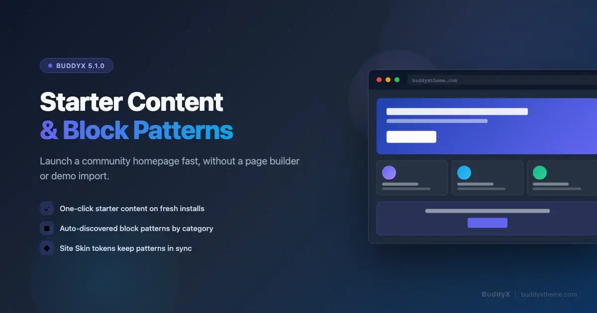
The blank-site problem is real. You activate BuddyX, install BuddyPress, and find yourself staring at a placeholder homepage with no content, no navigation, and no community feel at all. Getting from that empty state to a homepage that looks like a real community used to mean either buying a pre-built demo import or spending hours assembling blocks from scratch. BuddyX 5.1.0 changes both sides of that equation at once. It ships Starter Content that populates a fresh install in one click, and it ships a set of auto-discovered block patterns that let you compose any page, including a full community homepage, from reusable design pieces without touching a page builder.
This guide covers both features end to end: what Starter Content gives you and how to trigger it, how BuddyX patterns work and where to find them in the editor, how to assemble a community homepage from patterns step by step, how to adapt patterns using Site Skin palette tokens, and a launch-day checklist to make sure everything is wired up before you go live.
The blank-site problem when launching a community
A new WordPress install with BuddyX activated but no content is actively misleading to the people who need to decide whether to join your community. An empty homepage communicates nothing about who the community is for, what they get by joining, or why the site is worth their time. That problem compounds when you are also configuring BuddyPress, setting up registration flows, and thinking about plugin compatibility, all at once. You need something functional on screen quickly so you can make design decisions in context rather than in the abstract.
The traditional solution is a one-click demo import. Most themes ship an XML file you import through a tool, which loads demo posts, pages, menus, and widgets. This works, but it has a significant downside: it creates real content in your database that you then have to delete or replace. Demo posts appear in your feed, demo users get created, and cleaning up after a full demo import can be more work than building the site from scratch.
BuddyX 5.1.0 uses a different mechanism built into WordPress core: the Starter Content API. It populates the site only on a fresh install, only until you make your first save in the Customizer, and it leaves no orphaned content behind when you replace it with your own material.
What BuddyX 5.1.0 Starter Content gives you
Starter Content in BuddyX 5.1.0 is handled by inc/Starter_Content/Component.php. It registers a complete set of demo scaffolding via WordPress’s native add_theme_support( 'starter-content', $config ) call, which means it only appears on a new site where the Customizer has never been saved. Open the Customizer on a fresh install and you see the site populated exactly as the demo shows. Save the Customizer with your own settings and the Starter Content is replaced by your real configuration.
The configuration includes:
- A homepage composed from BuddyX patterns, giving you a complete above-the-fold community landing page immediately on activation.
- Key pages including an About page, a Members page (pointing to BuddyPress members directory), an Activity page, and a Community page that introduces what your space is about.
- A primary navigation menu wired to the key pages so the header is navigable from the first load.
- Sidebar widgets pre-configured with BuddyPress components where appropriate.
- Site color mode seeding so the Customizer opens with the Site Skin defaults already set, giving you a coherent color base from the start.
BuddyX Pro extends the Starter Content configuration further by adding premium patterns to the pages array. If you are running BuddyX Pro, your demo homepage includes the full set of Pro patterns the theme ships, giving you more section variety to work from before you customize anything.
How to trigger Starter Content on a fresh install
Starter Content is not a button you press after the fact. It activates automatically on the first Customizer visit after a clean install. Here is the exact sequence:
- Install WordPress fresh. Do not import any existing content.
- Install and activate BuddyX from the WordPress theme repository or from your Wbcom account.
- Install and activate BuddyPress (recommended before viewing Starter Content so the members and activity page links resolve).
- Go to Appearance > Customize in the WordPress admin.
- You will see the site already populated with the Starter Content homepage, pages, and navigation.
- Make your changes in the Customizer: set your site name, choose your brand color in Site Skin, configure your header. When you click Publish, the Starter Content is replaced by your real Customizer settings.
If you activated BuddyX on an existing site that already has content and a Customizer history, Starter Content will not appear. The WordPress API specifically guards against overwriting real site data. On an existing site, you use the block patterns directly in the editor instead, which is the workflow covered in the rest of this guide.
How auto-discovered block patterns work in BuddyX
BuddyX 5.1.0 ships a set of block patterns that WordPress auto-discovers at activation. Auto-discovery means the theme does not need to register each pattern individually with register_block_pattern() calls. Instead, pattern files in the patterns/ directory declare their metadata in a PHP file header, and WordPress reads that metadata automatically on theme activation using the WP 6.0+ pattern discovery API.
Each pattern file carries a set of front-matter fields:
- Title - the name that appears in the pattern inserter panel
- Slug - the unique identifier (prefixed with
buddyx/to namespace it correctly) - Categories - which category tabs the pattern appears under in the inserter
- Viewport Width - the preview width so the inserter thumbnail renders at the right scale
The patterns are organized into eight category groups: Hero, About, Features, Social Proof, Pricing & FAQ, CTA, Footer, and Query. These categories are registered by the theme alongside the pattern files, because WordPress auto-discovery creates the pattern entries but does not automatically create the category tabs they appear under.
Where to find patterns in the block editor
When you are editing a page or post in the WordPress block editor, patterns are available through two entry points:
- The Pattern tab in the block inserter - open the inserter with the blue + button in the toolbar, then click the Patterns tab. You will see BuddyX patterns grouped under their category headings. Click any pattern to insert it at the cursor position.
- The slash command - in the editor, type
/at the start of a new block and search by pattern name or category. This works well when you already know which pattern you want.
Patterns from the pattern inserter insert the full block markup at once. You can then edit the inserted blocks exactly like any other block content: change the heading text, swap the image, adjust the button label. The pattern is a starting point, not a locked template.
There is also a dedicated Patterns view under Appearance > Patterns in the WordPress admin sidebar. This view lets you browse all registered patterns and preview them at full width before inserting. For a community homepage project, spending a few minutes in this view to understand what each pattern looks like at full width is worth doing before you start building the page.
Composing a community homepage from patterns: step by step
This is the practical core of the guide. You will assemble a community homepage using BuddyX patterns without a page builder, working entirely in the native WordPress block editor. The target structure covers four key sections: a hero that communicates the community value proposition, a member showcase, an activity highlights area, and a closing CTA. This sequence mirrors the structure most successful community homepages use, and it maps directly to the pattern categories BuddyX ships.
Before you start, create or open the page you want to use as your homepage. If you are on a fresh install, the Starter Content will have already created a homepage - open it in the editor. If you are on an existing site, create a new page and set it as the static front page under Settings > Reading.
Step 1: Insert a hero section
The hero is the first section visitors see. It needs to communicate what the community is about and provide a clear join or learn more action. Open the block inserter, go to the Patterns tab, and look under the BuddyX Hero category. Hero patterns in BuddyX are designed for community contexts: they include headings structured around a value proposition, a supporting subheading, and one or two CTA buttons. The layout adapts across screen sizes automatically.
Click the hero pattern that matches your layout preference. Once inserted, edit the heading to name your community and its core benefit. Replace the subheading with one sentence describing who the community is for. Update the button text and link: the primary button should point to your registration or join page, and the secondary button can point to your About page or a key feature tour.
Step 2: Add a member showcase section
The member showcase section exists to answer the trust question: who is already here, and are they people I want to be around? BuddyX ships patterns in the Social Proof and About categories that work for this purpose. Look for patterns with member cards, testimonial layouts, or grid arrangements that show faces and names.
Insert a social proof pattern below the hero. Replace the placeholder avatar images with real community member photos where available, or use diverse stock photos that represent your audience. Update the member names and short bios. If you have real member quotes, use them - member testimonials are more persuasive than marketing copy written by the site owner.
If you do not yet have member content to populate this section, you can temporarily fill it with the type of member you are building for. Describe a realistic member persona rather than leaving placeholder text. You can replace it with real members after launch.
Step 3: Add an activity highlights section
The activity highlights section shows that the community is alive. This is where you connect the homepage to the actual BuddyPress data on your site. BuddyX patterns in the Query category include layouts built around the WordPress Query block, which can pull in latest activity, recent posts from community members, or recent group updates.
Insert a query pattern from the Query category. The inserted Query block will show your most recent posts by default. You can adjust the query via the block settings panel on the right: change the post type if you are surfacing a custom post type, adjust the number of items shown, and switch between grid and list layouts. Add a section heading above the Query block to frame what visitors are looking at. A heading like “Latest from the community” or “What members are discussing” signals that the site has ongoing activity and is worth checking back on.
Step 4: Add a CTA section
The closing CTA is the conversion moment for visitors who have scrolled the full page. By the time a visitor reaches this section they have seen the hero, the members, and the activity. The CTA needs to give them a clear next step that matches their interest level. BuddyX ships several CTA pattern variants in the CTA category, including full-bleed layouts with a large background color or image, and more compact card-style CTAs that sit inside the content column.
Insert a CTA pattern. Update the heading with an action-oriented line that restates the community’s value. The button should link to your registration page. If your community requires an approval step or a membership fee, note that in the supporting text so visitors are not surprised after clicking through. Transparency at the CTA improves conversion quality even when it slightly reduces conversion volume.
Customizing patterns with Site Skin palette tokens
Every color in a BuddyX pattern is expressed as a CSS custom property from the Site Skin token system rather than a hardcoded hex value. This is the property that makes patterns work coherently across style variations and palette configurations without any manual color editing after you insert them.
When you insert a BuddyX hero pattern that has a brand-colored button and a brand-colored heading accent, those colors are reading from --bx-color-brand at render time. When you change your brand color in the Site Skin section of the Customizer, every inserted pattern that uses the brand token updates in one step. You do not need to find and re-color each button across every page.
The same principle applies to the eight style variations BuddyX ships: Cool, Dark, Editorial, Minimal, Monochrome, Pastel, Vibrant, and Warm. Each variation is a palette preset in the Site Skin system. When you switch from one variation to another in the Customizer, all patterns on all pages recolor simultaneously because they all read from the same token layer. Your customizer override always wins over the variation default, so if you have set a specific brand color, it persists regardless of which variation is active.
How to adjust pattern colors through Site Skin
Open Appearance > Customize and navigate to the Site Skin section. The section is organized into nine clusters: Mode and Master, Brand, Header and Surfaces, Text and Links, Headings, Buttons, Footer, and Copyright. Each cluster exposes the color controls that feed into that area of the design.
For a community homepage, the Brand cluster is the first one to set. Your brand color feeds the primary button background, the link accent, the active navigation indicator, and any decorative elements patterns use to draw the eye. Set this to your actual brand color and preview the result live in the Customizer preview pane before saving.
The Buttons cluster lets you fine-tune the button color separately from the brand color if you want a distinction between brand accents and interactive elements. This is useful when your brand color is light or pastel and you need a higher-contrast button. The Header and Surfaces cluster controls the background color of the header bar and the main content surface, which affects how patterns with full-width backgrounds read against the page.
One detail worth understanding: the palette configuration system derives nine variants from every base color you set. Set your brand to a specific hex value and the theme automatically computes hover, active, focus, background tint, border, disabled, and inverse variants. You do not manually set each state. This means a single brand color field in the Customizer produces a full, accessible color family across every interactive state without any custom CSS.
Combining patterns with BuddyPress widgets and blocks
Patterns give you the visual shell of the community homepage. BuddyPress blocks and widgets fill that shell with live community data. The two work together rather than competing, and understanding how to combine them is what separates a static-looking demo homepage from a genuinely dynamic community landing page.
BuddyPress ships a set of Gutenberg blocks that output live data from your community: member lists, activity streams, group grids, and more. These blocks are available in the block inserter under the BuddyPress category when BuddyPress is active. The approach for a community homepage is to build the static sections (hero, member showcase, CTA) from patterns, and then insert BuddyPress blocks into the dynamic sections (activity highlights, member showcase when you have real data).
For the activity highlights section specifically, consider replacing the static Query pattern with the BuddyPress Activity block. It outputs real-time activity updates from your community - member posts, group activity, profile updates - which gives returning visitors a reason to scroll the homepage on every visit. Wrap the BuddyPress block in a Group block that matches the color token and spacing of the surrounding pattern sections so it reads as part of the designed page rather than a raw widget dropped into the content.
The Members block from BuddyPress is similarly useful in the member showcase area once you have actual members. It outputs a filterable grid of member avatars and names drawn live from the site’s user base. Insert it inside a Group block with the same card styling as the surrounding pattern content to maintain visual consistency. Set the count parameter to show a representative sample rather than all members - eight to twelve members displayed well is more compelling than forty members in a cramped grid.
If you are starting with a community that does not yet have many members, lean on the static pattern sections for the launch and add BuddyPress dynamic blocks after the community grows. A live feed with three posts looks sparser than a well-chosen static pattern. This is also a reason the Starter Content scaffold is valuable: it gives the homepage a structured, intentional look from day one before any members have posted anything.
Choosing between Starter Content and building from patterns directly
Both Starter Content and direct pattern assembly produce a community homepage. They suit different situations:
| Situation | Recommended approach |
|---|---|
| Fresh install, no existing content | Let Starter Content populate the site, then customize from that baseline in the Customizer and editor. |
| Existing site adding a new landing page | Build the page directly from patterns in the editor. Starter Content will not trigger on an existing site. |
| Client site where you want a clean handoff | Build from patterns directly so the client does not inherit placeholder content they need to delete. |
| Testing a visual direction before committing | Use Starter Content on a staging install to preview the full theme treatment, then rebuild from patterns on the real site. |
The most common path for a new BuddyX community site is to let Starter Content run on the first Customizer visit, make your palette configuration and typography choices, and then open the homepage in the editor and replace or adjust the Starter Content sections with your own community-specific content. Starter Content gives you accurate spatial context - you can see how the sections relate to each other and how your color choices land against real content - which makes design decisions faster and more grounded than looking at a blank page.
Launch-day checklist
Before you take the site live, work through this checklist. It is organized from the homepage outward to the community infrastructure that makes the homepage meaningful.
Homepage and content
- Set Settings > Reading to use the homepage you built as the static front page.
- Verify the primary navigation menu is assigned to the Header Menu location under Appearance > Menus.
- Check that all pattern placeholder text has been replaced with real community content.
- Verify all CTA buttons link to real destination pages, not
#placeholders. - Review the page on a mobile device or at 390px viewport width - patterns should stack cleanly at that width because they use responsive block layouts.
- Check that the hero heading and subheading clearly communicate who the community is for and what the join action is.
Site Skin and colors
- Open the Customizer and visit the Site Skin section. Confirm your brand color is set correctly.
- Check the site in both light and dark mode using the color mode toggle if you have it enabled. Verify all text remains readable against its background in both modes.
- Verify the header and footer colors match your intended palette by browsing a few pages after saving.
- If you chose a style variation, confirm that your customizer overrides (your specific brand color, custom button color if set) are taking effect rather than being masked by the variation defaults.
BuddyPress integration
- Visit the Members page and confirm BuddyPress member data appears correctly.
- Visit the Activity page and confirm the activity stream renders.
- Test user registration: go through the signup flow as a new user and confirm you receive any welcome or confirmation message you have configured.
- Check that the Community Settings panel in the Customizer (visible only when BuddyPress is active) is configured to your preferences for member profile layout and activity display.
SEO and sharing
- Set the SEO title, meta description, and focus keyword for the homepage via your SEO plugin.
- Verify the Open Graph image is set for the homepage so social shares display correctly.
- Add internal links from the homepage to your key community pages so search engines can crawl the site structure from the entry point.
Performance
- Run a Lighthouse or PageSpeed Insights check on the homepage. BuddyX 5.1.0 removes Kirki and TGMPA, which reduces admin-side script weight significantly, but front-end performance still depends on your hosting, image optimization, and caching configuration.
- Confirm that images in hero and member showcase sections are appropriately sized. Oversized images in pattern-based layouts are the most common cause of slow first-paint on community homepages.
- If BuddyPress shows a large member directory on the homepage, verify the query is paginated or limited to a count that does not cause long database query times.
Putting it together
BuddyX Starter Content and the auto-discovered pattern library solve the same problem from two different angles. Starter Content handles the zero-to-functional gap on a fresh install by giving you a scaffolded homepage and navigation immediately. The pattern library handles every subsequent design decision - new pages, updated homepage sections, feature-specific landing areas - by giving you a vocabulary of reusable section types that all draw from the same Site Skin tokens, stay coherent with each other, and respond correctly across screen sizes without any additional configuration.
The combination means you are not choosing between a demo import that leaves a mess behind and a blank editor that requires building from nothing. You get a working starting point that you can build on at your own pace, with patterns that keep your homepage looking intentional whether you assembled it in thirty minutes from four inserted patterns or refined it over weeks of iteration.
If you are at the earlier stage of figuring out the community concept before getting into the homepage build, the guide to starting an online community covers the foundational decisions - defining your community’s purpose, choosing the right membership model, and setting up the BuddyPress components that match your structure. That groundwork shapes which patterns serve your homepage best, because a niche peer community needs a different visual emphasis than a course-based membership or a professional network.
For the customizer side of the setup - understanding the Site Skin token system in depth, configuring dark mode, and working with style variations - the BuddyX Customizer Framework guide covers the full architecture of how palette configuration works under BuddyX 5.1.0, including what to check if you are upgrading from an older install.
Summary
BuddyX 5.1.0 ships two systems that together eliminate the blank-site problem for new community launches. Starter Content populates a fresh install with a homepage, key pages, and primary navigation automatically on the first Customizer visit - no demo import, no cleanup required. Auto-discovered block patterns give you a library of section types organized by purpose (Hero, About, Features, Social Proof, CTA, Query) that you can insert and customize directly in the block editor without a page builder.
A community homepage built from BuddyX patterns follows a four-section structure: hero with your community value proposition and CTA, member showcase to establish social proof, activity highlights to show the community is live, and a closing CTA. All pattern colors draw from the Site Skin palette token layer, so a single brand color set in the Customizer propagates across every inserted pattern. BuddyPress blocks slot into the dynamic sections of the homepage to show live member and activity data as your community grows.
The launch-day checklist covers homepage content, Site Skin palette configuration, BuddyPress integration, SEO setup, and performance - the five areas that determine whether the homepage works as a real community entry point rather than a visual demo.