

Building a sales page that actually converts takes strategic design, persuasive writing, and a real understanding of who’s reading it. Attention spans online keep shrinking, and a well-built sales page is often the difference between a visitor who buys and one who bounces after four seconds.
This guide walks through the steps involved in building a sales page that draws traffic and, more importantly, produces measurable results. Every step below, from the headline to the visuals, is a building block. Get enough of them right and the page starts pulling its weight.
What Is a Sales Page?
A sales page is a focused web page built to persuade a visitor into taking one specific action, usually completing a purchase. It’s a targeted platform that shows off a product or service, highlights what makes it worth buying, and pushes the visitor toward that final decision.
Good sales page copy speaks directly to the wants and problems of the intended audience. That’s accomplished through persuasive elements: call-to-action buttons, sharp copywriting, testimonials, and headlines that actually grab attention instead of blending into the scroll.

Sales pages also lean on graphics, multimedia, and intuitive navigation to guide visitors through the content toward whatever the target action is, whether that’s a download, a purchase, or a signup.
A well-designed sales page is one of the harder-working pieces of any online marketing setup, converting browsers into buyers by making a genuinely compelling case for the product’s value.
Sales Page vs. Landing Page: What’s the Difference?
Both formats are built to convert visitors, but they serve different roles in a marketing strategy.
Sales Page
The main job of a sales page is to sell something directly. It’s a dedicated page carrying detailed information meant to persuade a visitor to buy. Sales pages run deep: extensive product descriptions, features and benefits, testimonials, pricing. They’re built to answer objections before the visitor has to ask. The primary call-to-action centers on completing a purchase or a transaction.
Landing Page
A landing page is built for one specific campaign. Its job is usually to capture a lead, not close a sale, whether that’s an ebook download, a webinar signup, or a request for more information. Landing pages stay concise: a strong headline, a short form, one clear call-to-action. The CTA is tailored to the campaign’s goal rather than a purchase specifically.
In short, a sales page sells. A landing page captures. Both matter, but confusing one for the other tends to hurt conversion rates on whichever page gets the wrong treatment.
Sales Page vs. Homepage: What’s the Difference?
These two serve different visitors with different intent.
Sales Page
A specific, targeted page converting visitors on one product or service through detailed information and persuasive copy, with a direct call-to-action around purchase.
Homepage
The homepage introduces the whole business, not one product. It functions as a navigation hub, pointing visitors toward product categories, an about page, or the blog. It carries more general information, mission, values, an overview of what’s offered, and it serves multiple purposes at once rather than a single conversion goal.
A sales page pushes toward one transaction. A homepage opens the door to everything else.
8 Steps to Create a Sales Page
Here’s the process, step by step.
1. Define Your Goal
Get specific about what this page is for. Product promotion, service signup, lead capture, whichever it is, that goal shapes everything else you build.
2. Know Your Audience
Understand what your audience actually needs, prefers, and struggles with. Tailor the messaging to speak to those specific pain points rather than writing generically.
3. Craft a Compelling Headline
The headline needs to grab attention and communicate the core benefit immediately. Keep it clear and short enough to read in under two seconds.
4. Write Engaging Copy
Build persuasive, customer-centric copy through the page. State the features and benefits plainly, and connect them directly to what the reader actually needs. A conversational tone reads better than a corporate one almost every time.
5. Add Visuals and Multimedia
Images, graphics, and video break up dense text and can explain a complex idea faster than a paragraph can. Use them deliberately, not as filler.
6. Include Testimonials and Social Proof
Real reviews and endorsements build trust fast. Social proof reassures a hesitant buyer that other people already made this decision and were happy with it.
7. Build a Clear Call-to-Action
Place a prominent CTA button that tells the visitor exactly what happens next, whether that’s buying, signing up, or requesting information. Action-oriented language pushes people to act now rather than later.
8. Optimize for Mobile
A large share of visitors will hit this page from a phone. If it doesn’t render cleanly on mobile, you’re losing conversions before the copy even gets read.
Once the page is live, treat it as a work in progress. Watch the performance data and revise based on what visitors are actually doing on the page, not what you assumed they’d do.
How BuddyX Helps Build a Sales Page
BuddyX is a community and social networking theme for WordPress. It’s known mainly for social networks, communities, and intranet builds, but it’s also capable of assembling standalone pages, sales pages included.
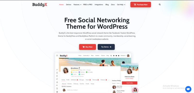
Here’s what that looks like in practice:
Page building: BuddyX pairs with popular page builder plugins, giving you a visual, drag-and-drop way to assemble a sales page without writing code.
Templates: Pre-built page templates give you a conversion-oriented starting structure instead of a blank canvas.
Ecommerce integration: WooCommerce integration handles product display, inventory, and transactions directly on the page if you’re selling something tangible or digital.
Customization: Colors, fonts, and layout can all be adjusted to match your brand rather than looking like a default theme install.
Responsive design: The theme renders properly across desktop, tablet, and mobile, which covers the mobile-optimization step above without extra work.
To use BuddyX for a sales page, install the theme, explore the customization options, and use whichever page-building tools or templates it offers. If the page needs ecommerce functionality, pair it with a compatible plugin like WooCommerce.
Copywriting Frameworks Worth Borrowing
AIDA (Attention, Interest, Desire, Action) is the oldest and still one of the most reliable structures. Grab attention with the headline, build interest through the problem statement, build desire through benefits and proof, then close with a direct call-to-action. Most sales pages that convert well, whether the writer knows the framework by name or not, follow this shape.
PAS (Problem, Agitate, Solution) works especially well for products solving a painful, specific problem. State the problem the reader is facing. Agitate it a little, make the cost of not solving it concrete. Then present your product as the solution. This framework tends to outperform AIDA for pain-point-driven purchases, while AIDA often works better for aspirational or lifestyle products.
FAB (Features, Advantages, Benefits) helps when a product is genuinely feature-rich and you need a way to translate specs into reasons to buy. List the feature, explain the advantage it creates, then connect that advantage to a real benefit the reader will experience. Skipping straight from feature to benefit, without the advantage step, often leaves readers unconvinced because the logical bridge is missing.
Pricing Psychology on a Sales Page
How a price is presented changes how it’s perceived, sometimes more than the number itself. Anchoring, showing a higher “regular” price crossed out next to the actual price, works because it gives the reader a reference point to judge the deal against. Without an anchor, buyers have no frame of reference for whether a price is fair.
Breaking a price into smaller units (“just $9 a month” instead of “$108 a year”) lowers the psychological barrier to purchase, even though the total cost is identical. This works particularly well for subscription products where the annual total might otherwise feel steep.
Bundling changes the math entirely. Offering three tiers, when only one tier is actually needed, gives buyers a comparison point and often nudges them toward the middle option rather than the cheapest one, a pattern well documented in pricing research and worth testing on your own page rather than assuming it always works.
Common Mistakes That Kill Conversions
A weak headline is the most common one. If the headline doesn’t communicate a real benefit in the first five words, most visitors won’t read past it. Vague benefit statements are another. “Improve your workflow” tells the reader nothing. “Cut your invoicing time from two hours to fifteen minutes” tells them everything.
Too many competing calls-to-action confuse visitors into taking no action at all. One page, one primary goal, one CTA repeated at logical points down the page. Burying the price or making pricing hard to find erodes trust rather than protecting it; visitors assume something’s being hidden.
Slow page load speed is a silent killer here too. A sales page that takes more than three seconds to load loses a meaningful chunk of visitors before they even see the headline, regardless of how good the copy underneath it is.
Generic stock photography is another quiet conversion killer. A visitor scrolls past hundreds of the same handshake and laptop-in-a-coffee-shop images every week, and none of them register as anything except filler. Real product screenshots, actual team photos, or genuine customer photos almost always outperform stock imagery, even when the stock photo is technically higher quality.
Trust Signals That Actually Move the Needle
Testimonials work best with specifics attached: a name, a photo, a role or company, ideally a measurable result. “Great product!” from an anonymous reviewer convinces almost nobody. “Cut our support tickets by 40% in the first month, Priya, Operations Manager at a 50-person startup” convinces a lot more people, because it’s specific enough to feel real.
Security badges, payment logos, and money-back guarantees reduce the perceived risk of the purchase itself. That risk reduction matters more for higher-priced items and for first-time visitors who have no prior relationship with your brand. A returning customer needs less reassurance than someone landing on the page for the first time from a cold ad.
Press mentions and client logos work as a faster form of trust signal, since visitors recognize the source and transfer some of that trust to you without reading a full case study. Use them if they’re genuine. A logo from a well-known company you barely worked with, stretched to look like a major partnership, tends to backfire once a skeptical visitor checks.
Writing the FAQ Section Well
A sales page FAQ isn’t just a place to dump every question support has ever received. It’s a final objection-handling tool. The best FAQ sections address the specific hesitations keeping a warm lead from clicking buy: refund policy, how long setup takes, whether it works with what they already use, what happens if it doesn’t work for them.
Order the questions by how commonly they come up, not alphabetically or randomly. The first two or three FAQ entries should tackle the objections most likely to be sitting in a reader’s mind right at that point in the page, since most visitors won’t read every single question.
How to Test and Improve a Sales Page Over Time
A/B testing headlines is usually the highest-leverage change you can make, since the headline determines whether anyone reads the rest of the page at all. Test one element at a time, headline, CTA button color, image versus video, so you know which change actually moved the number.
Heatmap tools show where visitors are actually clicking and how far down the page they scroll before leaving. If most visitors never reach your testimonials section, that section needs to move up, not get cut. Track conversion rate by traffic source too. A sales page that converts well for email traffic might convert poorly for cold social ads, because the visitor’s context and prior trust level are completely different.
Frequently Asked Questions
How long should a sales page be?
Long enough to answer every objection a skeptical buyer would raise, and not a word longer. A $20 product might need three paragraphs. A $2,000 course might need three thousand words of testimonials, FAQs, and detail. Let the price and complexity of the offer set the length, not a template.
Do I need a video on my sales page?
Not always, but video tends to lift conversion rates when the product or service benefits from demonstration. A software tool, a physical product with a tactile feature, or a service with a visible process all benefit more from video than a straightforward digital download does.
Should the price be visible above the fold?
For most products, yes. Hiding the price until the visitor scrolls past several sections of copy tends to feel evasive and drives people away rather than building anticipation. The exception is high-ticket, custom-quoted services where price genuinely depends on a conversation.
What’s a good conversion rate to aim for?
It varies enormously by industry and traffic source, but a well-optimized sales page for a targeted audience often converts somewhere between 2% and 5%. Cold traffic converts lower. Warm traffic from an email list or retargeting campaign often converts higher.
Should I write the sales page copy myself or hire a copywriter?
If you know your product and your customers intimately, a first draft written by you often captures details a hired copywriter would miss on day one. Bring in a professional copywriter for structure, persuasion technique, and polish once that draft exists, rather than starting from a blank page with someone unfamiliar with the product.
How often should I update a sales page?
Revisit it whenever a major offer, price, or feature set changes, and run a lighter review every few months even without a big change. Testimonials go stale, seasonal language ages badly, and small copy tweaks based on new data tend to compound into meaningful conversion gains over a year.
Final Thoughts
Building an effective sales page takes a genuine eye for design, persuasive writing, and a real read on your audience. Follow the steps here, know your goal, understand your reader, and back up the pitch with real visuals and testimonials, and you end up with a page that turns visitors into customers rather than just traffic.
Sales page optimization never really finishes. Check performance data regularly and stay willing to revise based on what users actually do, not what the first draft assumed they’d do. A page that keeps improving over months will outperform one that got built once and never touched again.
Pick one weak point from this guide, whatever’s most obviously missing from your current page, and fix that first. A perfect sales page built slowly loses to a decent one that’s live and collecting real data today.
Also read:
5 Strategies for Earning Income from Your Social Media Audience