

Infographic templates promise to shortcut the actual design work, structure and hierarchy and color logic already decided, so you’re mostly filling in numbers and swapping icons. That promise holds up only if you know what to do with the template once you have it. A handful of habits separate an infographic that gets shared from one that gets skimmed for three seconds and closed. Working from a solid Infographic Template, like the ones at Venngage, gets you most of the way there, but the choices you make while filling it in matter just as much as the template itself.

Using an infographic template
Here are the habits that make the difference once you actually sit down to create an infographic template.
1. Organize your information before you touch a template
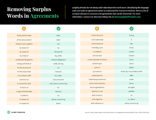
Get your information organized on paper, or in a plain document, before you open any design tool. Trying to figure out what goes where at the same time as picking fonts and colors is how infographics end up cluttered. Once you know the sequence of your points and roughly how much text each one needs, pick an Infographic Template that already matches that structure rather than forcing your content into a layout it wasn’t written for. Venngage’s template library sorts by use case, comparison, timeline, statistical, process, which makes this step faster once your content outline exists.
2. Don’t stack more than one chart type into a single infographic
Every extra chart type in the same infographic is one more visual language your reader has to learn mid-scroll. A bar chart next to a pie chart next to a scatter plot forces a reader to context-switch three times in one image, and most people won’t bother. Pick one chart type that fits your main data point and stick with it across the whole piece. If a bar graph is what your numbers actually call for, Venngage’s bar graph maker builds one without requiring a separate design tool.
3. Use color to signal structure, not to decorate
Color isn’t decoration on an infographic, it’s doing structural work: showing which numbers belong to which category, which section is which, what’s meant to stand out. Assigning a different color to every chart and section undoes that structure, because now color no longer signals anything, it’s just noise. Two or three colors plus a neutral background carries most infographics further than a full rainbow does. A color mix tool helps find combinations that read as intentional rather than random.
4. Don’t fill every inch of the canvas
Cramming every inch of the canvas with charts, icons, and text is the fastest way to make an infographic exhausting to look at. Empty space isn’t wasted space, it’s what lets a reader’s eye rest between sections and tells them where one idea ends and the next begins. Templates with generous margins and gaps between blocks tend to get read start to finish more often than dense ones, even when they contain less information overall.
5. Use icons that are instantly recognizable
A wall of statistics is hard to parse quickly, an icon next to each one gives a reader something to latch onto before they’ve even read the number. Icons work best when they’re literal enough to recognize instantly, a clock for time, a dollar sign for cost, rather than abstract or decorative for its own sake. The goal is recognition speed, not visual flair.
6. Don’t mix more than two or three fonts
Two typefaces, one for headings and one for body text, cover almost every infographic’s needs. A third can work for pull quotes or callout numbers if it’s used sparingly. Beyond that, extra fonts start competing with each other for attention instead of reinforcing a hierarchy, and the piece starts looking like it was assembled from four different templates stitched together.
7. Keep charts and graphs simple
A chart that needs a paragraph of explanation to understand has failed at its one job. Simple bar and line charts communicate faster than nested pie charts or dual-axis graphs, even when the underlying data is genuinely complex. If the data really does need a more technical visualization, that’s a sign the piece might work better as a full report with the infographic as a summary, rather than trying to cram complexity into a format built for quick scanning.
8. Know when a design program earns its extra step
Free infographic template tools cover the basics well, but a project that needs custom illustration or precise vector control sometimes benefits from opening the exported file in Photoshop or Illustrator for a final pass. That’s not necessary for most infographics, most people never need to leave the template tool, but it’s worth knowing the option exists for pieces where brand consistency or custom artwork actually matters.
9. Give the infographic a specific call to action
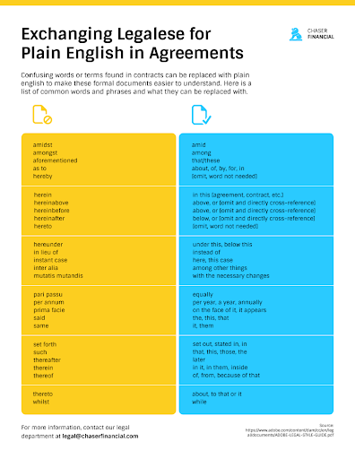
An infographic that ends without telling the reader what to do next wastes the attention it just earned. A short, specific call to action, visit a page, download a report, share the graphic, converts that attention into something measurable. Vague CTAs like “learn more” convert worse than specific ones like “get the full report” because they don’t tell the reader what happens if they click.
10. Don’t skip proofreading
Every infographic ships with typos eventually if nobody proofreads it, and once it’s shared publicly, those typos are attached to the brand for as long as the image exists somewhere. A second set of eyes catches things the person who wrote it stops seeing after the fifth read-through. This matters more for infographics than most content because there’s no quick edit-and-republish once it’s screenshotted and shared.
11. Know your audience before you design for them
The people who’ll actually read this infographic should shape every decision above, tone, chart complexity, jargon level. A technical audience tolerates denser data and industry terms that would lose a general audience in the first ten seconds. Write the outline with a specific reader in mind, not a generic one, and the rest of the decisions get easier because there’s a clear bar for whether something makes sense to them.
12. Pair the infographic with a blog post
An infographic dropped onto social media with no supporting context has a short shelf life, it gets a few shares and then disappears from anyone’s feed. A blog post built around the same infographic gives it a permanent home, room to add context the image itself can’t hold, and something that keeps generating search traffic long after the social posts have scrolled past. If the infographic took real effort to build, it’s worth the extra hour to write a few hundred words around it.
13. Layout is what ties everything else together
Layout ties every other decision together. The same content, chart, icons, colors, reads completely differently depending on how it’s arranged on the page. Left-to-right or top-to-bottom flow that matches how people naturally scan is worth testing before finalizing anything, and it’s usually the last thing worth adjusting once every individual element is already in place.
 Tools people actually use to build these templates
The template tool matters less than people assume, but it’s not irrelevant either. Venngage leans toward business and data-heavy infographics with a large library sorted by use case, which suits the comparison and statistical formats covered above. Canva’s infographic templates skew more toward social-media-ready pieces with simpler layouts, useful when the goal is a shareable square image rather than a long-form data piece. PhotoADKing sits somewhere between the two, with a broad general template library and a lower learning curve for anyone who hasn’t built one of these before. None of them replace the planning step, they just speed up execution once the content outline already exists.
Common infographic formats and when each one fits
Statistical infographics, the kind built around a handful of numbers with supporting charts, work best when there’s a genuinely surprising or useful data point to lead with. Timeline infographics suit anything with a clear chronological story, a company’s history, a process with sequential steps, an event’s key dates. Comparison infographics work when the whole point is choosing between two or more options, feature by feature, and they live or die on how clearly the comparison table itself is laid out. Process infographics walk through a sequence of steps rather than a chronology, useful for how-to content where order matters but dates don’t.
Picking the wrong format for the content is a common early mistake. A comparison forced into a timeline layout, or a process forced into a statistical one, tends to fight the content instead of supporting it. If the format feels awkward five minutes into building it, that’s usually the format, not you.
Where infographics go wrong even with a good template
Even with a well-built template, a few habits tank an otherwise solid infographic. Filling every available slot in the template just because it exists, rather than because the content actually needs that many sections, bloats the piece past what any reader wants to scroll through. Restating the same statistic two or three different ways to fill space reads as padding once a reader notices it, and readers notice it fast.
Sourcing numbers without citing where they came from undercuts credibility on a format that’s already competing with a reader’s skepticism about internet statistics in general, a small source citation at the bottom of the graphic goes further than it seems like it should. And exporting at low resolution for a format meant to be shared and re-shared means the tenth share downstream is illegible. Always export at the highest resolution the tool allows, even if the file size feels excessive for the platform you’re posting to first.
Making infographics accessible
An infographic is, by definition, an image, which means anyone using a screen reader gets nothing from it unless the alt text does real work. “Infographic about email marketing” as alt text tells a screen reader user almost nothing useful, a proper alt description summarizes the actual data points and conclusions the visual conveys, not just the topic. For anything with real information density, pairing the image with a text version of the same content, the blog post mentioned above is one way to do this, covers both the accessibility gap and gives search engines something to actually crawl, since they can’t read text baked into an image either.
Color contrast matters for more than just aesthetics here. Light gray text on a white background or pale yellow on white might look fine on a calibrated monitor and be nearly unreadable on a phone screen in direct sunlight, which is where a meaningful share of infographic views actually happen. Running a finished design through a contrast checker before export catches this before it becomes a support question or a complaint in the comments.
A quick pre-publish checklist
Before publishing, run through the same short list every time regardless of which template or tool built the piece:
- Every statistic has a source, even if it’s a small footnote at the bottom of the graphic.
- Alt text describes the actual data, not just the general topic.
- Contrast passes at the smallest text size used anywhere on the graphic.
- The file exports at full resolution, not a compressed preview size.
- At least one specific call to action appears, not a vague closing line.
- A second person has actually read it before it goes out, not just glanced at the visuals.
Infographics on a phone screen
Most infographic traffic today arrives through a phone screen, whether that’s a social media app or a blog post viewed on mobile. A layout that reads cleanly at full desktop width can turn into an unreadable column of tiny text once compressed to a phone’s screen width. Tall, narrow infographic formats generally survive this compression better than wide horizontal ones, which is worth factoring in at the template selection stage rather than discovering it after the piece is already built and shared.
Getting more mileage from one infographic
A single well-built infographic rarely needs to stay a single asset. Splitting it into individual sections, one chart plus its caption, one process step, works as a standalone social post series that stretches one piece of content across a week or two of posting instead of one image that gets seen once and forgotten. The reverse also works: a series of related smaller graphics, built with the same template and color system, can be stitched into one longer infographic for a blog post or a downloadable resource. Planning for this at the template stage, keeping individual sections modular rather than tightly interlocked, makes the repurposing far less work later.
When an infographic isn’t the right format
Not every piece of content should become an infographic just because the format is available. Data with real nuance, caveats, methodology notes, confidence intervals, gets flattened when it’s forced into a chart-and-icon format built for quick scanning. If the accurate version of a story needs paragraphs of context to avoid being misleading, that context belongs in the surrounding blog post, not squeezed into a footnote on the graphic. Infographics are a summary format, and treating them as anything more than that is usually where the “internet statistics you can’t actually verify” reputation comes from.
Frequently asked questions
How long should it take to build an infographic from a template?
Once the content outline exists, a straightforward template fill usually takes one to three hours depending on how many custom icons or charts are needed. The planning stage, deciding what to include and in what order, often takes longer than the actual template work, which is exactly why skipping it tends to backfire.
Are free infographic templates good enough for professional use?
For most business content, yes. The free tiers of tools like Venngage and Canva cover standard chart types, icon libraries, and export resolution well enough for blog posts, social sharing, and internal reports. Paid tiers mainly add premium icon sets, brand kit features for consistent multi-piece campaigns, and higher-resolution export options that matter more for print than web use.
What image format should an infographic be exported as?
PNG for anything going on the web or social media, it preserves sharp text and clean lines better than JPEG’s compression allows. PDF is worth exporting alongside the PNG if the infographic might get printed or attached to an email, since it holds resolution regardless of scale.
Can an infographic template be reused for multiple pieces of content?
Yes, and it’s usually a good idea for anyone publishing infographics regularly. Reusing a template’s structure across a series builds visual consistency that readers start to recognize, similar to how a recurring newsletter format builds familiarity. Swap the color palette or icon set occasionally so the series doesn’t start feeling identical piece to piece.
How many data points is too many for one infographic?
There’s no fixed number, but a useful test is whether someone could recall the main takeaway five seconds after looking away. Past roughly seven to nine distinct data points, most infographics stop being scannable and start requiring the kind of careful reading a chart is supposed to avoid. If the content genuinely has more than that worth including, splitting it into a short series usually serves readers better than cramming it all into one oversized graphic.
Should an infographic ever be interactive instead of a static image?
For web-only distribution, yes, it’s worth considering. Interactive versions, built with a charting library or a WordPress chart plugin rather than exported as a flat image, let readers filter or hover for detail without cluttering the base view. The tradeoff is that interactive versions don’t work at all once shared as an image on social media, so most teams end up building both, a static version for sharing and an interactive one embedded directly in the source post.
Getting it right
Getting an infographic right comes down to the same handful of decisions repeated across every point above: organize before designing, keep visual choices restrained rather than exhaustive, and build with a specific reader in mind instead of a generic one. A WordPress Chart Builder plugin can handle the data-visualization side directly on a site if infographics are becoming a regular part of the content mix rather than a one-off project. None of this is complicated once it’s broken down, it just takes more restraint than most first attempts have.
Interesting Reads:
How To Establish Trust In Your Marketplace Community