

If you run a blog, a small website, or any kind of social feed, you already know that visuals carry more weight than they used to. A strong caption can only do so much. If the photo next to it doesn’t grab attention in the first half-second, people scroll past without reading a word. One of the fastest ways to fix a flat, forgettable image is also one of the most overlooked: stickers.
Stickers aren’t just a leftover trend from messaging apps. Those small characters, emojis, arrows, and speech bubbles that make texting more expressive work just as well on photos. Drop one over a product detail, use it to build a banner, or slap a themed graphic on a cover image, and a plain photo turns into something people actually stop to look at. If you’ve searched for how to add stickers to photos and landed on a dozen confusing tutorials, this guide walks through the whole process with tools that don’t require a design background.
Why Stickers Work
Stickers do more than decorate an image. They direct the eye. A viewer scanning a photo in under a second needs something to land on, and a well-placed sticker gives them exactly that. An arrow pointing at a product feature, a heart hovering over a detail, a speech bubble carrying a joke: each one changes how long someone actually looks at the picture instead of scrolling past it.
They’re useful for a handful of specific jobs. Drawing the eye toward a product or a call-to-action is one. Building meme-style or reaction content is another. Post covers and banners get a lot more clickable with a bold sticker slapped across them, and brand images pick up personality they’d otherwise need a full redesign to get.
None of this requires Photoshop skills. Nobody needs to hire a designer for a task that takes thirty seconds once you know where to click. The tools built for this have gotten simple enough that the hardest part is picking which sticker to use.
A Simple Photo Editor That Gets the Job Done
The tool matters more than people expect. Pick something clunky and you’ll spend twenty minutes fighting menus for a job that should take two. What you actually want is software that works reliably without an internet connection, skips the tutorial requirement, and saves files in full quality rather than compressing them into mush.
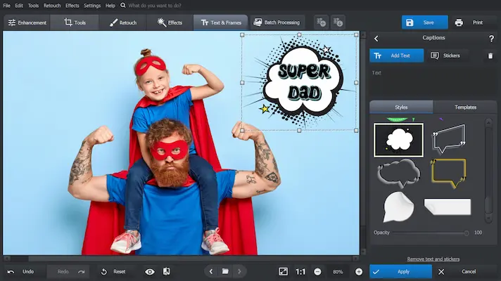
PhotoWorks is one option built around exactly that brief: load a photo, pick a sticker from the built-in library, and drag it into place. That’s the entire workflow for a basic edit. Resizing, rotating, flipping, and layering stickers all happen with mouse drags rather than menu diving, so stacking three emojis over someone’s head or adding a speech bubble with a quote takes about as long as it takes to think of the idea.

Desktop editors like this aren’t the only route, though they tend to be the fastest for anyone editing more than one or two images a week. Phone apps handle quick, single-photo edits well enough for a story post, but they get frustrating fast once you’re trying to line up multiple stickers precisely or export at a resolution that doesn’t look blurry on a bigger screen. If you’re editing a handful of photos for a blog post or a batch of product shots, a desktop tool saves real time over fighting with a touchscreen.
Practical Ideas for Creators and Bloggers
1. Highlighting Details
Arrows and circles are the simplest way to show off a part of an image that would otherwise get missed. Got a feature on a product photo that matters but isn’t obvious at a glance? Drop a sticker over it. Something in the background worth noticing? A magnifying glass icon or a simple emoji pointing at it does more than a caption ever could, because it works before anyone starts reading.
This trick works especially well for tutorial-style content. If you’re showing someone which button to click in a screenshot, or which corner of a room a piece of furniture goes in, a sticker arrow removes the need for a paragraph of explanation. People process a visual cue faster than they read a sentence describing the same thing.
2. Making Covers That Pop
Anyone building blog headers, post covers, or YouTube thumbnails already knows how much a cover image affects click-through. Stickers give a fast way to add bold text, icons, or graphics that make an image say “click me” without redesigning the whole layout from scratch. Borders and shape stickers can also give a plain photo some visual structure, which matters more than most people realize when a thumbnail has to compete against a dozen others in a feed.
A cover that uses two or three well-placed stickers usually beats one built entirely from stock photography, mostly because it looks less generic. Viewers have seen thousands of stock photos. A sticker-based cover reads as something a real person made on purpose.
3. Creating Seasonal or Themed Content
Holiday graphics, birthday balloons, summer icons: any of these can turn a plain photo into on-theme content without a redo of the whole design. This matters most for anyone running a content calendar that needs a burst of seasonal posts every few months. Instead of reshooting or rebuilding a graphic from zero, adding a few themed stickers to an existing photo gets the job done in minutes.
It also keeps a visual identity consistent across a year of posts. The base photo style stays the same; only the sticker set changes with the season. That consistency is worth more for brand recognition than most people give it credit for.
4. Boosting Engagement on Social Media
Stickers make content feel more relatable, and relatable content gets shared more than polished content does. A funny reaction emoji, a “tap here” icon, or a sticker-based quote costs almost no effort to add, but it often pulls in more likes, shares, and comments than the same photo posted plain. People respond to content that feels like it was made by a person, not a marketing department, and a well-timed sticker is one of the cheapest ways to signal that.
This is especially true on platforms where the algorithm rewards early engagement. A photo that gets a handful of quick reactions in its first hour tends to get shown to more people, and a sticker that makes someone smile or laugh is often the nudge that gets that first reaction.
5. Adding Humor or Emotion
Sometimes a single sticker communicates more than a paragraph of caption text. A crying-laugh emoji on a meme-style post, a heart hovering over a featured product, or a skull emoji next to a “don’t try this at home” warning all add tone instantly. Captions can only carry so much personality before they start to feel like they’re trying too hard. A sticker does the same job with none of that risk.
Matching Stickers to the Platform
Not every platform treats sticker-heavy images the same way, and it helps to plan for that before editing. Instagram feed posts crop to a square or a 4:5 ratio, so a sticker placed near the edge of a photo can get cut off once it’s uploaded. Stories give more room to play since the whole frame is visible, which is why so many creators go heavier on stickers there than on a main feed post.
Pinterest pins are tall and narrow, which makes bold, large stickers near the top of the image the ones that actually get noticed in a scrolling feed. Blog headers and YouTube thumbnails get viewed at a huge range of sizes, from a phone screen to a widescreen monitor, so stickers that are legible small tend to perform better than ones that only look good at full size. Testing an edited image at thumbnail size before publishing catches most of these problems before they become a real issue.
Where to Find Stickers Worth Using
A sticker library is only as good as the variety it offers. Built-in libraries inside editors like PhotoWorks save time because everything is pre-sized and already has a transparent background, which avoids one of the most common headaches beginners run into. For anyone who wants a broader style range, custom PNG sticker packs are widely available, though it’s worth checking the license on any pack before using it commercially, since not every free download is cleared for business use.
Hand-drawn or custom stickers are worth the extra effort for anyone building a strong brand identity. A consistent, recognizable sticker style, the same speech bubble shape, the same arrow style, the same color palette, becomes something followers start to associate with a specific creator or brand. That kind of visual consistency is hard to fake with generic stock stickers.
Desktop, Mobile, or Browser: Picking the Right Tool
Three broad categories of sticker tools exist, and each one fits a different workload. Desktop software like PhotoWorks handles precision work well: lining up a sticker exactly where it needs to be, layering several at once, and exporting at full resolution without the file getting squeezed down. Anyone editing product photos for a store, building a batch of blog headers, or preparing thumbnails ahead of a launch tends to end up here because the extra control saves time once there’s more than a handful of images to get through.
Mobile apps such as Canva or PicsArt cover the other end of the spectrum well. They’re built for speed, not precision: open the app, drop a sticker on a photo taken five minutes ago, and post it before the moment passes. That immediacy is exactly what a story post or a same-day social update needs. What mobile apps struggle with is anything that needs fine control, since resizing a sticker with a thumb is never as accurate as dragging a handle with a mouse.
Browser-based editors sit somewhere in between. No download, no install, works on whatever computer happens to be in front of a person at the time. The tradeoff is usually speed and feature depth; a browser tool asking a server to process every edit will always lag behind software running directly on a machine’s hardware. For a single quick sticker on one photo, that lag barely registers. For a batch of twenty images, it adds up fast.
None of these three is objectively better. The right pick depends on how many images need editing, how much precision the job calls for, and how quickly the finished photo needs to go live.
Batch Editing for Content Creators
Anyone publishing more than a couple of posts a week eventually runs into the same problem: editing images one at a time doesn’t scale. A blog that publishes twice weekly with two images per post is already looking at over 200 edited photos a year. Doing each one from scratch, picking a sticker fresh every time, adds up to hours that could go toward writing or strategy instead.
The fix is building a small, reusable sticker kit rather than hunting for a new graphic every time. A consistent set, a handful of arrows, one or two speech bubble styles, a couple of seasonal options swapped in every few months, cuts decision time down to almost nothing. Once a creator knows exactly which five or six stickers they reach for, applying one becomes a five-second task instead of a five-minute search through a library.
Saving a template for common layouts helps too. A blog header template with a sticker already positioned in the corner, ready to swap the background photo behind it, turns a repetitive task into a fill-in-the-blank job. This is where desktop editors pull ahead of mobile apps again, since most of them support saving and reusing layered project files rather than forcing a fresh edit every single time.
Frequently Asked Questions
Do stickers actually help with engagement, or is that just a marketing claim?
The honest answer is that it depends on execution. A sticker that adds a genuine visual cue, an arrow, a reaction, a piece of context, tends to hold attention longer than a plain photo. A sticker slapped on randomly with no purpose does nothing and can even hurt a photo that would have looked cleaner without it. The engagement lift comes from intentional use, not from stickers as a category.
Is it worth paying for sticker software, or are free tools enough?
For occasional use, free mobile apps or browser tools cover most needs without any cost. Paid desktop software earns its price back once editing becomes a regular part of a workflow, mostly through the time saved on precision work and batch exports rather than through any feature a free tool can’t technically replicate.
Do stickers work on professional or corporate content, or only casual posts?
Restrained use works fine even on professional content. A subtle arrow pointing at a chart detail or a small badge highlighting a stat reads as helpful rather than unprofessional. The line gets crossed when stickers start looking decorative rather than functional; a cartoon character on a quarterly report photo sends the wrong signal, but a clean directional arrow rarely does.
What file format should a finished, stickered image be saved in?
PNG for anything that still needs a transparent background or further editing, JPEG for a final version headed straight to a blog post or social upload where file size matters more than editability. Keeping an original layered file separate from the exported flat version makes future edits far less painful.
Tips for Using Stickers Like a Pro
- Don’t Overdo It: Too many stickers make an image look cluttered instead of intentional. Two or three per image is usually the ceiling before it starts working against you.
- Match Your Style: Stickers should fit the brand’s colors and tone. Mixing cartoonish and realistic sticker styles on the same image tends to look like a mistake rather than a design choice, unless the contrast itself is the point.
- Keep It Transparent: PNG stickers with transparent backgrounds are non-negotiable. Anything else leaves an ugly white box around the sticker that instantly signals a rushed edit.
- Resize Smartly: A sticker that’s too big overwhelms the photo; one that’s too small gets lost entirely. It should enhance the image, not fight it for attention.
- Test on Mobile: Most viewers will see the finished image on a phone screen first. Stickers that look sharp on a desktop monitor can shrink into an unreadable smudge on mobile, so previewing at phone size before publishing catches problems early.
- Watch Text Legibility: If a sticker includes text, check that it holds up against the photo’s background. Light text on a light photo, or dark text on a dark one, disappears the moment it’s viewed at a smaller size.
- Save a Layered Version: Keeping an editable copy with stickers on separate layers makes it far easier to swap one out later than starting the whole edit over from the original photo.
Common Mistakes to Avoid
The most frequent misstep is treating stickers as filler rather than as a deliberate design choice. Dropping a random sticker in an empty corner because the image looks bare rarely improves it. Every sticker on a finished image should be doing a job: pointing at something, adding a reaction, or building a theme. If it isn’t doing one of those things, it’s probably better left out.
A second common problem is inconsistent scale. When several stickers on the same image are sized without any relationship to each other, the result looks unplanned even if each individual sticker is well chosen. Lining up sizes so the biggest sticker anchors the composition and smaller ones support it usually reads as more polished.
The third mistake worth flagging is skipping the export check. Files saved at low resolution or heavily compressed lose sticker detail first, since fine edges and small text are the first things a compression algorithm blurs. Exporting at full resolution and only compressing afterward, if a platform requires it, keeps stickers looking crisp instead of muddy.
Using stickers isn’t about making photos look silly, unless that’s genuinely the goal for a particular post. It’s about giving an otherwise flat image an extra bit of punch, something that makes people pause instead of scrolling past. A basic desktop editor and a few minutes of playing around is usually all it takes to see the difference. Once the habit sticks, going back to posting plain, filter-only photos starts to feel like leaving something obvious on the table.
How to Create Your Social Networking Website?