

Online education has stopped being a side project for most schools, coaches, and training teams. It is now where a large share of paying students actually show up. As more of that traffic moves onto WordPress sites running LearnDash, the way a course catalog looks and behaves has become almost as important as the course content itself. A learner who lands on a cluttered, unfiltered list of course titles is far less likely to enroll than one who sees a clean, browsable grid with images, categories, and pricing laid out clearly.
That is the gap the LearnDash Course Grid add-on was built to close. Instead of dumping every course into a plain bulleted list or forcing visitors to dig through menus, Course Grid turns your catalog into a responsive, filterable visual layout that behaves more like a modern app store than a 2010-era course page. This guide walks through what the add-on actually does, how to install and configure it, where it fits alongside a theme like BuddyX, and what to check before you rely on it for a real launch.
Learndash Course Grid
The Course Grid add-on gives you the ability to create a responsive course library that can be inserted on any page or post on your site. This is a perfect feature if you have a variety of course offerings and want to give users the ability to filter through them by category.
The LearnDash Course Grid acts as a visual front door to your entire course library, giving learners an organized, scannable way to browse and choose what to study next. Below, we break down why it has become a standard part of so many LearnDash-powered sites, and how to set it up properly on yours.
Key Features of the LearnDash Course Grid
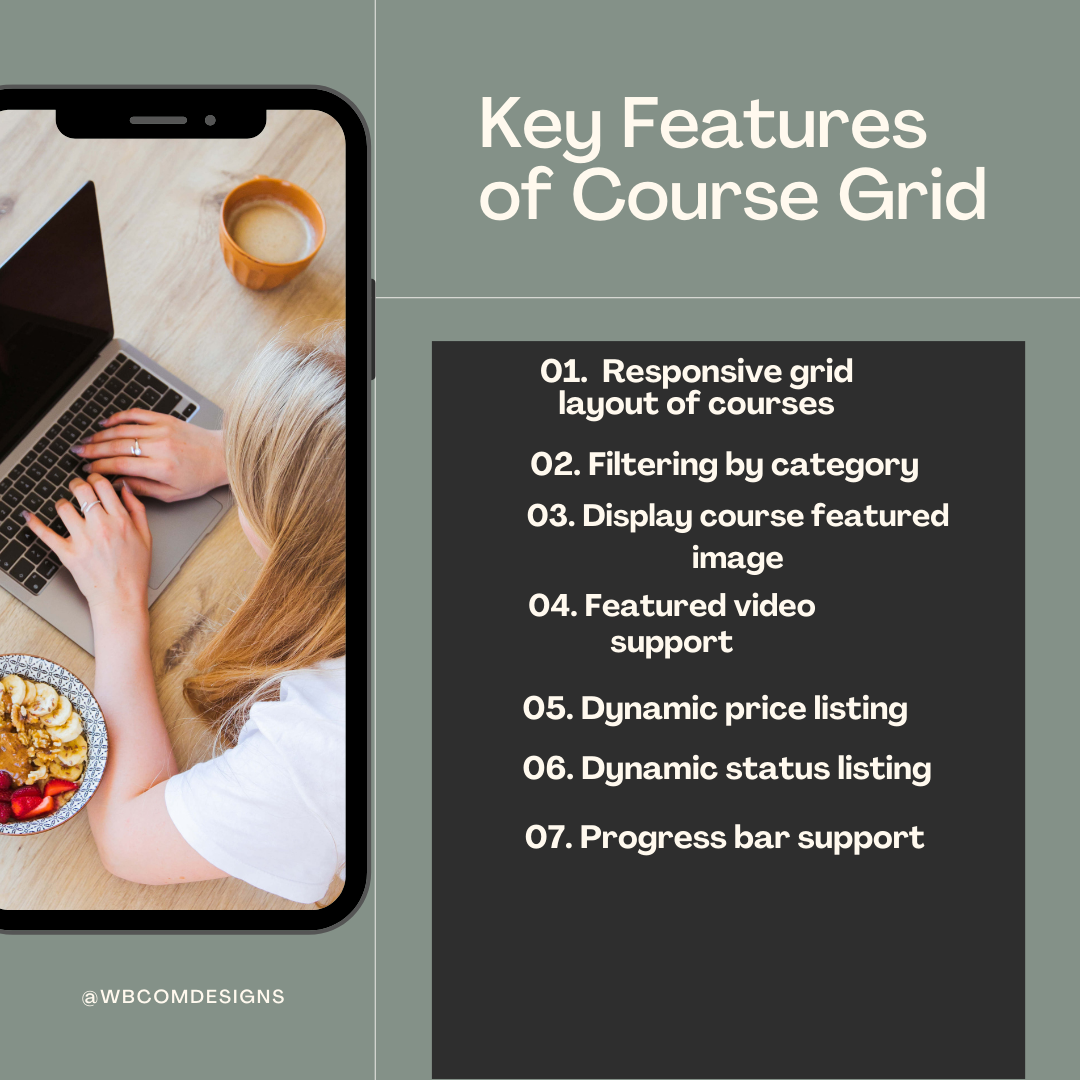
1. Responsive grid layout of courses: You can choose to display your courses in one, two, three, four, six, or twelve columns. Simply insert the shortcode onto a regular page or post and your courses will display.
2. Filtering by category: Easily allow users to search for courses by category using the category filter.
3. Display course featured image and short description: Courses are displayed with their featured image and a custom short description.
4. Featured video support: The ability to use a featured video instead of an image.
5. Dynamic price listing: The price of the course is automatically displayed.
6. Dynamic status listing: The price ribbon updates if a user has access to the course, displaying either “Enrolled” or “Completed.”
7. Progress bar support: The course grid can show the user’s course progress with a progress bar.
None of these features are locked behind confusing settings screens. Most of the configuration happens directly in the block or shortcode parameters, which means a site owner without development experience can still build a working catalog page in under half an hour. That matters more than it sounds, because a lot of course creators end up paying a developer for something they could set up themselves once they understand the options.
Also Read: AI-Powered Voice Assistants for Businesses
Why use LearnDash Course Grid?
1. Enhanced User Experience: By presenting courses in a visually appealing and organized grid layout, Course Grid enhances the overall user experience for learners. The intuitive navigation and filtering options make it easier for users to explore course offerings and select the ones that best align with their learning objectives.
2. Increased Engagement: A well-structured course grid captures learners’ attention and encourages them to explore multiple courses within your e-learning platform. The ability to preview course details and filter options empowers learners to make informed decisions, leading to increased engagement and participation.
3. Efficient Course Management: For administrators, LearnDash Course Grid simplifies course management tasks by providing a centralized platform to organize and showcase courses. The automated updates and customization options streamline the process of creating and maintaining a comprehensive course catalog.
There is a fourth reason worth calling out on its own: search engines tend to reward pages that link out to well-organized internal content. A course grid page with real filtering, real thumbnails, and clean URLs per course gives Google more to index and more reasons to treat your site as a legitimate education resource rather than a thin landing page.
How to use Learndash course grid?
To use the Learndash Course Grid, we first need to install it.
Installation
1: Add-ons Menu (requires an active LearnDash license)
1. In your WordPress admin area, navigate to LEARNDASH LMS > ADD-ONS.
2. Locate the LearnDash Course Grid add-on and click Install Now.
3. Click the Activate Plugin button.
2: Manual Upload
1. Download the plugin file (you must be logged in to do so).
2. In WordPress, navigate to PLUGINS > ADD NEW.
3. Click Upload Plugin and Browse for the.zip file you downloaded in Step 1.
4. Click Install Now and Activate Plugin after the plugin.
If you manage more than one LearnDash site, the manual upload route is usually faster once you already have the zip saved locally, since you skip re-authenticating against your LearnDash account on every install. Either method works fine for a single production site; the add-ons menu route is simpler for a first-time setup because it handles version checks for you.
Also Read: Best Business Process Management Software
Using the Course Grid
There are three ways in which you can add a grid to any page on your LearnDash site:
1. Block
1. First, make sure that the plugin is activated and then visit the page where you want to add this plugin.
2. Click the + icon to add a new block, search for “LearnDash Course Grid,” and click on the block to insert it.
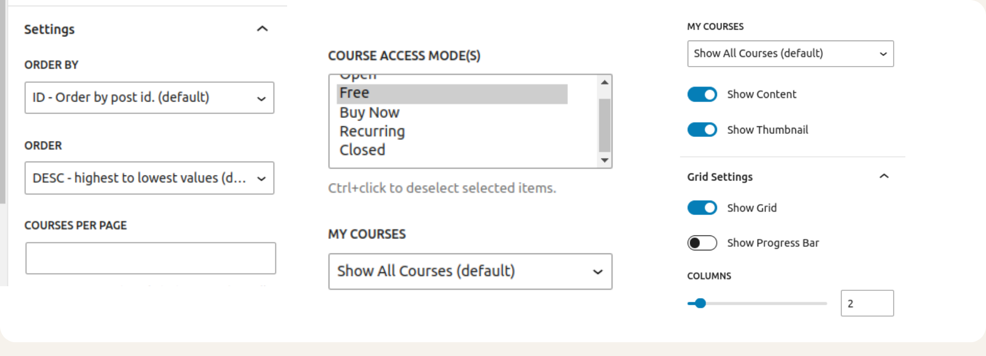
3. Now you can customize it to your requirements. The features that you can customise are as follows:
i) Order by: It shows how the results are ordered by. The default is ID.
ii) Course Per page: Number of posts per page. The default is 4.
iii) Order: How the results are ordered. Accepts ASC (ascending) or DESC (descending). The default is DESC.
iv) Enrollment status: Accepts enrolled, not-enrolled, or empty values. The default is empty, which means all statuses.
v) Progress status: accepts completed, in_progress, not_started, or empty values. The default is empty, which means all statuses.
vi) Show Content and Show Thumbnail: You can choose to show thumbnail, content or both.
vii) Course access mode: You can choose to show only free, buy now, open, recurring or closed.
2. Shortcode
You can also use shortcodes to use the LearnDash Course Grid on your page or post. You can find all the shortcodes here.
The course grid looks something like this on the BuddyX Pro theme page.

3. Widget
Beyond the block and shortcode routes, Course Grid also ships as a standard WordPress widget. Go to Appearance > Widgets, find “LearnDash Course Grid” in the widget list, and drag it into any active widget area your theme supports, such as a sidebar or footer column. This is a handy option if you want a compact preview of a few featured courses on a non-course page, like your homepage, rather than the full catalog.
Styling and Customizing Your Grid
The default grid styling is clean but generic, and most site owners end up adjusting it to match their brand. A few practical tweaks worth knowing:
Column count by device: Six or twelve columns can look great on a wide desktop monitor and completely unreadable on a phone. Test your chosen column count at a 390px viewport before publishing, and drop to two or three columns for smaller layouts if the theme does not handle the reflow automatically.
Custom CSS hooks: Course Grid outputs predictable class names on each card, price ribbon, and progress bar, which means you can target them with a small custom CSS snippet in the WordPress Customizer without touching the plugin’s core files. This is the safest way to adjust card spacing, border radius, or font sizing to match your site’s design system.
Featured video thumbnails: If you enable featured video instead of a static image, keep clips short. A grid full of auto-loading video previews can slow page load meaningfully, especially on mobile connections, so many sites use a static thumbnail with a small play icon overlay instead and reserve the video for the individual course page.
Category filter placement: By default the filter bar sits above the grid. On category-heavy catalogs with a dozen or more course types, consider pairing it with a search box or grouping categories into parent/child pairs, otherwise the filter list itself becomes another wall of text learners have to scan.
Common Use Cases
Corporate training teams use Course Grid to organize onboarding paths by department, filtering compliance courses separately from skills development so new hires are not overwhelmed by the full catalog on day one. Independent instructors selling cohort-based courses use it to show enrollment status at a glance, so returning students immediately see which course they are mid-way through instead of hunting through email confirmations.
Membership sites that bundle LearnDash with community features often place the grid on the main dashboard a member lands on after logging in, right next to activity feeds or group directories. Educational institutions running multiple certificate tracks use the category filter to separate tracks by department or credential level, which keeps a five-hundred-course catalog from becoming an unmanageable scroll.
Course Grid vs. the Default Course List
LearnDash ships with a built-in archive page that lists courses in a simple stacked format. It works, but it was never designed to sell a catalog the way a storefront does. The default list shows a title, sometimes a thumbnail, and a link, in a single column that scrolls indefinitely as your catalog grows. There is no built-in category filter, no progress indicator, and no way to switch between grid densities depending on screen size.
Course Grid replaces that experience with something closer to what learners already expect from any modern subscription platform. The visual difference alone tends to raise time-on-page and click-through to individual course pages, simply because a grid with images and short descriptions gives a visitor more to evaluate at a glance than a bare list of titles. For catalogs under ten courses the difference is smaller. Past twenty or thirty courses, the default list becomes genuinely hard to browse, and the filtering built into Course Grid stops being a nice-to-have and starts being the thing that keeps visitors from bouncing.
Measuring Whether Your Grid Is Working
Once the grid is live, it is worth tracking a few numbers rather than assuming it is helping. Compare the bounce rate on your catalog page before and after switching to the grid layout using your analytics tool of choice. Watch which categories get filtered most often, since that tells you which subjects visitors are actually interested in, and can guide which new courses you build next. If you have course pricing visible in the grid, keep an eye on whether visitors who filter by a specific category convert to enrollment at a different rate than visitors who browse the full unfiltered list, since that can reveal whether your category taxonomy actually matches how people search for your content.
A simple but effective habit is reviewing the grid on a real phone once a month, not just in a browser’s device emulator. Font rendering, tap target spacing, and image loading speed can all drift slightly after theme or plugin updates, and catching that early is much cheaper than losing enrollments to a broken mobile layout nobody noticed for weeks.
Accessibility Considerations
A visual grid is only as good as its accessibility. Make sure every course thumbnail has meaningful alt text rather than being left blank, since screen reader users rely on that description to understand what each card represents before deciding whether to open it. Check that the category filter is operable by keyboard alone, tabbing through each option and confirming focus is visible, not just relying on mouse hover states. If you use color to indicate enrollment status, such as a green ribbon for “enrolled,” pair it with text as the add-on already does by default rather than color alone, since a portion of your learners may not perceive that color distinction.
Troubleshooting Common Issues
A few problems come up often enough to be worth listing directly. If courses are not appearing in the grid, check that they are published rather than in draft, and confirm the enrollment/progress filter parameters are not accidentally excluding them. If styling looks broken after a theme update, clear any page caching plugin and your CDN cache, since Course Grid’s CSS is enqueued conditionally and a stale cached page can serve outdated markup. If the featured image is missing on a course card, make sure a featured image is actually set on that specific course post, since Course Grid does not generate a placeholder automatically in every theme.
Pairing Course Grid with BuddyX
LearnDash Course Grid stands as a cornerstone for modern e-learning platforms, offering a wealth of features and benefits that streamline course management and enhance user engagement. By using LearnDash Course Grid well, administrators can create visually appealing course catalogs, simplify enrollment processes, and provide learners with a seamless navigation experience across devices.
Whether you’re a solo instructor, a corporate training department, or an educational institution, integrating “LearnDash Course Grid” and “BuddyX free” into your e-learning platform can elevate your offerings and enrich the learning experience. BuddyX is built with community-driven sites in mind, so a course grid sits naturally alongside member profiles, groups, and activity streams rather than feeling bolted onto a generic theme. If you want a deeper level of layout control and want to take full ownership of your site’s design, try BuddyX Pro, which adds extra header and layout options that make a course catalog page feel like a purpose-built part of the site rather than an add-on.
Frequently Asked Questions
Does Course Grid work with LearnDash’s free plan? No. Course Grid is an official LearnDash add-on that requires an active LearnDash LMS license to install through the Add-ons menu, though the manual upload method still requires you to have purchased access to download the plugin file.
Can I run more than one grid on the same page? Yes, you can insert multiple blocks or shortcodes with different filter parameters, for example one grid showing only “enrolled” courses and a second showing the full catalog below it.
Does the grid affect SEO negatively? Not inherently. Since each course still has its own URL and the grid simply links out to those pages, it functions as an internal linking hub. Just make sure course descriptions used in the grid are not pure duplicates of thin content elsewhere on the site.
Is coding required to customize the look? Basic column and filter changes need no code at all. Deeper visual customization benefits from a bit of CSS knowledge, but nothing beyond what a site owner comfortable with the WordPress Customizer could pick up in an afternoon.
What happens if I deactivate the plugin later? Your courses, enrollments, and progress data all live in LearnDash itself, not in Course Grid. Deactivating the add-on just removes the grid display option; any shortcode or block left on a page will simply stop rendering until you reactivate it or replace it with the default course list.
Can I sort courses manually instead of by date or ID? The built-in order options cover ID, title, date, and menu order, so if you want a specific hand-picked sequence, set the “menu order” field on each course under the page attributes panel and choose menu order as your sort option in the grid settings.
Planning Your Catalog Structure Before You Launch
Before publishing a grid page, it helps to spend a little time on the taxonomy itself rather than jumping straight to layout settings. List every course you currently offer, or plan to offer within the next few months, and group them into categories a first-time visitor would actually recognize, not internal naming conventions that only make sense to your team. A category labeled “Track 3B” means nothing to a stranger; “Beginner Web Design” does.
Keep the number of top-level categories manageable, generally under eight, and use subcategories sparingly if your catalog is still under fifty courses. A filter bar with thirty options defeats the purpose of filtering in the first place. Once the structure is set, apply it consistently to every course before turning the grid on, since a handful of miscategorized courses is one of the most common reasons visitors report “not finding” something that was actually on the site the whole time.