
Color Scheme - Site Skin
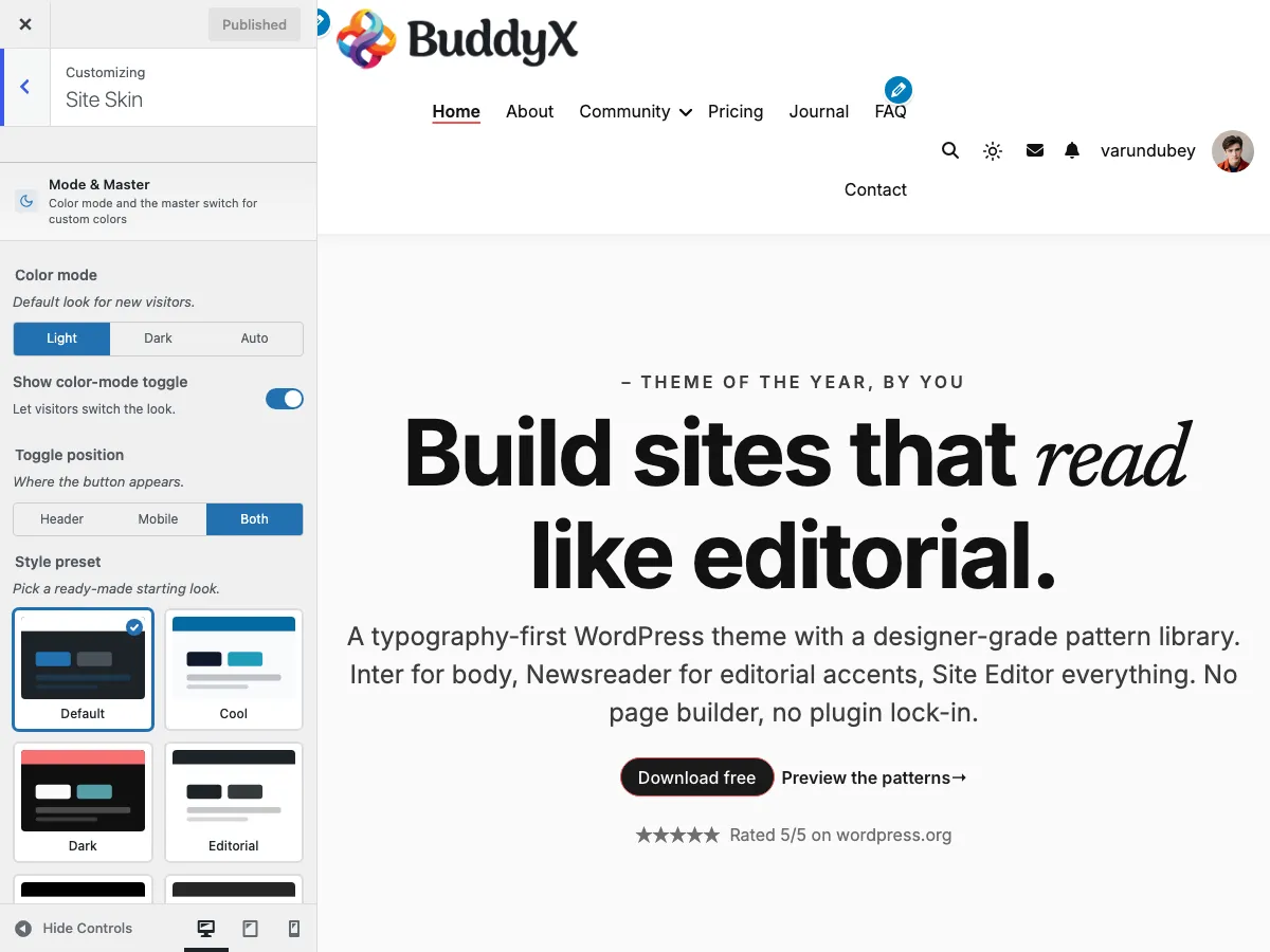
Free themeThe Site Skin panel at Appearance -> Customize -> Site Skin is where you control every color on your site. BuddyX gives you two approaches:
- Pick a style preset - Default + 8 presets (9 options), one click. Fastest path.
- Set custom colors - 50+ individual color settings if you need precise brand matching.
Both approaches work together. A preset sets a starting palette; any custom color you set overrides the preset for that specific element.
Quick start: Most sites only need to set 1-3 colors. The defaults already look good and meet WCAG-AA contrast. If you're in a rush, just pick a style preset and call it done.
Path 1 - Style presets (fastest)
BuddyX ships Default + 8 presets (9 options):
| Preset | Palette feel |
|---|---|
| Default | BuddyX red (#ef5455) on soft-gray surfaces |
| Cool | Sky-blue accents on cool-gray surfaces |
| Dark | Light text on near-black surfaces (designed as a starting point for dark-first sites) |
| Editorial | Restrained, magazine-style palette with strong contrast |
| Minimal | Subtle accents, pared-down color use |
| Monochrome | Black, white, and grays - no chromatic accents |
| Pastel | Soft pastel palette with gentle contrast |
| Vibrant | Saturated, energetic accent colors |
| Warm | Earthy reds, oranges, and warm grays |
How to apply a preset
- Appearance -> Customize -> Site Skin
- Find the Style preset picker (swatches at the top of the panel)
- Click a preset - preview updates immediately
- Click Publish
Each preset card previews the palette before you pick, so you can see what you're getting.
Custom colors win over presets
If you've already set custom colors and then apply a preset, your custom colors still take priority for those specific elements. The preset acts as the "starting layer"; the customizer is the "fine tune layer" on top.
This means you can:
- Set your brand primary color manually
- Then pick a preset for everything else
- Your brand color stays; the preset only affects elements you didn't customize
Path 2 - Custom colors (precise brand match)
When you need an exact brand color, set the Site Primary Color first:
- Appearance -> Customize -> Site Skin -> Brand -> Site Primary Color
- Pick your brand color (e.g.,
#0066CC) - Click Publish
The primary color is the most influential single setting - it controls:
- Buttons (background, border, hover)
- Menu hover + active states
- Link hover
- Site title hover
- Footer / copyright link hover
- Site loader background
For most sites, just changing Site Primary Color is enough - every other color is set to a sensible default that pairs with the primary.
When to go deeper
If you need finer control, BuddyX exposes 50+ individual color settings organized into clusters:
Cluster 1 - Color Mode (4 settings)
| Setting | Default | What it does |
|---|---|---|
| Default color mode | Light | Light / Dark |
| Show color-mode toggle | On | Sun/moon button visitors can use to switch |
| Toggle position | Both | Header / Mobile / Both |
| Style preset | Default | Default + 8 presets (9 options), see above |
See Dark Mode for details.
Cluster 2 - Brand (1 setting)
| Setting | Default | Used for |
|---|---|---|
| Site Primary Color | #ef5455 |
Buttons, menu hover, link hover, brand accents everywhere |
Cluster 3 - Body (7 settings)
| Setting | Default | Used for |
|---|---|---|
| Body background color | #f7f7f9 |
Main page background |
| Content background color | #f7f7f9 |
Behind post/page content |
| Box background color | #ffffff |
Cards, post boxes, panels |
| Secondary background color | #fafafa |
Subtle alternate-row backgrounds |
| Body text color (under Typography) | #505050 |
Paragraph and body text |
| Site links color | #111111 |
Default link color |
| Site links hover color | #ef5455 |
Link hover (inherits primary) |
Cluster 4 - Headings (6 settings)
| Setting | Default | Used for |
|---|---|---|
| H1 color | #111111 |
Page titles, single-post titles |
| H2 color | #111111 |
Section headings |
| H3 color | #111111 |
Sub-section headings |
| H4 color | #111111 |
Smaller headings |
| H5 color | #111111 |
Very small headings |
| H6 color | #111111 |
Smallest headings |
Most sites set all six to the same color. Set per-level only if you want a visual hierarchy beyond size alone.
Cluster 5 - Header (8 settings)
| Setting | Default | Used for |
|---|---|---|
| Header background color | #ffffff |
Top header bar background |
| Site title color | #111111 |
Text site title (if no logo) |
| Site title hover color | #ef5455 |
Hover state |
| Tagline color | #757575 |
Tagline below title |
| Menu text color | #111111 |
Primary menu links |
| Menu hover color | #ef5455 |
Menu link hover |
| Menu active color | #ef5455 |
Current-page menu link |
| Sub-header text color | #111111 |
Optional secondary header row |
Cluster 6 - Buttons (6 settings)
| Setting | Default | Used for |
|---|---|---|
| Button background | #ef5455 |
All primary buttons |
| Button background hover | #f83939 |
Hover state |
| Button border | #ef5455 |
Outline buttons |
| Button border hover | #f83939 |
Outline hover |
| Button text | #ffffff |
Button label |
| Button text hover | #ffffff |
Hover label |
Contrast tip: button text on button background must meet WCAG-AA contrast (4.5:1 for normal text, 3:1 for large text). The defaults pass. If you customize, test with a tool like WebAIM Contrast Checker.
Cluster 7 - Footer (4 settings)
| Setting | Default | Used for |
|---|---|---|
| Footer title color | #111111 |
Widget titles in footer |
| Footer content color | #505050 |
Footer widget text |
| Footer links color | #111111 |
Widget links |
| Footer links hover color | #ef5455 |
Link hover |
Footer background is set via Customize -> Site Footer -> Background (a background image / color combo, not just a color).
Cluster 8 - Copyright (5 settings)
| Setting | Default | Used for |
|---|---|---|
| Copyright background | #ffffff |
Bottom copyright bar background |
| Copyright border | #e8e8e8 |
Top border separating from footer |
| Copyright content | #505050 |
Copyright text |
| Copyright links | #111111 |
Links in copyright bar |
| Copyright links hover | #ef5455 |
Hover state |
"Set Custom Colors" toggle
Under Customize -> Site Skin there's a Set Custom Colors? switch (default Yes).
- Yes - the custom color settings above are exposed and applied.
- No - the customizer hides individual color settings; the theme uses its built-in palette (or the active style preset's palette) only.
Leave this On for most sites. Turn off only if you want to deliberately constrain yourself / a junior editor to the preset palettes.
How colors are wired internally
For developers + curious users:
BuddyX 5.1.0 uses CSS custom properties (design tokens) to keep colors consistent. The Customizer values you set get converted into tokens like:
--bx-color-primary<- Site Primary Color--bx-color-bg-body<- Body Background--bx-color-text-primary<- Body Text color--bx-color-button-bg<- Button background- ...etc.
These tokens cascade through every stylesheet. When you change a color in the Customizer, only the token's value updates - every place that uses the token updates automatically.
This is also why dark mode can flip colors smoothly: dark mode swaps the same tokens to dark values. No double-set-everything-twice required.
See Design Tokens reference for the full token list.
Common scenarios
"I want my brand color everywhere - buttons, links, hover"
Set Site Primary Color. Everything else inherits automatically. Don't fiddle with individual button/link/hover settings unless you need a different shade.
"I want a dark mode with my own colors"
BuddyX free uses a theme-controlled dark palette - when dark mode is active, the theme applies a near-black background with light text. You can't set per-element dark colors in the free Customizer.
If you need full dark-mode color control, BuddyX Pro adds 30+ dark_* Customizer fields for that purpose. Or use a child theme to override the dark tokens directly.
"I want consistent colors across blog + BuddyPress + WooCommerce"
BuddyX is built on a single token system - every surface (blog, community, shop) reads from the same --bx-color-* tokens. Set your colors once; they apply everywhere.
"My color change isn't appearing"
See Troubleshooting -> I changed a Customizer setting but the front-end didn't update. Most often it's caching.
Related
- Dark Mode - color mode + visitor toggle
- Customize your colors and fonts - walkthrough for customizing brand colors and fonts (heading colors are in Site Skin, font choices are in Customize -> Typography)
- Design Tokens reference - full
--bx-color-*token list (for developers)