
Mobile Header
Pro featureYour mobile header is what visitors see on smartphones and tablets. BuddyX Pro switches from the full desktop menu to a hamburger menu automatically, and gives you one control over exactly when that switch happens: the Hamburger Menu Breakpoint.
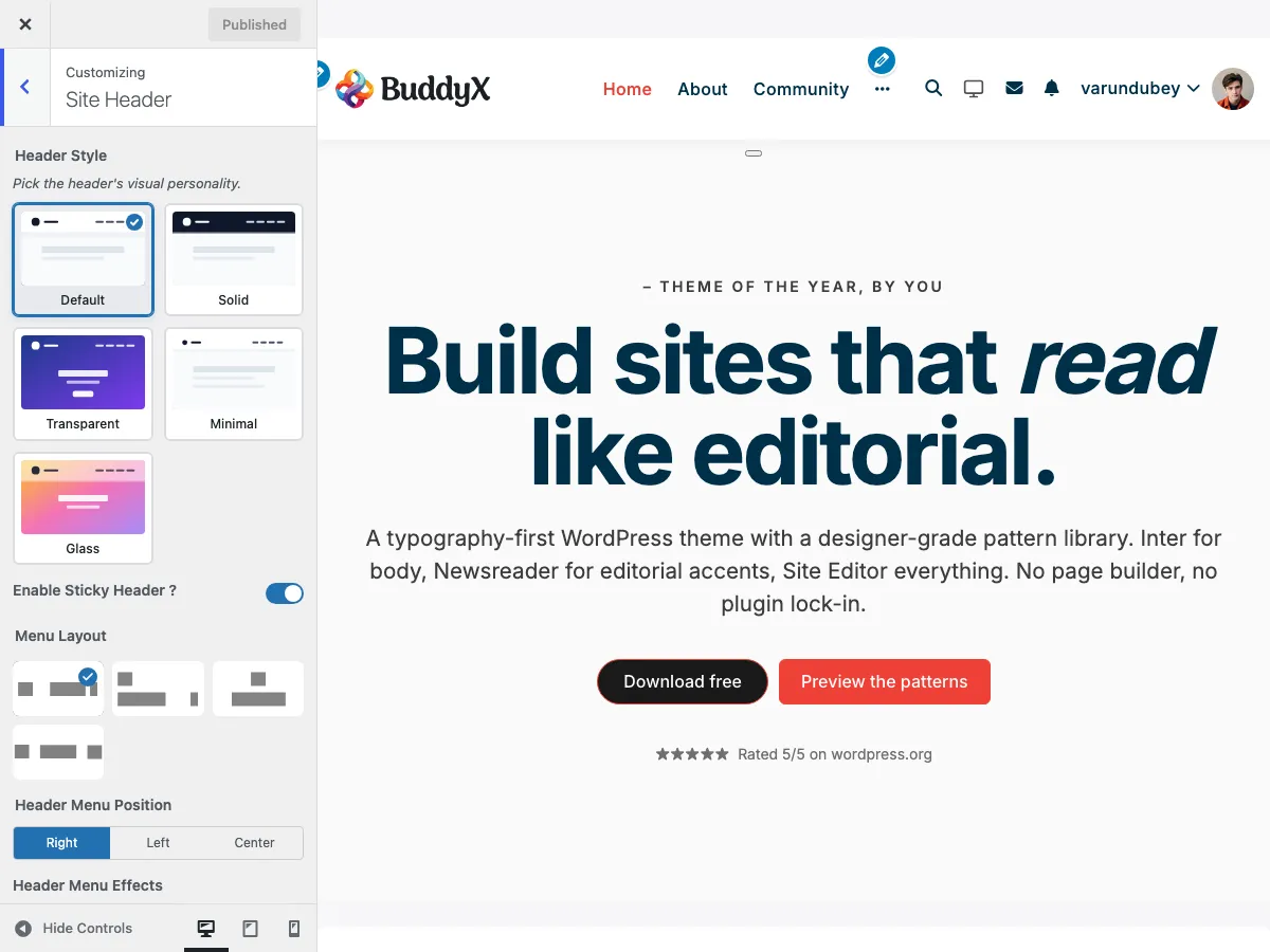 Header configuration options in the Site Header section of the Customizer
Why Mobile Header Matters
- Over 60% of web traffic comes from mobile devices
- First impression on mobile affects engagement
- Easy navigation reduces bounce rates
- Mobile-friendly design impacts SEO rankings
What You Can Customize
BuddyX Pro's mobile header behaviour is intentionally simple. The one dedicated mobile control is the Hamburger Menu Breakpoint slider in the Site Header section. The mobile menu itself is populated by dedicated Mobile Menu navigation locations you assign under Appearance > Menus.
Hamburger Menu Breakpoint
The Hamburger Menu Breakpoint slider sets the screen width, in pixels, where the header switches from the full desktop menu to the hamburger menu.
| Setting | Setting ID | Range | Default |
|---|---|---|---|
| Hamburger Menu Breakpoint | site_hamburger_menu_breakpoint |
768px to 1600px | 768px |
How to set it:
- Go to Appearance > Customize and open the Site Header section
- Drag the Hamburger Menu Breakpoint slider to your preferred width
- Click Publish
Raise the breakpoint if your menu has many items and starts to wrap on tablets - the hamburger will then kick in earlier (on wider screens) and keep the header tidy. Below the chosen width the desktop menu collapses into the hamburger; at or above it, the full menu shows.
The Hamburger Menu
When the viewport is narrower than the breakpoint, a hamburger icon (three horizontal lines) appears. Tapping it opens the mobile navigation. The icon, panel, and animation are handled by the theme automatically - there are no separate style, size, or panel controls in the Customizer.
Mobile Menu Content
The mobile menu is driven by dedicated navigation menu locations, so you can show a different menu on mobile than on desktop. Assign menus under Appearance > Menus > Manage Locations:
| Location | Shown To |
|---|---|
| Mobile Menu - Logged in users | Logged-in visitors on mobile |
| Mobile Menu - Logged out users | Logged-out visitors on mobile |
If no mobile menu is assigned, the theme falls back to your Primary menu.
To create a mobile-specific menu:
- Go to Appearance > Menus
- Create a new menu (for example, "Mobile Navigation")
- Add the links you want mobile visitors to see
- Assign it to Mobile Menu - Logged in users and/or Mobile Menu - Logged out users
- Save
Testing Your Mobile Header
Preview Methods
- Customizer Preview: use the responsive device icons at the bottom of the Customizer
- Browser DevTools: press F12 and toggle device mode
- Real Devices: test on actual phones and tablets
What to Check
| Check | Why It Matters |
|---|---|
| Breakpoint feel | Does the hamburger appear at the right width for your menu length? |
| Logo visibility | Can visitors identify your brand at mobile sizes? |
| Touch targets | Are the hamburger and menu links easy to tap? |
| Menu navigation | Can visitors reach all pages, including submenus? |
| Load speed | Does the header appear quickly? |
Common Questions
Can I change the width where the hamburger appears? Yes. That is exactly what the Hamburger Menu Breakpoint slider does (768px to 1600px, default 768px).
Can I show different menu items on mobile? Yes. Create a separate menu in Appearance > Menus and assign it to a Mobile Menu location.
Can I change the hamburger icon style or the panel animation? These are handled by the theme and are not exposed as Customizer controls. Custom CSS in a child theme can adjust them.
Why isn't my desktop menu collapsing on tablet? Your breakpoint may be set lower than the tablet width. Raise the Hamburger Menu Breakpoint so the hamburger kicks in on wider screens.
Related Settings
- Header Layout Styles - Desktop header options
- Header Elements - Elements in the header
- Sticky Header - Keep the header fixed while scrolling
- Topbar Settings - The bar above the main header
Got a question? We're a friendly team - happy to help.
- Visit our Documentation Portal
- Email us at support@wbcomdesigns.com