
Color Presets
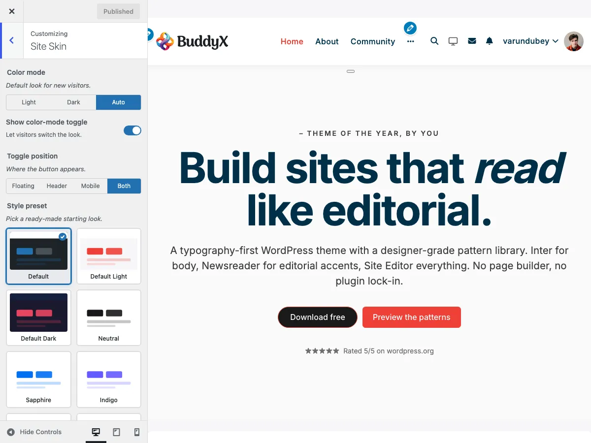
Pro featureApply one of 14 hand-tuned palettes with a single click. Each preset rewires the entire colour system - header, buttons, links, surfaces, body text, accent - and runs cleanly in both light and dark mode without any extra setup.
New in BuddyX Pro 5.1.0.
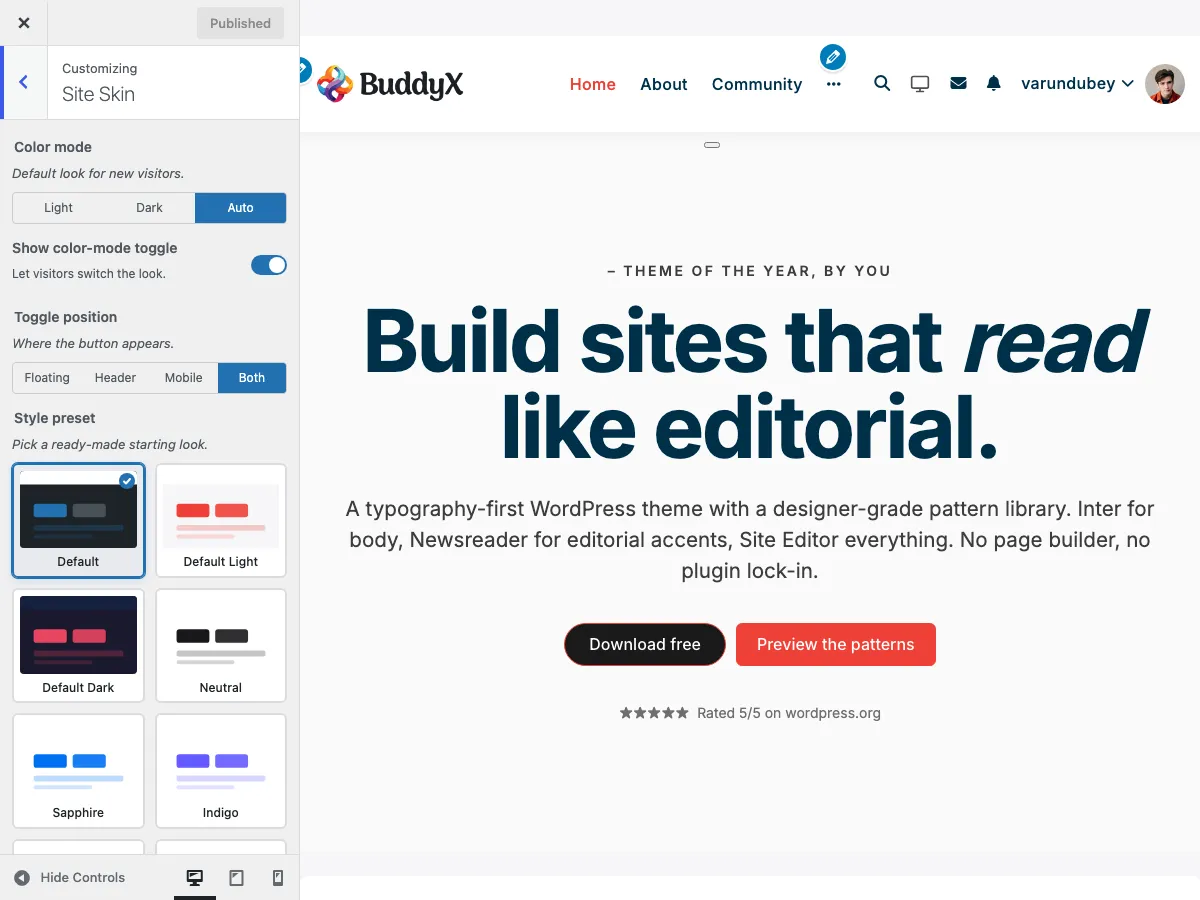 Default Light - the baseline preset BuddyX Pro ships with: neutral surfaces + the active accent colour.
What you can do
- Apply one of 14 brand-tested palettes from a visual swatch picker
- Switch between palettes without losing any other customizer setting (typography, layout, header style)
- Use the same preset across light + dark mode - the preset ships both halves so the colour mode toggle just works
- Override individual colours after picking a preset (the per-cluster Site Skin controls still take precedence over the preset)
Accessing color presets
- Appearance > Customize
- Open the Site Skin section
- Find the Style preset card grid (it sits right under the Color Mode toggle)
- Click any card. The preview updates immediately. Click Publish when you have the one you want.
Available presets (5.1.0)
| Slug | Name | Accent | Vibe |
|---|---|---|---|
default-light |
Default Light | active accent | Neutral surface + bright accent. The starting point. |
default-dark |
Default Dark | active accent | Same accent, dark surface. |
neutral |
Neutral | #18181b |
Greyscale interface, ideal for content-led products. |
sapphire |
Sapphire | #0070F3 |
Vercel-style bright blue. SaaS / developer tools. |
indigo |
Indigo | #635BFF |
Stripe-style indigo. Fintech / dashboards. |
cobalt |
Cobalt | #0C66E4 |
Atlassian-style cobalt. Productivity / B2B. |
trust |
Trust | #0530AD |
Deep navy. Banking / insurance / legal. |
commerce |
Commerce | #2A6E3F |
Forest green. Marketplaces / sustainability. |
signal |
Signal | #F22F46 |
High-contrast red. Alerts / news / emergency. |
coral |
Coral | #FF7A59 |
HubSpot-style warm coral. Marketing / hospitality. |
aubergine |
Aubergine | #4A154B |
Slack-style dark purple. Communities / collaboration. |
midnight |
Midnight | #1E3A5F |
Deep blue-grey. Editorial / publishing. |
stone |
Stone | #57534E |
Warm stone neutral. Wellness / lifestyle. |
carbon |
Carbon | #09090B |
Near-black. Premium / luxury. |
Preset previews
Default Light (neutral surface, light backgrounds):
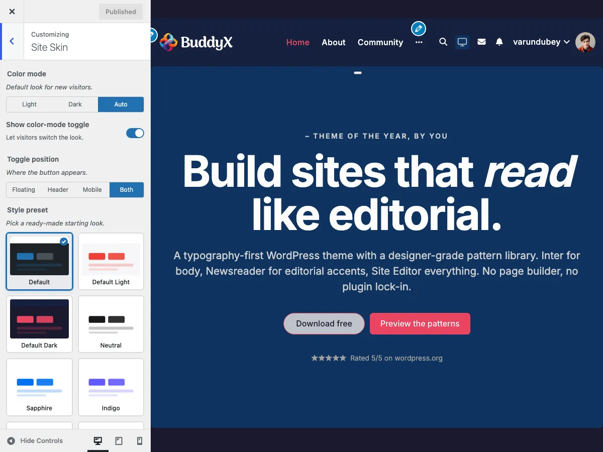
Default Dark (dark surfaces, same accent, recommended for night-first communities):
Sapphire (bright blue, SaaS-friendly):
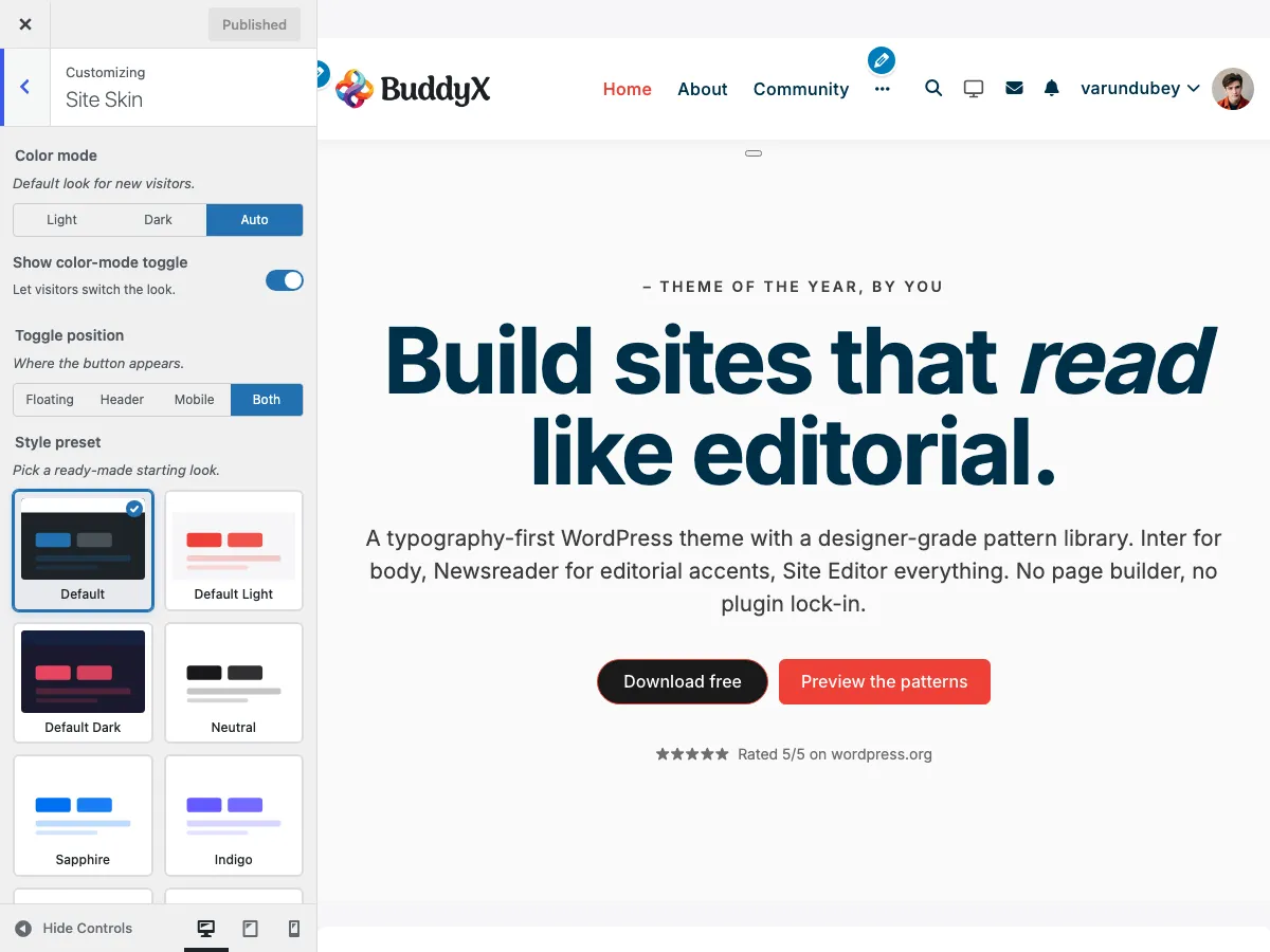
Indigo (rich purple-blue, fintech-friendly):
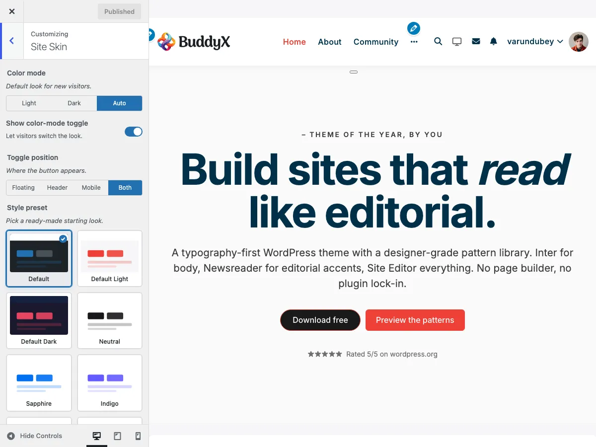
Coral (warm coral, marketing-friendly):
How presets interact with Color Mode
Each preset ships both a light variant and a dark variant. When the site default (site_color_mode) is Dark, or when a visitor toggles to dark mode, the matching variant kicks in - you do NOT need to pick a separate preset for dark mode.
If you want a different palette in dark mode (e.g. light = Coral, dark = Carbon), set the per-cluster Site Skin controls instead of a preset, since they accept independent light + dark values.
Customising after a preset
Picking a preset does NOT lock the colour controls. The per-cluster fields under Site Skin (Header BG, Body BG, Buttons, Side Panel, Footer, Copyright) take precedence over the preset's defaults. Workflow:
- Pick the closest-matching preset for the 95% case
- Open the per-cluster control for the colour you want different
- Pick the exact hex / RGBA value
- Save
The preset stays selected (the swatch card still has the check badge); the explicit overrides win on the frontend.
Resetting
The swatch grid's first card is Default (theme) - the empty preset. Pick it to clear your preset selection: it leaves your per-control Site Skin color settings untouched and lets the theme's built-in defaults paint. This is the built-in "reset to no preset" escape hatch.
To return fully to the theme baseline look, pick Default Light (or Default Dark) to re-apply the shipped palette, or pick Default (theme) and clear any per-cluster overrides you set.
Performance
Switching presets is a single theme_mod write. The Customizer Framework re-emits the CSS custom-property block on the next page render; no extra HTTP or DB hit per preset. Site Skin colours flow through the --bx-color-* token system documented in Theme Architecture.
Related
- Color Scheme - Per-cluster colour controls that override the preset
- Dark Mode - Color mode toggle + the light/dark variant pairing
- Typography Presets - The typography-side cousin of this picker
Got a question? We're a friendly team - happy to help. support@wbcomdesigns.com