
Border Radius & Styling
Pro featureControl how rounded or sharp the corners of your buttons, form fields, cards, and containers appear. BuddyX Pro exposes three global border-radius controls so you can match your site's shape language to your brand - a modern, soft look or a clean, sharp aesthetic.
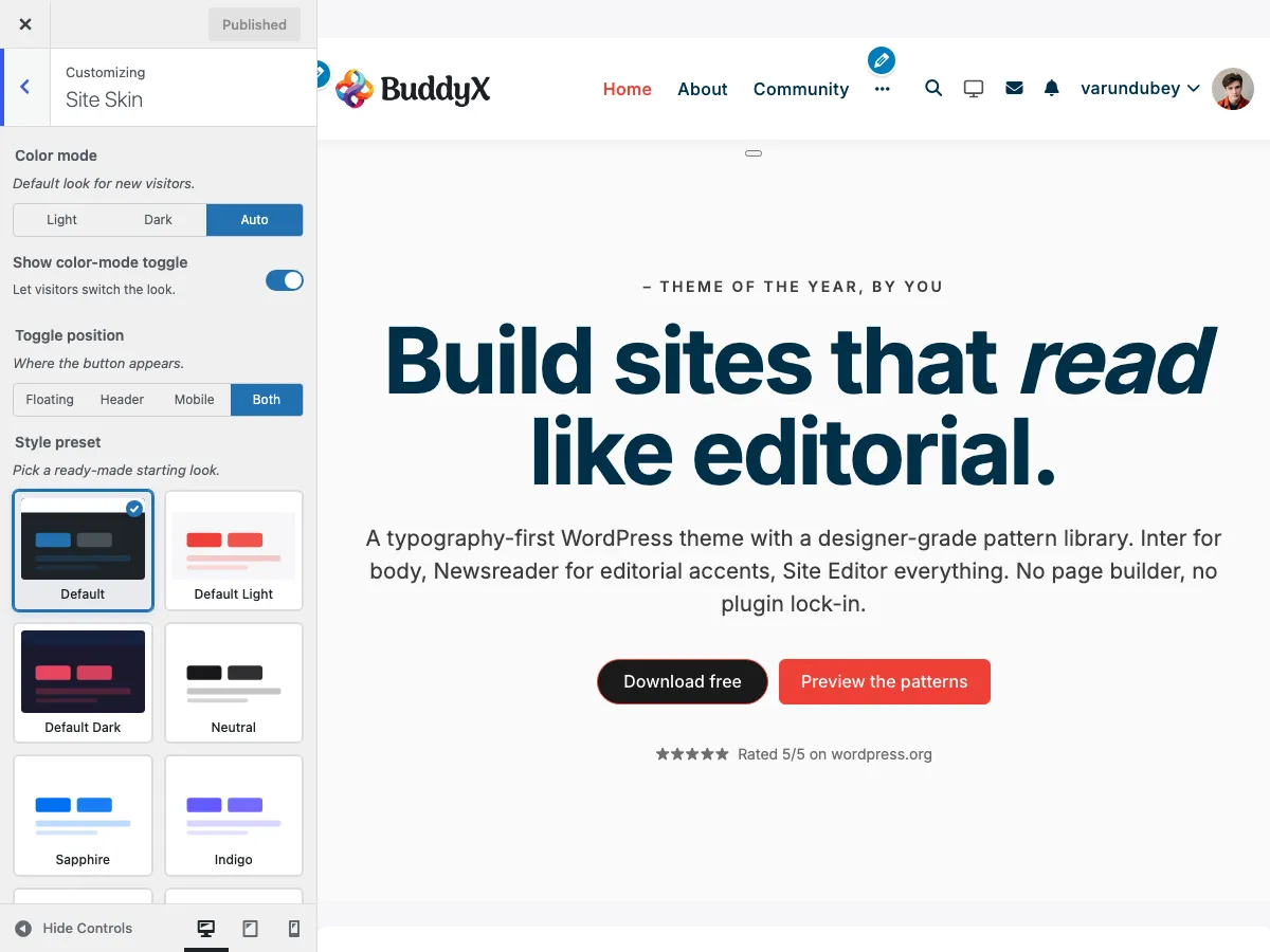 Border radius controls in the Site Layout section
What You Can Do
- Set a single global corner radius for content, cards, and containers
- Set a separate radius for buttons
- Set a separate radius for form fields (inputs and selects)
- Switch between modern (rounded) and traditional (sharp) designs instantly
What is Border Radius?
Border radius determines how rounded the corners of elements appear:
| Style | Radius | Visual Effect |
|---|---|---|
| Sharp (0px) | No rounding | Square corners, traditional look |
| Subtle (3-5px) | Slight rounding | Softened edges, professional |
| Moderate (8-12px) | Noticeable rounding | Modern, friendly appearance |
| Rounded (15-25px) | Heavy rounding | Soft, contemporary design |
| Pill (50px+) | Fully rounded | Capsule-shaped buttons and badges |
The three border-radius controls
BuddyX Pro ships exactly three border-radius controls. They all live in the same place - the Site Layout section, not a separate "Skin" panel.
- Go to Appearance > Customize
- Open General > Site Layout
- Scroll to the border-radius controls
Each control is a dimension field: type a pixel value such as 8px.
| Control | Key | Default | What it controls |
|---|---|---|---|
| Global Border Radius | site_global_border_radius |
8px | Content, cards, containers, images, and most other elements site-wide. |
| Buttons Border Radius | site_button_border_radius |
6px | All buttons across the site. |
| Form Border Radius | site_form_border_radius |
6px | Form elements (inputs, selects) - textareas are excluded. |
There is no separate control for images, avatars, cards, or badges. Those surfaces follow the Global Border Radius. Buttons and form fields are the only elements with their own dedicated control.
Global Border Radius
What it controls: content boxes, widget containers, post cards, images, and general elements.
| Setting | Appearance | Best For |
|---|---|---|
| 0px | Structured, grid-like | Minimal, editorial sites |
| 5-8px | Polished, professional | Business sites |
| 10-15px | Modern, clean | Contemporary designs |
| 20-25px | Soft, friendly | Creative, casual sites |
Examples affected:
- Blog post cards
- Widget containers
- BuddyPress activity items
- Member / group cards
- Course cards (LearnDash)
- Product cards (WooCommerce)
- Featured images and thumbnails
Buttons Border Radius
What it controls: every button across your site.
| Setting | Appearance | Best For |
|---|---|---|
| 0px | Square, traditional | Corporate, formal sites |
| 3-5px | Slightly softened | Professional businesses |
| 8-12px | Modern, approachable | Most websites |
| 20-30px | Pill-shaped | Creative, friendly brands |
Examples affected:
- Login / Register buttons
- Submit buttons on forms
- Call-to-action buttons
- BuddyPress action buttons (Follow, Join Group)
- WooCommerce Add to Cart buttons
Form Border Radius
What it controls: text inputs, select boxes, and search fields. (Textareas keep the theme default and are not affected by this control.)
| Setting | Appearance | Best For |
|---|---|---|
| 0px | Clean, sharp | Minimal designs |
| 3-4px | Subtle rounding | Professional forms |
| 6-8px | Friendly, modern | Most websites |
| 10-15px | Soft, welcoming | Creative sites |
Examples affected:
- Contact form fields
- Search boxes
- Login fields
- BuddyPress activity post box inputs
- WooCommerce checkout fields
Design Styles by Industry
Corporate & Professional (Sharp to Subtle)
Global:  5px
Buttons: 3px
Forms:   3px
Effect: Professional, structured, trustworthy. Works well for finance, legal, consulting, B2B sites.
Modern & Tech (Moderate Rounding)
Global:  12px
Buttons: 8px
Forms:   6px
Effect: Contemporary, clean, approachable. Perfect for tech companies, SaaS platforms, startups.
Creative & Friendly (Heavy Rounding)
Global:  22px
Buttons: 26px
Forms:   12px
Effect: Soft, welcoming, creative. Ideal for creative agencies, social platforms, lifestyle brands.
Minimal & Editorial (Sharp Edges)
Global:  0px
Buttons: 0px
Forms:   0px
Effect: Clean, structured, traditional. Great for news sites, magazines, portfolios, editorial content.
Social & Community (Balanced Rounding)
Global:  12px
Buttons: 10px
Forms:   6px
Effect: Friendly, modern, engaging. Perfect for BuddyPress communities, forums, social networks.
Quick Style Presets
Preset 1: Sharp & Professional
All three controls set to 0px for a traditional, structured look.
Use when: You want a serious, corporate, or editorial aesthetic.
Pairs well with:
- Trust color preset (deep navy)
- Carbon color preset (near-black, premium)
- Classic fonts (serif or traditional sans-serif)
Preset 2: Modern Standard (the theme default)
The values BuddyX Pro ships with:
- Global: 8px
- Buttons: 6px
- Forms: 6px
Use when: You want a contemporary, professional look that's still approachable.
Pairs well with:
- Sapphire or Cobalt color preset
- Default Light preset
- Sans-serif fonts
Preset 3: Soft & Friendly
Generous rounding for a welcoming feel:
- Global: 20px
- Buttons: 25px (pill)
- Forms: 12px
Use when: You want a creative, friendly, or casual community vibe.
Pairs well with:
- Coral preset
- Commerce preset (forest green)
- Rounded, friendly fonts
Consistency Tips
Match Your Brand Guidelines
If your logo or brand materials use:
- Sharp corners -> Use 0-5px across all three controls
- Rounded corners -> Use 8-15px
- Very rounded -> Use 15-30px
Keep It Consistent
Do:
- Keep buttons and forms within a few pixels of each other
- Match the global radius to your overall style
Avoid:
- Mixing sharp (0px) buttons with a heavily rounded (20px) global radius
- Drastically different values across the three controls
Test Across Your Site
After setting border radius, check:
- Homepage layout
- Blog post pages
- Form pages (contact, checkout)
- BuddyPress profiles and activity
- Shop pages (if using WooCommerce)
Impact on User Experience
Rounded Corners (8px+)
Benefits:
- Appears more modern and approachable
- Guides the eye naturally around elements
- Creates a friendlier, less formal impression
Best for: Social platforms, creative sites, modern businesses, casual communities
Sharp Corners (0-3px)
Benefits:
- Maximizes content space
- Creates a structured, organized feel
- Appears more traditional and serious
Best for: News sites, corporate platforms, editorial content, formal businesses
Combining Border Radius with Other Settings
With Color Presets
Rounded + Bright Colors = Friendly, energetic
Global / Buttons: 15-25px
Color Preset: Coral or Commerce
Sharp + Professional Colors = Corporate, trustworthy
Global / Buttons: 0-3px
Color Preset: Trust or Carbon
Moderate + Modern Colors = Contemporary, balanced
Global / Buttons: 8-12px
Color Preset: Sapphire or Indigo
With Typography
Rounded + Rounded Fonts = Very friendly (radius 15px+, fonts like Nunito or Quicksand).
Sharp + Geometric Fonts = Very structured (radius 0-3px, fonts like Montserrat or Roboto).
Mixed (Recommended) = Balanced (radius 8px, traditional sans-serif).
Mobile Considerations
Border radius can appear more pronounced on small screens:
- Avoid very large radius values (30px+) if buttons span the full mobile width
- Test tappable areas on touchscreens after changing values
Common Questions
Can I set a different radius for individual buttons?
The Buttons Border Radius control applies to all buttons. For specific buttons, use custom CSS or a child theme.
Is there a separate control for images, avatars, or badges?
No. Those follow the Global Border Radius. Only buttons and form fields have their own controls. (BuddyX Pro typically renders avatars as circles regardless.)
Are textareas affected by the Form Border Radius?
No. The Form Border Radius covers inputs and selects; textareas are intentionally excluded and keep the theme default.
Will changing border radius affect my site's speed?
No, border radius is a lightweight CSS property with no performance impact.
Can I use a different radius for light and dark mode?
No. Border radius applies to both modes; the shape stays consistent.
What if I don't see changes after adjusting?
Clear your browser cache (Ctrl+F5 or Cmd+Shift+R) and make sure you clicked Publish in the Customizer.
Troubleshooting
Changes Not Appearing
Problem: Adjusted border radius but elements look the same.
Solutions:
- Click Publish in the Customizer
- Clear browser cache (hard refresh)
- Check if custom CSS is overriding theme styles
- Disable caching plugins temporarily
Inconsistent Rounding
Problem: Some elements are rounded, others aren't.
Possible causes:
- Plugin styles overriding theme styles
- Custom CSS with higher specificity
- The element type isn't governed by one of the three controls
Solution: Use your browser's inspect tool to check which styles are applied.
Related Settings
- Color Presets - Complete your visual style
- Color Scheme Settings - Customize site colors
- Dark Mode - Color mode toggle and dark palette
- Typography Settings - Choose matching fonts
Got a question? We're a friendly team - happy to help.
- Visit our Documentation Portal
- Email us at support@wbcomdesigns.com