
Header Layout Styles
Pro featureBuddyX Pro gives you two independent header controls that work together: a Header Style preset (the header's visual personality) and a Menu Layout (how the logo and navigation are arranged). All header controls live in the flat, top-level Site Header section of the Customizer - there is no separate "Header" panel.
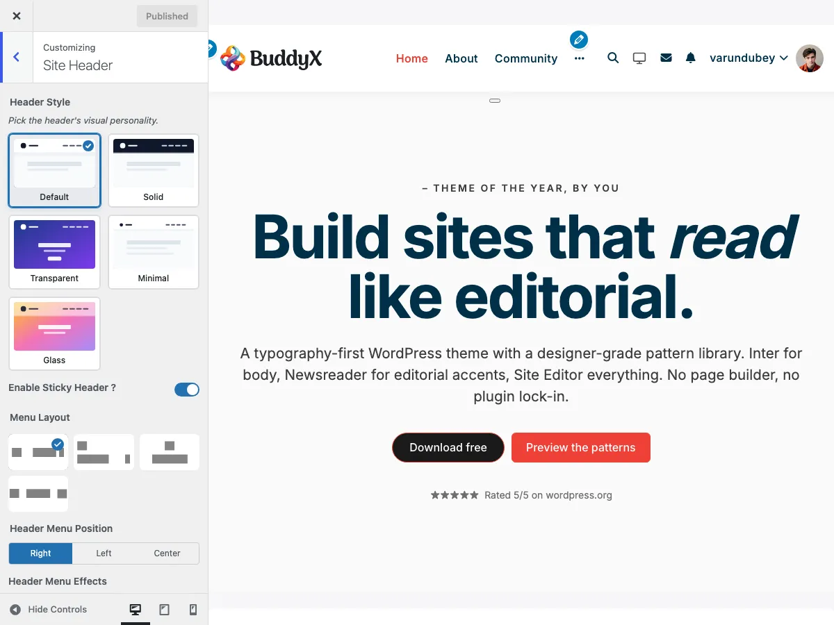 The Site Header section in the WordPress Customizer showing style and layout options
Accessing Header Settings
- Go to Appearance > Customize
- Open the Site Header section
Header Style (Visual Presets)
Header Style (site_header_style) sets the header's visual personality. It is a layer above the Menu Layout choice, so you can pair any menu layout with any style. There are five presets.
| Style | What It Does | Default |
|---|---|---|
| Default | The standard Pro header (solid background, soft shadow on scroll) | Yes |
| Solid | A flat colored bar with a 1px bottom border, no shadow | - |
| Transparent | Sits over a hero image or page cover with no background fill | - |
| Minimal | Thin, compact bar with a 1px divider | - |
| Glass | Frosted-glass effect: backdrop blur with a semi-transparent fill | - |
How to change:
- Go to Appearance > Customize and open the Site Header section
- Pick a swatch under Header Style
- Click Publish
Default keeps existing sites rendering exactly as before, so switching styles is always safe to preview and revert.
Menu Layout (Logo & Navigation Arrangement)
Menu Layout (site_header_layout) chooses one of four arrangements for the logo and navigation. In the Customizer this control is labelled Menu Layout and shown as four image swatches.
| Swatch | Value | Arrangement |
|---|---|---|
| Layout 1 | default |
Logo left, menu right (or repositioned via Header Menu Position) |
| Layout 2 | style_2 |
Logo left, menu on a full-width row below |
| Layout 3 | style_3 |
Logo centered, menu centered below |
| Layout 4 | style_4 |
Logo left, menu centered in the header |
Layout 1: Logo Left, Menu Right
The classic header layout with logo on the left and navigation aligned to the right.
Structure:
[Logo] .......................... [Primary Menu] [Icons]
Best For:
- Traditional business websites
- Corporate sites
- Most common layout expectation
- Sites with extensive navigation menus
Features:
- Logo positioned at far left
- Primary navigation aligned right
- Header icons (search, cart, notifications) after menu
- Clean, professional appearance
Layout 2: Logo Left, Menu Below
A two-row header with the logo on top left and navigation row below it.
Structure:
[Logo] ...................... [Header Icons/Search]
---------------------------------------------------
[Primary Menu - Full Width]
Best For:
- Large navigation menus (10+ items)
- Sites with prominent search functionality
- E-commerce sites with cart prominence
- Community sites with many navigation options
Features:
- Larger logo display area
- Full-width navigation bar below logo
- More space for header elements
- Clear visual hierarchy
Layout 3: Logo Center, Menu Below
A stacked layout with centered logo above centered navigation.
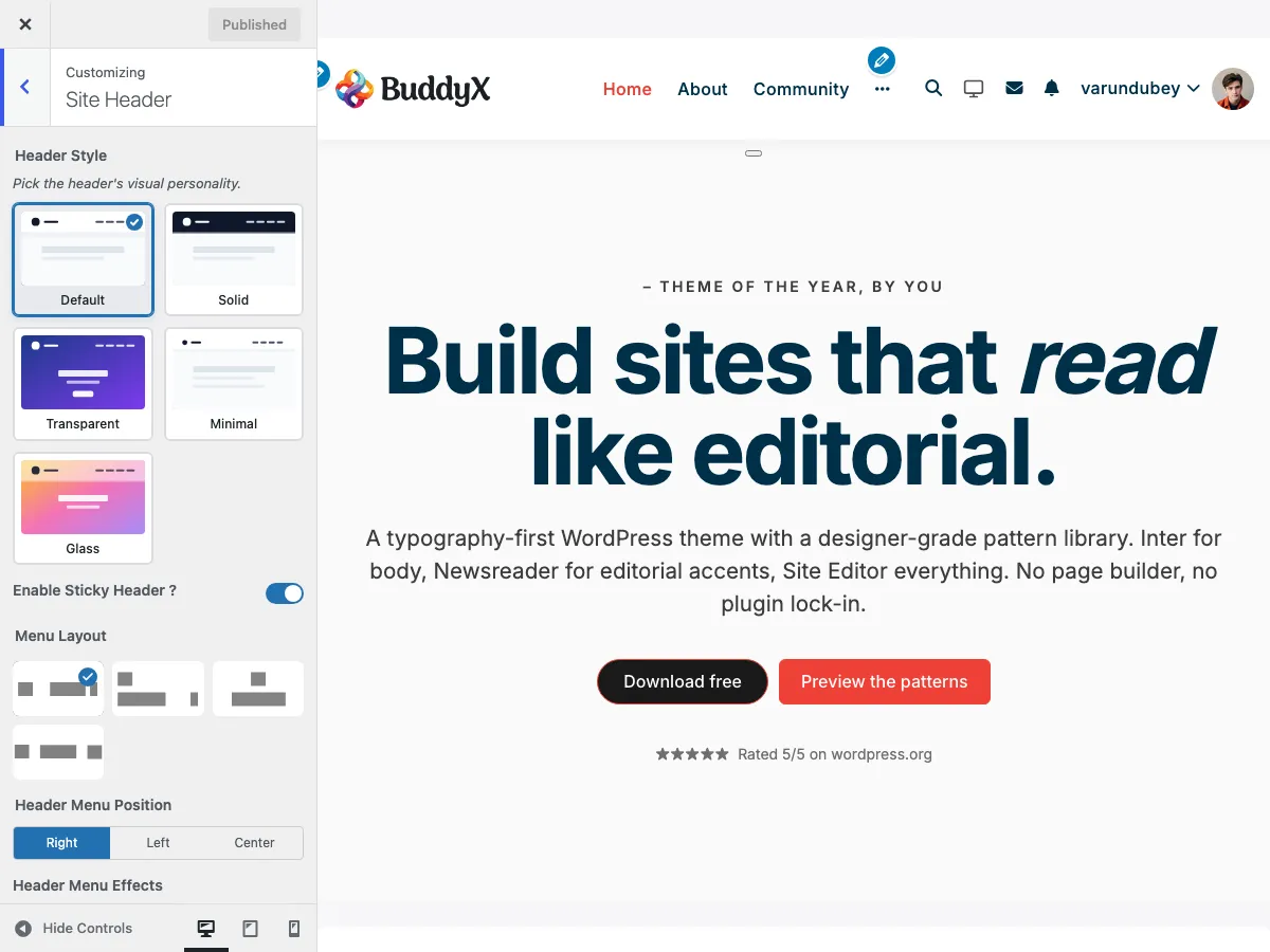 Layout 3 with centered logo and navigation menu below
Structure:
              [Logo]
---------------------------------------------------
         [Primary Menu - Centered]
Best For:
- Magazine-style sites
- Portfolio websites
- Blogs with strong branding
- Sites wanting maximum logo visibility
Features:
- Maximum logo prominence
- Centered visual balance
- Elegant, editorial feel
- Works well with horizontal logos
Layout 4: Logo Left, Menu Centered
A single-row layout with logo on the left and navigation menu centered in the header.
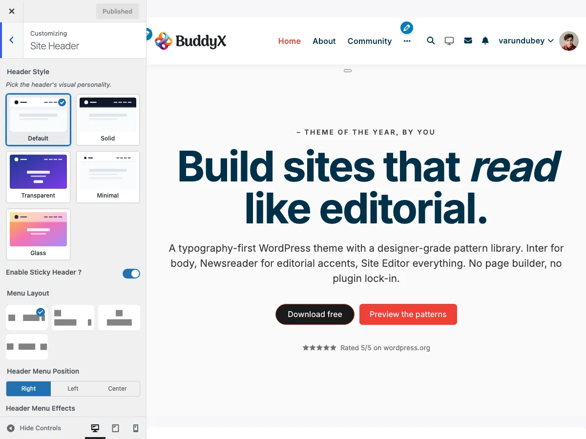 Layout 4 with logo on left and centered navigation menu
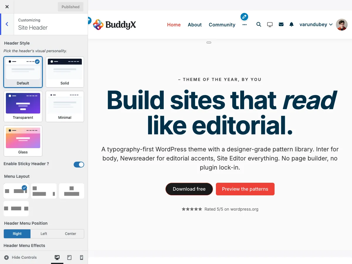 Close-up showing the centered menu alignment with logo and icons
Structure:
[Logo] ....... [Primary Menu - Centered] ....... [Icons]
Best For:
- Brand-focused websites
- Creative portfolios
- Sites wanting balanced visual appearance
- Modern, clean designs
Features:
- Logo positioned at left
- Menu items centered in available space
- Header icons on right
- Balanced, symmetrical look
Header Elements Configuration
Each layout supports configurable header elements:
Logo Settings
Logo image, size, and dark-mode logo are set in the WordPress Site Identity section, not in Site Header.
| Setting | Setting ID | Description | Location |
|---|---|---|---|
| Logo | custom_logo |
Primary logo upload | Site Identity |
| Logo Size | logo_size |
Desktop logo width (150-300px, default 150px) | Site Identity |
| Dark Mode Logo | dark_mode_logo |
Alternate logo for dark mode | Site Identity |
Navigation Settings
| Setting | Setting ID | Description | Default |
|---|---|---|---|
| Primary Menu | (Menus) | Main navigation menu, assigned to the "Primary - Logged in users" location | Assigned in Menus |
| Header Menu Effects | site_header_menu_effect |
Hover effect for menu items | No Effect |
Header Menu Position
When you use Layout 1 (Logo Left, Menu Right), the Header Menu Position control (site_header_menu_position) decides where the primary menu sits within the header bar.
| Option | Result | Default |
|---|---|---|
| Right | Menu aligned to the right of the header | Yes |
| Left | Menu aligned next to the logo on the left | - |
| Center | Menu centered in the available space | - |
This control only appears when Menu Layout is set to Layout 1 (default). The other layouts fix the menu position as part of their design.
Header Menu Effects
Add a hover effect to your navigation menu items via Header Menu Effects (site_header_menu_effect). Choose from four options:
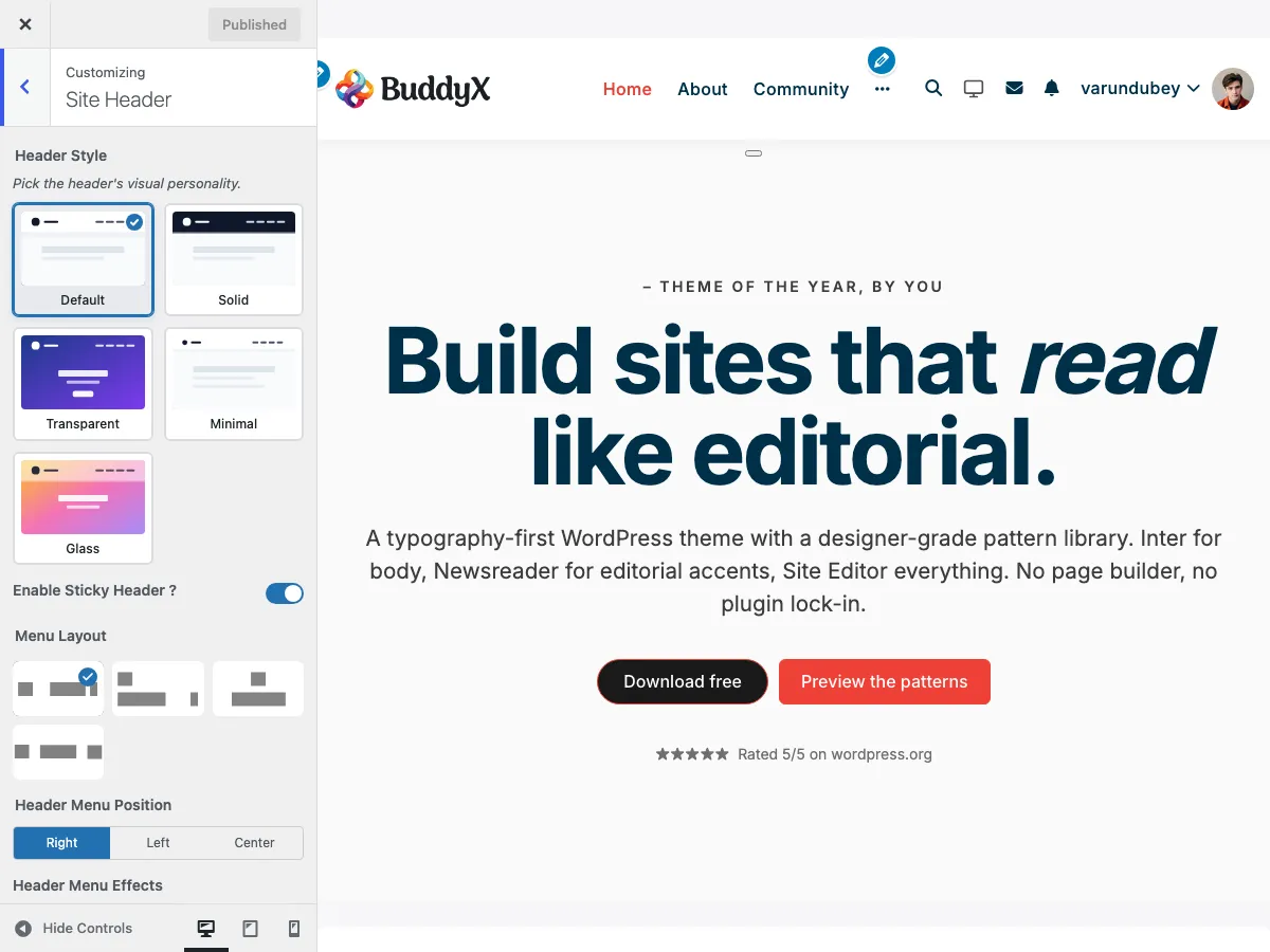 Effect 1: Dot indicator appears above the hovered menu item
| Effect | Description | Best For |
|---|---|---|
| No Effect | Standard hover (color change only) | Minimal, clean designs |
| Effect 1 | Dot indicator above menu item | Modern, subtle indication |
| Effect 2 | Underline animation | Professional, corporate sites |
| Effect 3 | Brackets around menu item | Creative, unique styling |
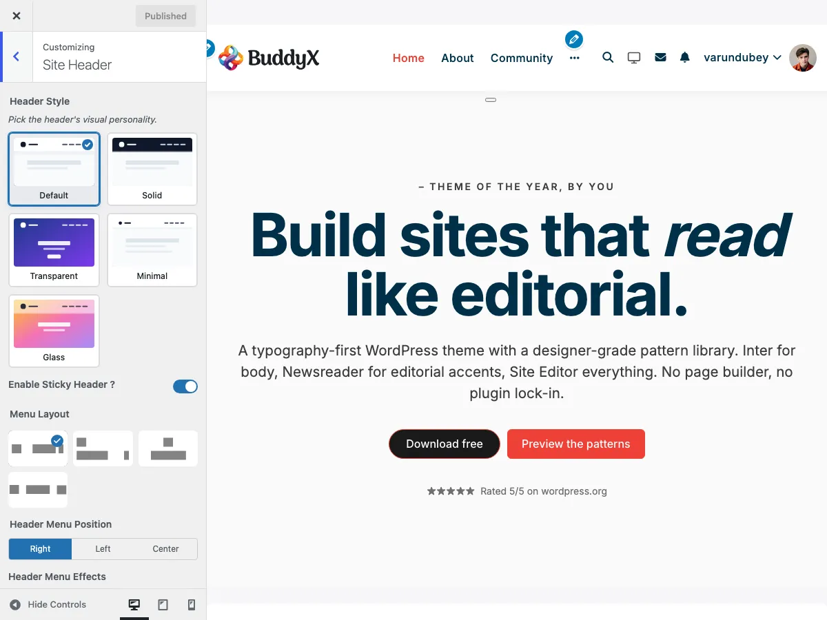 Effect 3: Brackets appear around the hovered menu item [Members]
How to Change:
- Go to Appearance > Customize and open the Site Header section
- Find the Header Menu Effects dropdown
- Select your preferred effect
- Preview by hovering over menu items
- Click Publish
Header Elements
Configure which elements appear in the header area. Every toggle is a Yes / No switch and lives in the Site Header section. See Header Elements & Icons for full detail.
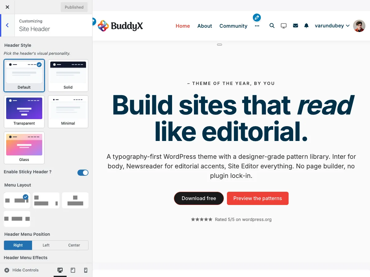 Header element toggles showing in the header preview
| Setting | Setting ID | Options | Default |
|---|---|---|---|
| More Menu ? | site_more_menu |
Yes / No | Yes |
| Site Search ? | site_search |
Yes / No | Yes |
| Site Search Style | side_search_style |
Default, Fullwidth | Default |
| Site Cart ? | site_cart |
Yes / No (requires WooCommerce) | Yes |
| Friends Component ? | site_friend |
Yes / No (requires BuddyPress) | No |
| Messages Component ? | site_message |
Yes / No (requires BuddyPress) | Yes |
| Notifications Component ? | site_notification |
Yes / No (requires BuddyPress) | Yes |
| Site Login Link ? | site_login_link |
Yes / No | Yes |
| Site Register Link ? | site_register_link |
Yes / No | Yes |
| Login/Register Button Style | site_header_button_style |
Icon+Text, Only Icon, Only Text, Icon+Text Button, Icon Button, Text Button | Icon+Text |
Sticky Header
Enable a fixed header that stays visible while scrolling. BuddyX Pro ships a single on/off control for this.
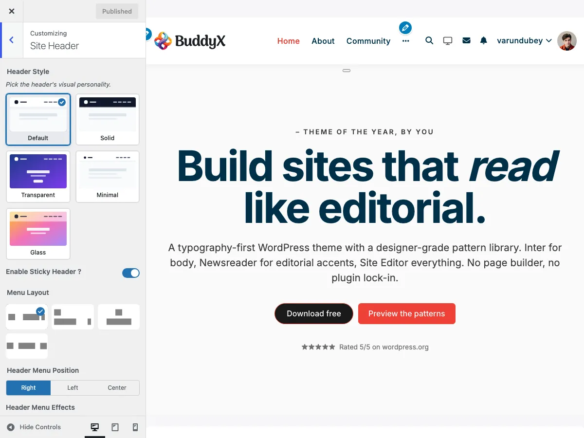 Sticky header enabled - header remains fixed at top while page content scrolls
| Setting | Setting ID | Description | Default |
|---|---|---|---|
| Enable Sticky Header ? | site_sticky_header |
Fix the header to the top of the screen on scroll | Yes |
When enabled, the theme adds a sticky-header body class and the header stays pinned as the page scrolls. See Sticky Header for details.
Mobile Header
The header switches from the full desktop menu to a hamburger menu based on the Hamburger Menu Breakpoint control.
| Setting | Setting ID | Range | Default |
|---|---|---|---|
| Hamburger Menu Breakpoint | site_hamburger_menu_breakpoint |
768px to 1600px | 768px |
Below the breakpoint width, the navigation collapses into the hamburger menu. See Mobile Header for details.
Layout Comparison
| Feature | Layout 1 | Layout 2 | Layout 3 | Layout 4 |
|---|---|---|---|---|
| Logo Position | Left | Left | Center | Left |
| Menu Position | Right | Below | Below Center | Centered |
| Rows | 1 | 2 | 2 | 1 |
| Logo Prominence | Medium | Medium | High | Medium |
| Menu Capacity | Medium | High | Medium | Medium |
| Best For | Business | Large Menus | Editorial | Modern/Balanced |
Configuration Examples
Example 1: Corporate Website
Layout: Layout 1 (Logo Left, Menu Right)
Sticky Header: Enabled
Header Icons: Search only
Mobile: Hamburger menu
Example 2: Community Platform
Layout: Layout 2 (Logo Left, Menu Below)
Sticky Header: Enabled
Header Elements: Search, Notifications, Messages, Cart
Mobile: Side panel navigation
Example 3: Portfolio Site
Layout: Layout 3 (Logo Center, Menu Below)
Sticky Header: Disabled
Header Icons: None
Menu Items: Work, About, Contact
Mobile: Minimal hamburger
Troubleshooting
Menu Items Not Aligning Correctly
Problem: Navigation doesn't align as expected in chosen layout.
Solutions:
- Check menu is assigned to Primary Menu location
- Verify no CSS conflicts from plugins
- Clear caching plugins
- Try a different layout temporarily to compare
Sticky Header Jumping
Problem: Content jumps when sticky header activates.
Solutions:
- This is normal - space is reserved for the header
- Check for conflicting sticky-header plugins
- Adjust body padding in custom CSS if needed
Header Elements Overlapping
Problem: Icons or menu items overlap on certain screen sizes.
Solutions:
- Reduce number of visible header icons
- Shorten menu item text
- Use mobile breakpoints appropriately
- Consider Layout 3 for more horizontal space
Related Documentation
- Header Elements & Icons - Configure header icons
- Sticky Header - Fixed header settings
- Mobile Header - Mobile-specific options
- Topbar Configuration - Above-header bar
Got a question? We're a friendly team - happy to help.
- Visit our Documentation Portal
- Email us at support@wbcomdesigns.com