
Topbar Configuration
Pro featureThe topbar is an optional horizontal bar that appears above your main header. It's perfect for displaying contact information, social links, announcements, or secondary navigation.
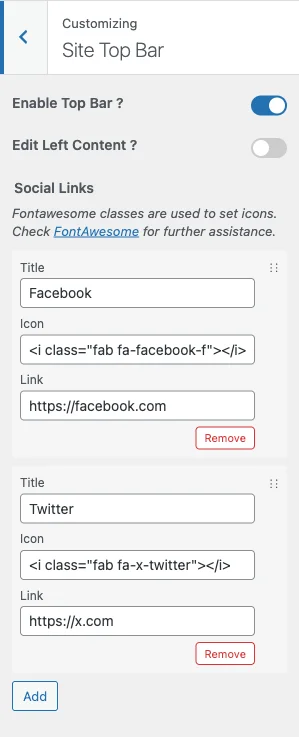 Topbar settings showing contact information on the left and social media icons on the right
What You Can Do
With BuddyX Pro's topbar, you can:
- Display important contact details (phone, email) in the left text/HTML area
- Show social media icons on the right via the Social Links repeater
- Display a short announcement or promotional line in the left area
- Customize colors to match your brand (via Site Skin)
Enabling the Topbar
- Go to Appearance > Customize
- Open the Site Top Bar section
- Switch Enable Top Bar ? to Yes
- Click Publish
You'll see a new bar appear above your main header.
Topbar Controls
Once the topbar is on, BuddyX Pro gives you these exact controls in the Site Top Bar section:
| Control | Setting ID | What It Does | Default |
|---|---|---|---|
| Enable Top Bar ? | site_topbar_enable |
Turns the topbar on or off | No |
| Edit Left Content ? | site_topbar_left_edit |
Reveals the left content editor so you can replace the default contact line (appears only when the topbar is on) | No |
| Left Content Area | site_topbar_left_area |
A text/HTML field for the left side (phone, email, short message); appears only when Edit Left Content is Yes | Phone + email sample |
| Social Links | topbar_social_links |
A repeater for the social icons shown on the right side (appears only when the topbar is on) | Preset sample links |
That is the complete set of topbar controls. The left side is a single free-form text/HTML field and the right side is the social-links repeater - there is no left/right content-type selector, and no topbar menu location.
Left Content Area
Switch Edit Left Content to Yes to unlock the Left Content Area field. It accepts text and HTML, including FontAwesome icon markup and links. The default value is a phone-and-email line you can edit or clear:
<i class="fas fa-phone-alt"></i> 011 322 44 56 | <i class="fas fa-envelope"></i> <a href="mailto:mail@example.com">mail@example.com</a>
Tips:
- Keep it to one short line - topbar height is limited.
- Use the pipe character (
|) to separate items.
Social Links
The Social Links repeater controls the icons on the right side of the topbar. Click Add to create a row, and fill in three fields per link:
| Field | Purpose | Example |
|---|---|---|
| Title | Label used for the row and the link's accessible name | |
| Icon | FontAwesome markup for the icon | <i class="fab fa-facebook-f"></i> |
| Link | The full profile URL | https://facebook.com/yourpage |
Add as many rows as you need, and drag rows to reorder them. Icon markup uses FontAwesome classes - browse there to find the exact class for any network.
How the Two Sides Work
The topbar has two fixed sides:
- Left side: the Left Content Area free-form text/HTML field (phone, email, a short message). Enable Edit Left Content to edit it.
- Right side: the Social Links repeater (icons that link to your profiles).
There is no per-side "content type" picker - the left side is always the text field and the right side is always the social-links repeater.
Adding Contact Information
To display your phone number or email on the left:
- With the topbar on, set Edit Left Content ? to Yes
- Enter your information in the Left Content Area field. It accepts text, HTML, links, and FontAwesome icon markup:
<i class="fas fa-phone-alt"></i> (555) 123-4567 | <i class="fas fa-envelope"></i> <a href="mailto:hello@yoursite.com">hello@yoursite.com</a> - Click Publish
Tips:
- Keep it short - topbar space is limited
- Include only essential contact methods
- Use the pipe character (
|) to separate items
Adding Social Icons
To display social media links on the right:
- With the topbar on, find the Social Links repeater
- Click Add to create a row, then fill in Title, Icon (FontAwesome markup), and Link (profile URL)
- Repeat for each network, and drag rows to reorder
- Click Publish
Only the rows you add will appear.
Topbar Colors
The topbar color controls are not in the Site Top Bar section - they live under Appearance > Customize > Site Skin, each with a light and a dark-mode variant.
| Setting | Setting ID (light / dark) | What It Controls |
|---|---|---|
| Background Color | topbar_background_color / dark_topbar_background_color |
The topbar background |
| Text Color | topbar_content_color / dark_topbar_content_color |
Regular text and icons |
| Link Color | topbar_links_color / dark_topbar_links_color |
Clickable links |
| Link Hover Color | topbar_links_hover_color / dark_topbar_links_hover_color |
Links when hovered |
Recommended Color Combinations
Professional/Corporate:
- Background: Dark gray (#333333)
- Text: White (#ffffff)
- Creates a strong contrast with a light header below
Friendly/Approachable:
- Background: Your primary brand color
- Text: White (#ffffff)
- Adds a pop of color to the top
Subtle/Minimal:
- Background: Light gray (#f5f5f5)
- Text: Dark gray (#666666)
- Blends gently with the page
Announcement/Sale:
- Background: Bright color (red, orange)
- Text: White
- Draws attention to promotions
Recommended Setups by Site Type
Remember: the left side is the text/HTML field and the right side is the social-links repeater. Colors are set in Site Skin.
Business/Corporate Site
Left Content Area: "(555) 123-4567 | Mon-Fri 9am-5pm"
Social Links: LinkedIn, Twitter
Colors (Site Skin): dark background, white text
Community Platform
Left Content Area: "Need help? support@yoursite.com"
Social Links: all your community platforms
Colors (Site Skin): primary brand background, white text
E-Commerce Store
Left Content Area: "Free shipping on orders over $50!"
Social Links: Facebook, Instagram
Colors (Site Skin): attention red or brand background, white text
Blog/Magazine
Left Content Area: "New posts every week - follow along"
Social Links: Twitter, Instagram, RSS
Colors (Site Skin): light gray background, dark gray text
Online Course Platform
Left Content Area: "10,000+ students enrolled"
Social Links: YouTube, LinkedIn
Colors (Site Skin): green background, white text
Mobile Display
When enabled, the topbar shows across screen sizes, including mobile, and its content reflows to fit. There is no dedicated "hide on mobile" toggle - if you want to hide it on small screens, add a Custom CSS rule such as:
@media (max-width: 768px) {
    .top-bar { display: none; }
}
Tip: keep the left content line short so it does not wrap awkwardly on narrow screens.
What It Looks Like
With Topbar Enabled:
┌─────────────────────────────────────────────────┐
│ 📞 (555) 123-4567     [Facebook] [Twitter] [IG] │  ← Topbar
├─────────────────────────────────────────────────┤
│ [Logo]              Home  About  Services  Blog │  ← Main Header
├─────────────────────────────────────────────────┤
│                                                 │
│                  Page Content                   │
Without Topbar:
┌─────────────────────────────────────────────────┐
│ [Logo]              Home  About  Services  Blog │  ← Main Header
├─────────────────────────────────────────────────┤
│                                                 │
│                  Page Content                   │
Common Questions
Should I use a topbar? Use it if you have important secondary information. Skip it for cleaner, minimal designs.
Can I show different content on mobile? The topbar shows the same content on all screen sizes. You can hide it on mobile with a Custom CSS media query (see Mobile Display above).
Can I add HTML to the text fields? Yes, you can add links and basic HTML formatting.
Will the topbar affect my sticky header? The sticky header scrolls independently; the topbar stays at the top or scrolls away.
Related Settings
- Header Layout Styles - Main header options
- Header Elements - Icons and search in header
- Site Identity - Logo settings
Got a question? We're a friendly team - happy to help.
- Visit our Documentation Portal
- Email us at support@wbcomdesigns.com