
Navigation Menus
Pro featureBuddyX Pro provides multiple menu locations for comprehensive site navigation.
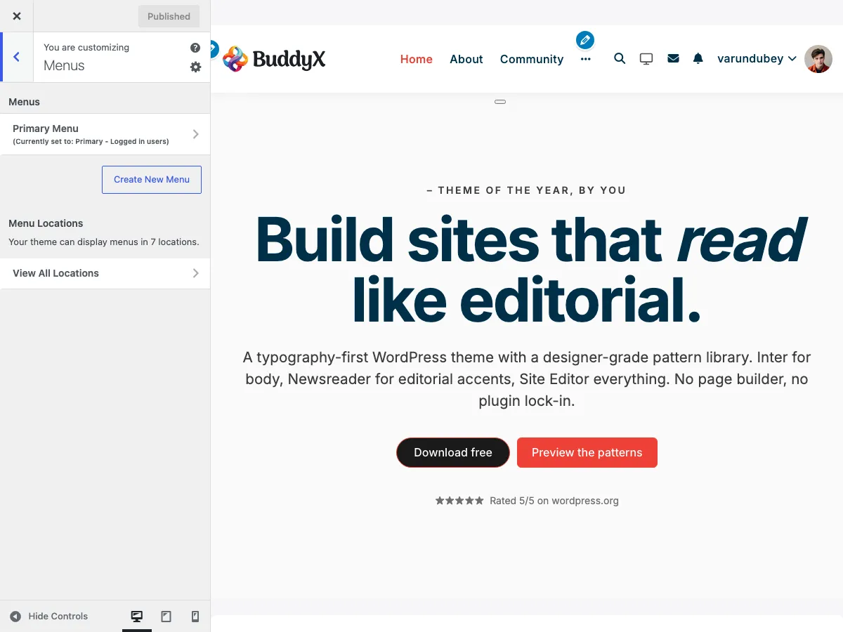 Menu configuration in the Customizer
Menu Locations
BuddyX Pro registers 7 menu locations:
Primary Menus
| Location | Description |
|---|---|
| Primary - Logged in users | Main header navigation for logged-in members |
| Primary - Logged out users | Main header navigation for visitors |
Mobile Menus
| Location | Description |
|---|---|
| Mobile Menu - Logged in users | Mobile navigation for logged-in members |
| Mobile Menu - Logged out users | Mobile navigation for visitors |
Side Panel Menus
| Location | Description |
|---|---|
| Side Menu - Logged in users | Side panel menu for logged-in members |
| Side Menu - Logged out users | Side panel menu for visitors |
User Menu
| Location | Description |
|---|---|
| User Menu | User account dropdown menu in header |
Creating Menus
Step 1: Create a Menu
- Go to Appearance → Menus
- Click Create a new menu
- Enter a menu name (e.g., "Main Menu")
- Click Create Menu
Step 2: Add Menu Items
Add items from:
- Pages - Site pages
- Posts - Blog posts
- Custom Links - External URLs
- Categories - Post categories
- BuddyPress - Community pages (if active)
- WooCommerce - Shop pages (if active)
Step 3: Assign Location
- Scroll to Menu Settings
- Check the desired location(s)
- Click Save Menu
Menu Configuration
Logged In vs Logged Out Menus
BuddyX Pro shows different menus based on login status:
Logged In Users See:
- Member dashboard links
- Profile and settings
- Logout option
- Community features
Logged Out Users See:
- Login/Register links
- Public pages only
- Promotional content
Setting Up Both Menus
Create a "Main Menu (Logged In)" menu
- Assign to: Primary - Logged in users
Create a "Main Menu (Logged Out)" menu
- Assign to: Primary - Logged out users
Mobile Menu
The mobile menu appears on screens below the responsive breakpoint.
Mobile Menu Setup
- Create a menu specifically for mobile
- Keep it simpler than desktop menu
- Assign to: Mobile Menu - Logged in/out users
Tips for Mobile Menus:
- Limit to 6-8 top-level items
- Use shorter link text
- Prioritize important links
- Test on actual devices
Side Panel Menu
The side panel (hamburger menu) provides additional navigation.
Enabling Side Panel
- Go to Appearance → Customize → Side Panel
- Enable the side panel
- Configure display options
Side Panel Menu Setup
- Create a menu for the side panel
- Assign to: Side Menu - Logged in/out users
- Consider vertical layout when designing
User Menu
The user menu appears when clicking the user avatar in the header.
User Menu Contents
Typically includes:
- Profile link
- Account settings
- Dashboard
- Orders (if WooCommerce)
- Courses (if LearnDash)
- Logout
Setting Up User Menu
- Create a "User Menu" menu
- Add user-specific links
- Assign to: User Menu location
Menu Icons
Add icons to menu items using CSS classes.
Using FontAwesome Icons
- Edit a menu item
- In CSS Classes field, add:
menu-icon fas fa-home - Save the menu
Common icons:
fas fa-home- Homefas fa-user- Profilefas fa-cog- Settingsfas fa-shopping-cart- Cartfas fa-sign-out-alt- Logout
Enabling CSS Classes Field
- Click Screen Options at top of Menus page
- Check CSS Classes
- The field now appears for each menu item
Dropdown Menus
Create multi-level navigation with dropdowns.
Creating Dropdowns
- Add menu items normally
- Drag child items slightly to the right
- They indent under the parent item
- Save the menu
Dropdown Behavior
- Desktop: Hover to reveal dropdown
- Mobile: Tap to expand/collapse
- Auto-close when clicking elsewhere
BuddyPress Menu Items
When BuddyPress is active, additional menu items are available:
| Item | Description |
|---|---|
| Activity | Activity feed |
| Members | Members directory |
| Groups | Groups directory |
| Profile | Current user's profile |
| Settings | Account settings |
Adding BuddyPress Items
- In the menu editor, find BuddyPress section
- Check desired items
- Click Add to Menu
WooCommerce Menu Items
When WooCommerce is active:
| Item | Description |
|---|---|
| Shop | Product archive |
| Cart | Shopping cart |
| Checkout | Checkout page |
| My Account | Account dashboard |
Menu Settings
Display Options
In Menu Settings at bottom of menu editor:
- Auto add pages - Automatically add new top-level pages
- Menu locations - Where the menu appears
Screen Options
Click Screen Options to show/hide:
- CSS Classes
- Link Target
- Title Attribute
- Link Relationship (XFN)
- Description
Best Practices
Navigation Structure
- Limit top-level items to 6-8
- Use clear, descriptive labels
- Group related items in dropdowns
- Place important items first
Accessibility
- Use descriptive link text
- Avoid "Click Here" or "Read More"
- Maintain logical order
- Test keyboard navigation
Mobile Considerations
- Test on actual devices
- Consider thumb-friendly placement
- Keep text concise
- Limit nesting depth
Troubleshooting
Menu Not Appearing
- Verify menu is assigned to location
- Check if location is displayed in header
- Clear any caching
- Check theme customizer settings
Dropdowns Not Working
- Check for JavaScript errors
- Verify parent item has children
- Test with plugins disabled
- Check CSS for conflicts
Mobile Menu Issues
- Resize browser to trigger mobile view
- Check mobile menu is assigned
- Verify hamburger icon is enabled
- Test touch interactions
Related Documentation
- Header Options - Header configuration
- Side Panel - Side panel settings
- BuddyPress Options - BP menu integration