
Color Scheme Settings
Pro featureBuddyX Pro provides comprehensive color customization options to match your brand identity. Configure primary colors, secondary colors, backgrounds, and component-specific colors through the Site Skin panel in the Customizer.
This page covers the light-mode palette. The parallel dark-mode palette (45 dedicated dark_* controls) is documented in Dark Mode. For one-click preset palettes, see Color Presets.
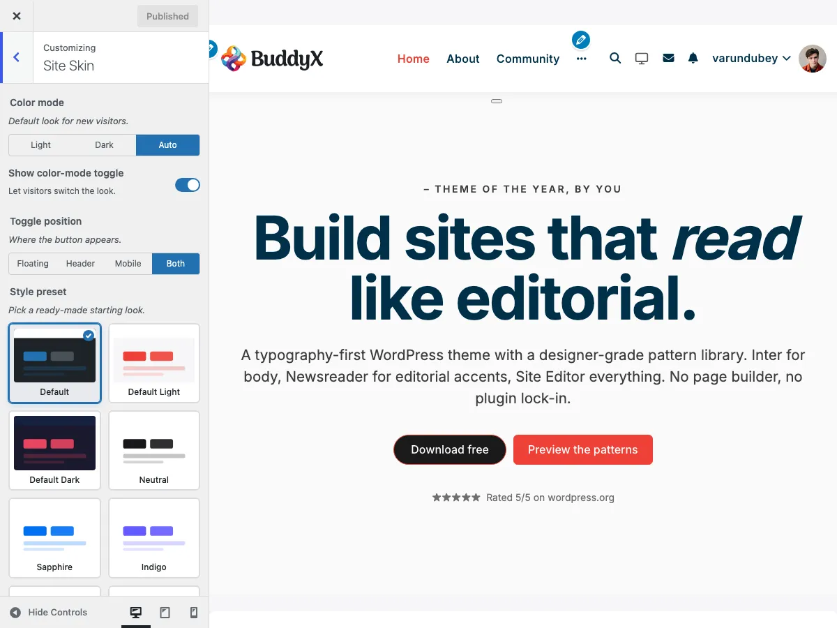 The Site Skin panel in the WordPress Customizer showing color scheme options
Accessing Color Settings
- Go to Appearance → Customize
- Open the Site Skin section
The section contains: a Style preset picker (visual swatch grid), a Color Mode toggle (light / dark), per-cluster color controls for every surface, and a parallel Dark Palette subsection.
Set Custom Colors?
| Setting | Key | Options | Default |
|---|---|---|---|
| Set Custom Colors? | site_custom_colors |
Yes / No | Yes |
This is the master switch for the whole color palette. When it's set to Yes, every per-cluster color control below (Top Bar, Header, Sub Header, Body, Buttons, Side Panel, Footer, Copyright - light and dark) becomes editable. Set it to No to hide all the individual color pickers and fall back to the colors that come from your Style preset or the theme defaults. Leave it on Yes whenever you want to hand-tune colors.
Every color control in this section has a Dark Mode counterpart with a matching
dark_*key (for examplesite_footer_background_colorfor light,dark_site_footer_background_colorfor dark). The dark twin of each control only appears when Color Mode is Dark or the visitor toggles to dark. The full dark palette is documented in Dark Mode.
How your color choices reach the site
When you change a color in the Customizer, it updates instantly everywhere it's used - buttons, links, headings, cards, blocks, patterns, even your dark-mode counterpart if you have one. You don't have to clear caches or tell anything to rebuild.
Developers + child-theme authors curious about the token system that makes this work - see Design Tokens for the full reference, or the Dark Mode developer notes for the architecture.
Primary Color Settings
The primary color is used throughout your site for buttons, links, accents, and interactive elements.
Primary Color
| Setting | Description | Default |
|---|---|---|
Primary Color (site_primary_color) |
Main brand color | #ee4036 |
| Primary Hover Color | Hover state for primary elements | Darkened primary |
Where Primary Color Appears:
- Buttons and call-to-action elements
- Links (text and menu items)
- Active/selected states
- Progress bars and indicators
- Form focus states
- Navigation underlines
- BuddyPress accent elements
Secondary Color
| Setting | Description | Default |
|---|---|---|
| Secondary Color | Supporting brand color | #03A9F4 |
| Secondary Hover Color | Hover state for secondary elements | Darkened secondary |
Where Secondary Color Appears:
- Secondary buttons
- Alternative link colors
- Accent elements
- Badges and tags
- Alternate hover states
Background Colors
Site Background
| Setting | Key | Default |
|---|---|---|
| Site Background Color | body_background_color |
#f7f7f9 |
| Site Background Image | background_image (WP core) |
None |
| Background Repeat | background_repeat |
No Repeat |
| Background Position | background_position |
Center Center |
| Background Size | background_size |
Cover |
| Background Attachment | background_attachment |
Scroll |
Content Background
| Setting | Key | Default |
|---|---|---|
| Content Background | content_background_color |
#f7f7f9 |
| Box Background (cards / elevated surfaces) | box_background_color |
#ffffff |
| Secondary Background (subtle tint) | secondary_background_color |
#fafafa |
| Global Border Color | site_border_color |
#e4e3e3 |
Header Background
| Setting | Key | Default |
|---|---|---|
| Header Background | site_header_bg_color |
#ffffff |
| Site Title Color | site_title_color |
#003049 |
| Site Title Hover | site_title_hover_color |
#e94560 |
| Menu Link | menu_color |
#003049 |
| Menu Hover | menu_hover_color |
#ee4036 |
| Menu Active | menu_active_color |
#ee4036 |
Top Bar
These controls only appear when the top bar is enabled (Header → Top Bar). Each has a Dark Mode twin.
| Setting | Key | Default |
|---|---|---|
| Top Bar Background Color | topbar_background_color |
#ee4036 |
| Top Bar Content Color | topbar_content_color |
#ffffff |
| Top Bar Link Color | topbar_links_color |
#ffffff |
| Top Bar Link Hover | topbar_links_hover_color |
#ee4036 |
Sub-Header Background
The sub-header is the breadcrumb / page-title strip below the header.
| Setting | Key | Default |
|---|---|---|
| Subheader Background Color | site_subheader_bg_color |
rgba(255,255,255,0.5) |
| Subheader Title Color | subheader_title_color |
#003049 |
Side Panel (slide-out menu)
Colors for the slide-out side panel and its toggle icon. Each has a Dark Mode twin.
| Setting | Key | Default |
|---|---|---|
| Side Panel Toggle Color | side_panel_toggle_color |
#ee4036 |
| Side Panel Background Color | side_panel_background_color |
#ffffff |
| Side Panel Menu Color | side_panel_menu_color |
#003049 |
| Side Panel Menu Hover Color | side_panel_menu_hover_color |
#ee4036 |
| Side Panel Menu Active Color | side_panel_menu_active_color |
#ee4036 |
| Side Panel Menu BG Hover Color | side_panel_menu_bg_hover_color |
#ffffff |
| Side Panel Menu BG Active Color | side_panel_menu_bg_active_color |
#ffffff |
Footer Background
| Setting | Key | Default |
|---|---|---|
| Footer Background | site_footer_background_color |
#ffffff |
| Footer Title | site_footer_title_color |
#003049 |
| Footer Text | site_footer_content_color |
#505050 |
| Footer Link | site_footer_links_color |
#003049 |
| Footer Link Hover | site_footer_links_hover_color |
#ee4036 |
Copyright Bar
Colors for the copyright strip below the footer widgets. Each has a Dark Mode twin. (For the copyright text itself, see Copyright & Credits Settings.)
| Setting | Key | Default |
|---|---|---|
| Copyright Background Color | site_copyright_background_color |
#ffffff |
| Copyright Content Color | site_copyright_content_color |
#505050 |
| Copyright Link Color | site_copyright_links_color |
#003049 |
| Copyright Link Hover Color | site_copyright_links_hover_color |
#ee4036 |
Text Colors
Body Text
| Setting | Key | Default |
|---|---|---|
| Body Text Color | body_text_color |
#505050 |
| Heading Color | headings_color |
#003049 |
| Link Color | site_links_color |
#003049 |
| Link Hover Color | site_links_focus_hover_color |
#ee4036 |
Meta Text
Meta-text colors (post meta, dates, muted helpers) inherit from the --bx-color-fg-muted and --bx-color-fg-subtle tokens - these aren't directly customizer-exposed but derive from the body-text customizer choices via the token cascade. To customize them explicitly, use a child theme or custom CSS targeting --bx-color-fg-muted / --bx-color-fg-subtle on :root.
Component Colors
Buttons
| Setting | Key | Default |
|---|---|---|
| Button Background | site_buttons_background_color |
#ee4036 |
| Button Text | site_buttons_text_color |
#ffffff |
| Button Border | site_buttons_border_color |
#ee4036 |
| Button Hover Background | site_buttons_background_hover_color |
#f83939 |
| Button Hover Text | site_buttons_text_hover_color |
#ffffff |
| Button Hover Border | site_buttons_border_hover_color |
#f83939 |
Forms
Form input styling inherits from the global --bx-color-border, --bx-color-bg-elevated, and --bx-color-fg tokens. Focus borders use --bx-color-accent (the primary color). To customize form-specific colors beyond the global cascade, override via child-theme CSS targeting the relevant input selectors.
Sidebar / Widgets
Sidebar widgets inherit from the box-background and body-text tokens; widget titles inherit from --bx-color-h3 (heading color). No widget-specific customizer controls - widgets pick up your global color choices automatically via the token cascade.
Color Presets
BuddyX Pro 5.1.0 ships 14 hand-tuned palettes through the Style preset picker. Picking a preset overwrites every per-cluster colour in one click; the per-cluster controls below still take precedence if you change them afterwards.
See Color Presets for the full preset reference (Default Light, Default Dark, Neutral, Sapphire, Indigo, Cobalt, Trust, Commerce, Signal, Coral, Aubergine, Midnight, Stone, Carbon) including frontend previews.
The legacy 5.0.x presets (Default Blue, Fresh Green, Warm Orange, Royal Purple, Modern Teal, Classic Red, Dark Theme, Light Minimal, Ocean Blue, Mocha, Electric, Teal Coral) were retired in 5.1.0 - existing customer saves are migrated to the closest 5.1.0 match on upgrade.
Applying a Preset:
- Open Skin > Color Presets in Customizer
- Click on desired preset thumbnail
- Colors update automatically
- Customize individual colors as needed
- Publish changes
Color Application Examples
Example 1: Corporate Brand
Primary Color: #003366 (Navy Blue)
Secondary Color: #CC9900 (Gold)
Site Background: #F8F9FA
Content Background: #FFFFFF
Text Color: #333333
Example 2: Community Platform
Primary Color: #5C6BC0 (Indigo)
Secondary Color: #26A69A (Teal)
Site Background: #ECEFF1
Header Background: #FFFFFF
Footer Background: #37474F
Example 3: E-Learning Site
Primary Color: #43A047 (Green)
Secondary Color: #FB8C00 (Orange)
Site Background: #FAFAFA
Content Background: #FFFFFF
Link Color: #1B5E20
Color Accessibility
Ensure your color choices meet accessibility standards:
Contrast Ratios (WCAG 2.1)
| Text Type | Minimum Ratio | Recommended |
|---|---|---|
| Normal Text | 4.5:1 | 7:1 |
| Large Text (18px+) | 3:1 | 4.5:1 |
| UI Components | 3:1 | 4.5:1 |
Tools for Checking Contrast:
- WebAIM Contrast Checker
- Colour Contrast Analyser
- Browser DevTools accessibility audit
Color Blindness Considerations
- Don't rely solely on color to convey information
- Use icons or text alongside color indicators
- Test with color blindness simulation tools
- Ensure sufficient contrast for all users
How customizer changes reach the front end
5.1.0 emits color tokens inline in the page <head> as a <style> block - there's no separate dynamic CSS file, no transient cache, no admin-ajax round-trip. The token block is rebuilt from theme_mods on every page render (lightweight; ~15 KB of CSS variable declarations).
When you save a customizer change, the new value lands in theme_mods_buddyxpro immediately. The next page load (anywhere on the site) reflects the change.
If colors don't seem to update:
- Hard reload the front end (Cmd+Shift+R / Ctrl+F5) - the HTML page response includes the inline tokens, so browser cache of the HTML can serve stale colors. Hard reload bypasses the HTML cache.
- Clear page caching plugins (WP Rocket, W3 Total Cache, etc.) - these cache the HTML and don't know your customizer changed.
- Purge CDN cache if your CDN caches HTML (most CDNs only cache static assets; HTML caching is opt-in).
- Customizer preview vs published: the Customizer preview is the published value as of last Save / Publish. Hit Publish to roll the change out to the live site.
Troubleshooting
Colors Not Applying
Problem: Changed colors don't appear on frontend.
Solutions:
- Click "Publish" in Customizer (changes aren't saved until published)
- Clear browser cache (Ctrl+F5 / Cmd+Shift+R)
- Disable caching plugins temporarily
- Check for custom CSS overriding theme styles
Colors Look Different Than Picker
Problem: Selected color looks different on the site.
Solutions:
- Monitor color calibration may differ
- Check if transparency/opacity is applied
- Verify no color filters in browser extensions
- Compare in multiple browsers
Preset Doesn't Apply Completely
Problem: Color preset doesn't change all elements.
Solutions:
- Some elements may have custom overrides
- Check plugin-specific color settings
- Clear all caches after applying preset
- Some colors may need manual adjustment
Dark Mode Colors Conflicting
Problem: Colors look wrong when dark mode is active.
Solutions:
- Configure dark mode specific colors
- Check Dark Mode Settings
- Some colors auto-invert, others need manual setting
- Test both light and dark modes after changes
Related Documentation
- Color Presets - Pre-designed color schemes
- Dark Mode - Dark color scheme settings
- Border Radius & Styling - Element styling options
- Typography Settings - Font colors
Got a question? We're a friendly team - happy to help.
- Visit our Documentation Portal
- Email us at support@wbcomdesigns.com