
Typography Presets
Pro featurePick a curated font pair sourced from a real product brand system in one click. Each preset fills every typography field on your site (Site Title, Site Tagline, H1-H6, Menu, Sub-menu, Body) with a coherent pairing - matching weight, size, line-height, and a scale ratio that keeps headings in tune. After picking, every individual typography field is still editable for fine-tuning.
New in BuddyX Pro 5.1.0.
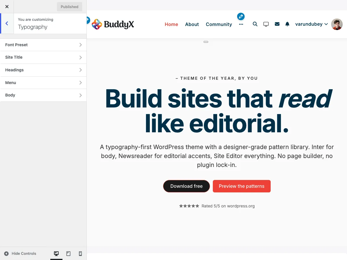 The Typography Presets section in the Customizer. Each card shows the heading + body font live, with a brand-credit caption underneath.
What You Can Do
- Apply one of 7 hand-picked font pairs by clicking a single card
- Adjust the global base font size (12-22 px)
- Adjust the heading scale ratio (Minor Third 1.2, Major Third 1.25, Perfect Fourth 1.333, Augmented Fourth 1.414)
- Override any single field afterwards (Site Title, Site Tagline, H1-H6, Menu, Sub-menu, Body) without losing the preset elsewhere
Available Presets
| Preset | Brand credit | Heading | Body | Vibe |
|---|---|---|---|---|
| Inter | Linear, Notion, Figma | Inter | Inter | Clean modern SaaS, dense interfaces |
| Geist | Vercel | Geist | Geist | Technical, developer-tooling polished |
| IBM Plex | IBM | IBM Plex Sans | IBM Plex Sans | Corporate, neutral, slab-adjacent |
| DM Sans | Google Design | DM Sans | DM Sans | Friendly, rounded, marketing sites |
| Editorial | NYT, Intercom | Source Serif 4 | Source Sans 3 | Long-form articles, serif headings + sans body |
| Magazine | Premium editorial | Playfair Display | Lora | High-contrast display headings, serif body |
| Humanist | Publishing | Newsreader | Crimson Pro | Warm serif, book-like reading |
Font stacks fall back to system fonts (system-ui, Georgia/Times, sans-serif) so text stays readable while the web fonts load. Inter falls back to the system UI stack and loads no Google font; the other six load their Google families only while their card is previewed or their preset is active.
Accessing Presets
- Go to Appearance > Customize
- Click on Typography
- Open the Font Preset section at the top
- Click any preset card
The selected card gets a check badge. The customizer iframe refreshes once and every typography field underneath updates to match. A Default card sits first as an escape hatch - it leaves your per-control font choices untouched.
Size & Scale
Two sliders sit under the preset picker:
Base font size
The body / paragraph size in pixels. All other sizes (H1-H6, Menu, Site Title) are recomputed from this baseline.
- 12-14 px - Dense interfaces, dashboards
- 16 px (default) - Standard reading
- 17-20 px - Editorial, blog-first sites
- 21-22 px - Display, hero-heavy designs
Heading scale ratio
Controls how much larger each heading level is relative to the next one down. h6 = base, then each step multiplies by the ratio: h5 = base * ratio, h4 = base * ratio^2, ... h1 = base * ratio^4.
| Ratio | Name | Use For |
|---|---|---|
| 1.2 | Minor Third | Subtle hierarchy, dense UIs |
| 1.25 | Major Third (default) | Clean sans, standard product sites |
| 1.333 | Perfect Fourth | Editorial, news, magazine sites |
| 1.414 | Augmented Fourth | Display headings, hero-led marketing |
Each preset above ships its own recommended Base Size + Scale Ratio - picking a preset updates both sliders, so you do not need to set them manually.
Fine-tuning Individual Fields
Picking a preset does not lock anything. Below the preset section, every individual typography control is still editable:
- Typography > Site Title - hero / branding text (gets the heading font)
- Typography > Site Tagline - the tagline under the site title (gets the body font)
- Typography > Headings > H1 through H6 (get the heading font)
- Typography > Menu - primary nav (gets the body font)
- Typography > Sub-menu - dropdown items (gets the body font)
- Typography > Body - paragraphs + general text (gets the body font)
Site Title and H1-H6 receive the preset's heading font; Site Tagline, Menu, Sub-menu, and Body receive its body font. Use the preset for the 95% match, then tweak any single field for fine control. Re-picking the preset re-applies the full pair from scratch.
When to Use Presets vs Manual
| Scenario | Recommendation |
|---|---|
| Brand-new site, no typography decisions yet | Pick a preset that matches your industry vibe |
| Want to match an existing brand book | Manual - set Site Title + H1 by hand, leave the rest to a preset that's close |
| Migrating from BuddyX 5.0.x with Kirki typography | Existing values persist. Pick a preset only if you want to start fresh |
| Switching to dark mode | No change - presets are colour-agnostic, dark mode only swaps the palette |
Performance
Each preset's Google Fonts are loaded only when that preset is active. Switching presets re-enqueues the new pair on the next page load (no double-load on the same view). All fonts ship with font-display: swap for fast first paint.
Related
- Body Typography - Paragraph + general text controls
- Heading Typography - H1-H6 fine-tuning
- Google Fonts Integration - How fonts are loaded
- Color Presets - Pre-built colour schemes (the colour-side cousin of this picker)
Got a question? We're a friendly team - happy to help. support@wbcomdesigns.com