
Blog Archive Layout
Pro featureControl how your blog posts appear on your main blog page, category pages, and archive pages. Choose from seven layouts and customize how posts are displayed.
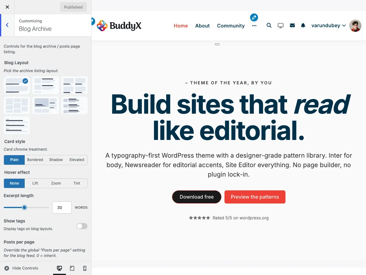
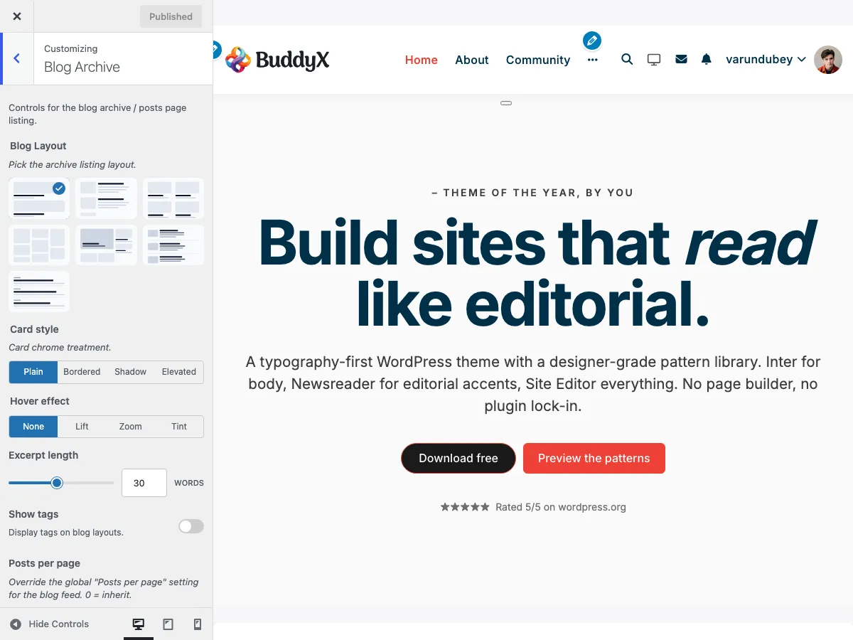
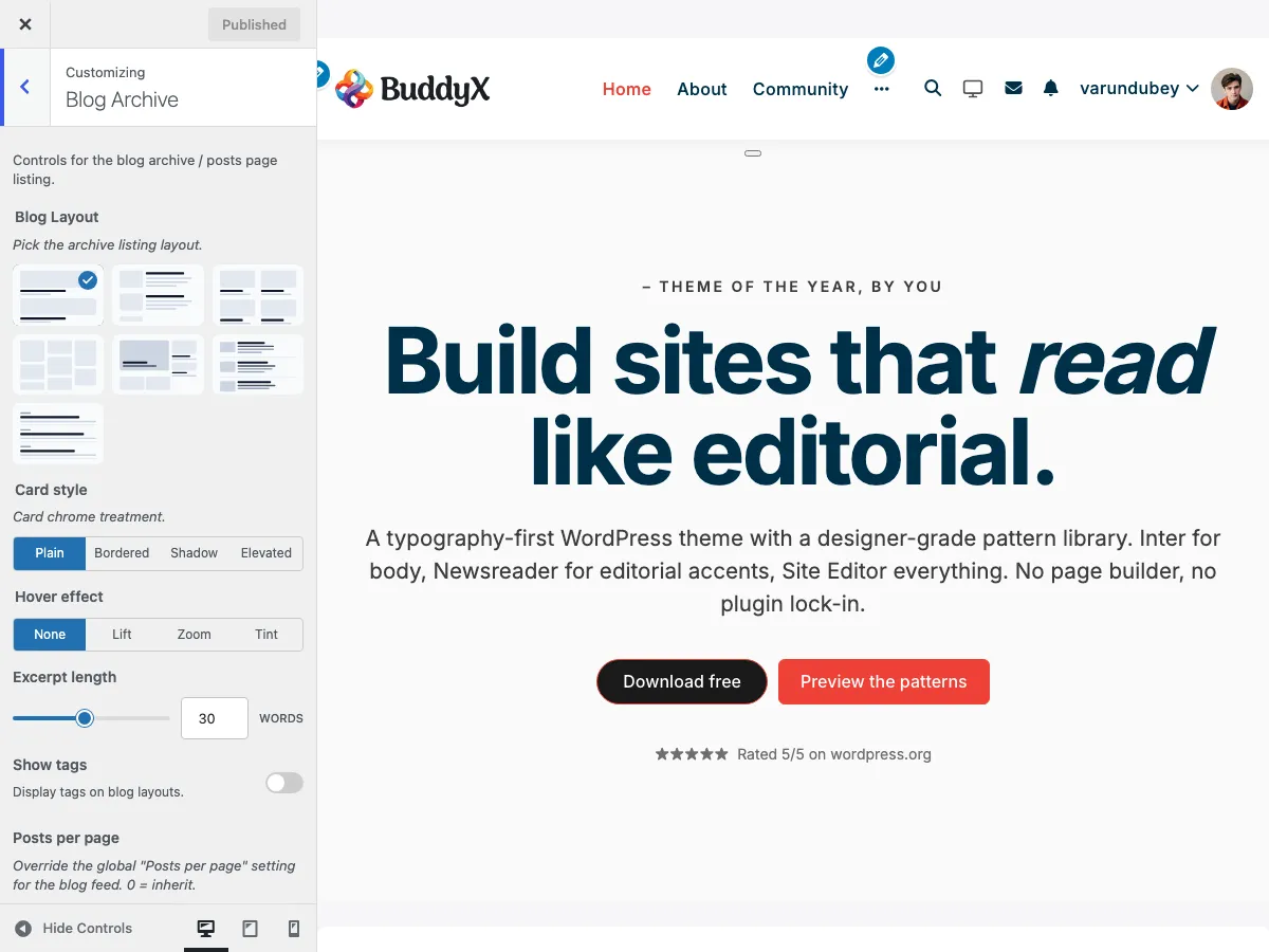
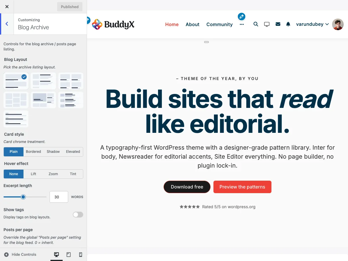 The Blog Archive panel in the WordPress Customizer showing layout options, image position, and card controls
What You Can Do
With BuddyX Pro 5.1.0+ blog archive settings, you can:
- Choose from 7 layouts: Default, List, Grid, Masonry, Magazine, Editorial, Minimal
- Set the image position (Left or Right) for the List layout
- Pick 1, 2, 3, or 4 columns for Grid, Masonry, and Magazine (the same
blog_columnsradio-buttonset drives all three) - Enable Pinterest-style masonry on the Masonry layout
- Pick a card style: Plain, Bordered, Shadow, or Elevated
- Pick a hover effect: None, Lift, Zoom, or Tint
- Set the excerpt length (5-60 words)
- Override how many posts show per page for the blog feed (0-50, or inherit the Reading setting)
- Show or hide a category filter pill row above the feed
- Show or hide tags, and pick a tag style
- Override the sidebar specifically for the blog feed (including when the homepage is set to "Your latest posts")
- Show or hide the front-end edit link for logged-in editors
Every control on this page lives in Appearance > Customize > Blog Archive.
Choosing Your Blog Layout
Step 1: Access Blog Settings
- Go to Appearance > Customize
- Click on Blog Archive (the panel was split in 5.1.0 - single-post controls now live in the Single Post panel)
- The first control is Blog Layout
Step 2: Select a Layout
BuddyX Pro offers seven distinct blog layouts (blog_layout_option, default default-layout):
| Layout | Key | Best For | Description |
|---|---|---|---|
| Default | default-layout |
Traditional blogs | Classic single-column layout with featured images above title |
| List | list-layout |
News / chronological feeds | Image on the left or right (toggle via blog_image_position), title + excerpt to the side - compact, lets you fit more posts per scroll |
| Grid | grid-layout |
Portfolio / visual blogs | Card-based grid with 1, 2, 3, or 4 columns |
| Masonry | masonry-layout |
Image-heavy blogs | Pinterest-style staggered grid (enable via the blog_masonry switch), 1-4 columns |
| Magazine | magazine-layout |
News / publishing | Three-region NYT-style layout: one large feature card, three side cards, then a 1-4-column grid for the rest |
| Editorial | editorial-layout |
Long-form / text-first | Small thumbnail to the left of headline + excerpt, hairline divider between articles |
| Minimal | minimal-layout |
Personal blogs / portfolios | Title-led with optional excerpt; featured image suppressed for a stripped-back read |
Image Position (List layout only)
When List is selected, the Image position toggle (blog_image_position, default thumb-left) decides which side the thumbnail sits on:
| Option | Key |
|---|---|
| Left (default) | thumb-left |
| Right | thumb-right |
This control only appears for the List layout.
Columns
After picking Grid, Masonry, or Magazine, the Columns control (blog_columns) sets how many cards fit on a desktop row. The same setting drives all three layouts, so switching between them keeps your column choice. The default is Default (the layout's own built-in column count) plus explicit 1, 2, 3, and 4 options.
| Columns | Desktop (>1280px) | Laptop (1024-1280) | Tablet (640-1024) | Mobile (<640) |
|---|---|---|---|---|
| 1 | 1 | 1 | 1 | 1 |
| 2 | 2 | 2 | 2 | 1 |
| 3 | 3 | 3 | 2 | 1 |
| 4 | 4 | 3 | 2 | 1 |
Magazine layout caps the bottom grid at the same column count; the feature + side region stays at one large card + three small cards regardless.
Layout Previews
Default Layout:
 Default blog layout - classic single-column with featured images above titles
┌────────────────────────────────────┐
│  ┌────────────────────────────┐   │
│  │    Featured Image          │   │
│  └────────────────────────────┘   │
│  Blog Post Title                   │
│  Written by Author | Date          │
│  Post excerpt text here...         │
├────────────────────────────────────┤
│  ┌────────────────────────────┐   │
│  │    Featured Image          │   │
│  └────────────────────────────┘   │
│  Blog Post Title                   │
│  Written by Author | Date          │
│  Post excerpt text here...         │
└────────────────────────────────────┘
Grid Layout (2 Columns):
 Grid layout - card-based 2-column design with consistent heights
┌──────────────────┬──────────────────┐
│ ┌──────────────┐ │ ┌──────────────┐ │
│ │Featured Image│ │ │Featured Image│ │
│ └──────────────┘ │ └──────────────┘ │
│ Post Title       │ Post Title       │
│ Author | Date    │ Author | Date    │
│ Excerpt...       │ Excerpt...       │
├──────────────────┼──────────────────┤
│ ┌──────────────┐ │ ┌──────────────┐ │
│ │Featured Image│ │ │Featured Image│ │
│ └──────────────┘ │ └──────────────┘ │
│ Post Title       │ Post Title       │
│ Author | Date    │ Author | Date    │
│ Excerpt...       │ Excerpt...       │
└──────────────────┴──────────────────┘
Masonry Layout:
 Masonry layout - Pinterest-style staggered grid with variable heights
┌──────────────┬──────────────┬──────────────┐
│ ┌──────────┐ │ ┌──────────┐ │ ┌──────────┐ │
│ │  Image   │ │ │  Image   │ │ │  Image   │ │
│ └──────────┘ │ │  (tall)  │ │ └──────────┘ │
│ Title        │ │          │ │ Title        │
│ Excerpt...   │ │          │ │ Excerpt...   │
├──────────────┤ └──────────┘ ├──────────────┤
│ ┌──────────┐ │ Title        │ ┌──────────┐ │
│ │  Image   │ │ Excerpt...   │ │  Image   │ │
│ │  (tall)  │ ├──────────────┤ └──────────┘ │
│ │          │ │ ┌──────────┐ │ Title        │
│ └──────────┘ │ │  Image   │ │ Excerpt...   │
│ Title        │ └──────────┘ │              │
└──────────────┴──────────────┴──────────────┘
Card Style and Hover
Two controls change how each post card looks and reacts to the pointer. They apply to the card-based layouts (Grid, Masonry, Magazine) and default to their pre-5.1.0 behavior, so existing sites render identically until you change them.
Card style
Setting: Card style (blog_card_style)
Default: Plain
| Option | Key | Effect |
|---|---|---|
| Plain (default) | plain |
No card chrome - the pre-5.1.0 look |
| Bordered | bordered |
Thin border around each card |
| Shadow | shadow |
Soft drop shadow |
| Elevated | elevated |
Larger shadow for a lifted, floating card |
Hover effect
Setting: Hover effect (blog_card_hover)
Default: None
| Option | Key | Effect |
|---|---|---|
| None (default) | none |
No hover animation |
| Lift | lift |
Card rises slightly on hover |
| Zoom | zoom |
Featured image zooms inside its frame |
| Tint | tint |
Subtle overlay tint on hover |
Both default to their quietest option so upgrading sites get no surprise animation.
Masonry Options
When Masonry is selected, the Enable masonry switch (blog_masonry) appears:
| Option | Key | Description |
|---|---|---|
| No (default) | off |
Regular grid - all cards align to the same height |
| Yes | on |
True Pinterest-style layout with staggered heights |
The Columns control (1-4) applies to Masonry too. See the responsive table above for how the count steps down on tablet and mobile.
The setting ships empty (No) by default, and a read-side helper falls back to the legacy blog_masonry_view value so customers who configured masonry before 5.1.0 keep their staggered grid without re-toggling.
Magazine Options
When Magazine is selected, the top region is fixed:
- One large feature card (post #1)
- Three small side cards stacked next to it (posts #2-4)
- A grid below for the rest (posts #5+)
The Columns control drives only that bottom grid (1-4 columns).
Editorial and Minimal
- Editorial renders every post as a small left-aligned thumbnail next to its headline and excerpt, with a hairline divider between articles. There is no column option - the layout is always single-column for a long-form reading rhythm.
- Minimal is title-led with an optional excerpt and suppresses the featured image for a stripped-back read.
Excerpt Length
Set how much of each post's summary shows on the archive.
Setting: Excerpt length (blog_excerpt_length)
Default: 30 words
Range: 5-60 words (step 1)
Guidelines:
- Short (5-25 words): Visual-heavy blogs, card layouts
- Medium (30-45 words): Balanced approach, most blogs
- Long (50-60 words): Content-rich sites, news portals
Posts Per Page
By default the blog feed uses the WordPress core Settings > Reading > Blog pages show at most value. BuddyX Pro adds a per-feed override so you do not have to change the site-wide setting.
Setting: Posts per page (blog_archive_posts_per_page)
Location: Appearance > Customize > Blog Archive
Default: 0 (inherit the Settings > Reading value)
Range: 0 - 50 (step 1)
Set any value from 1-50 to override how many posts the blog archive shows before pagination, without touching the site-wide Reading setting that other archives use. Leave it at 0 to keep inheriting the global value, which is what existing sites do on upgrade.
Category Filter Row
Show a horizontal row of category pills above the first post so visitors can filter the feed by category without leaving the page.
Setting: Show category filter (blog_archive_show_filter)
Location: Appearance > Customize > Blog Archive
Default: No
Options: Yes / No
The filter renders server-side (no JavaScript) using the standard ?cat= query argument, so it works with caching and is crawlable. Enable it on topic-driven or magazine feeds where readers browse by subject; leave it off for single-topic or personal blogs.
Tags
Tags are the one post-meta element the archive lets you toggle. Date and author always render in the meta row (see Post Elements & Meta); tags are opt-in.
Show tags
Setting: Show tags (blog_show_tags)
Default: Disabled
Options: Enable / Disable
Tag style
When Show tags is enabled, the Tag style control (blog_show_tags_style, default default) sets their appearance:
| Style | Key | Appearance |
|---|---|---|
| Default (default) | default |
Plain text links |
| Badge | badge |
Tag with a filled background |
| Underline | underline |
Tag with a bottom border |
Blog Feed Sidebar
Override the global sidebar just for the blog feed. This applies both to post archives (category, tag, author, and date archives) and to the homepage when it is set to "Your latest posts".
Setting: Sidebar (blog_archive_sidebar)
Location: Appearance > Customize > Blog Archive
Default: Default (inherit the global sidebar setting)
| Option | Key | Effect |
|---|---|---|
| Default (default) | `` (empty) | Inherit the global sidebar_option setting |
| None | none |
Full-width feed, no sidebar |
| Left | left |
Sidebar on the left of the feed |
| Right | right |
Sidebar on the right of the feed |
| Both | both |
Sidebar on both sides |
Leaving it on Default keeps existing sites rendering exactly as before. See Sidebar Options for the global setting this overrides.
Show Edit Link
Setting: Show edit link (blog_edit_link)
Default: Disabled
Who sees it: Logged-in users with manage_options (administrators)
Shows an "Edit" link on posts so administrators can jump straight into the editor from the front end. It renders only for logged-in administrators, so visitors never see it.
Common Questions
Why aren't my layout changes showing?
Check these:
- Click Publish in the customizer
- Clear your browser cache (Ctrl+F5 or Cmd+Shift+R)
- Clear any caching plugins (WP Super Cache, W3 Total Cache)
- Check if a child theme is overriding templates
Can I use different layouts for different categories?
Not directly through the customizer, but you can:
- Use category-specific templates in a child theme
- Add custom CSS to target specific category pages
- Use a page builder plugin for custom category archives
My masonry layout isn't staggering.
Common fixes:
- Confirm Enable masonry is set to Yes (default is No)
- Ensure JavaScript is enabled and check the console for errors
- Verify all images have proper dimensions
- Clear cache and reload the page
How do I change the number of posts per page?
Use the Posts per page control in Blog Archive to override just the blog feed, or Settings > Reading for the site-wide default that other archives inherit.
Does reading time show on archive pages?
No. Reading time is a single-post-only feature. It renders on the full-article page, never on the blog listing. See Reading Time.
The excerpt is cutting off mid-sentence.
This is normal WordPress behavior. To adjust:
- Manually add an excerpt in the post editor (WordPress will use that instead)
- Increase the excerpt length control in the customizer
Performance Tips
For faster loading:
- Keep the excerpt length reasonable (30-45 words)
- Set posts per page to 6-10 (not 20+)
- Optimize featured images (compress before upload)
- Enable caching plugins
For better user experience:
- Match the layout to your content (Grid/Masonry for visual blogs, List/Editorial for text-first)
- Use a card style and hover effect that suits your brand
- Test every layout at 390px width before publishing
Related Settings
- Single Post Layout - Configure individual post pages
- Post Elements & Meta - What renders in the post meta row
- Reading Time - Single-post read-time estimate
- Sidebar Options - Blog sidebar configuration
- Typography - Text styling for blog posts
- Color Scheme - Blog color customization
Got a question? We're a friendly team - happy to help.
- Visit our Documentation Portal
- Email us at support@wbcomdesigns.com